
![[OC] US Mortality and Life Expectancy Data](https://www.byteseu.com/wp-content/uploads/2026/02/37say2cgevjg1-1024x1024.png "[OC] US Mortality and Life Expectancy Data")
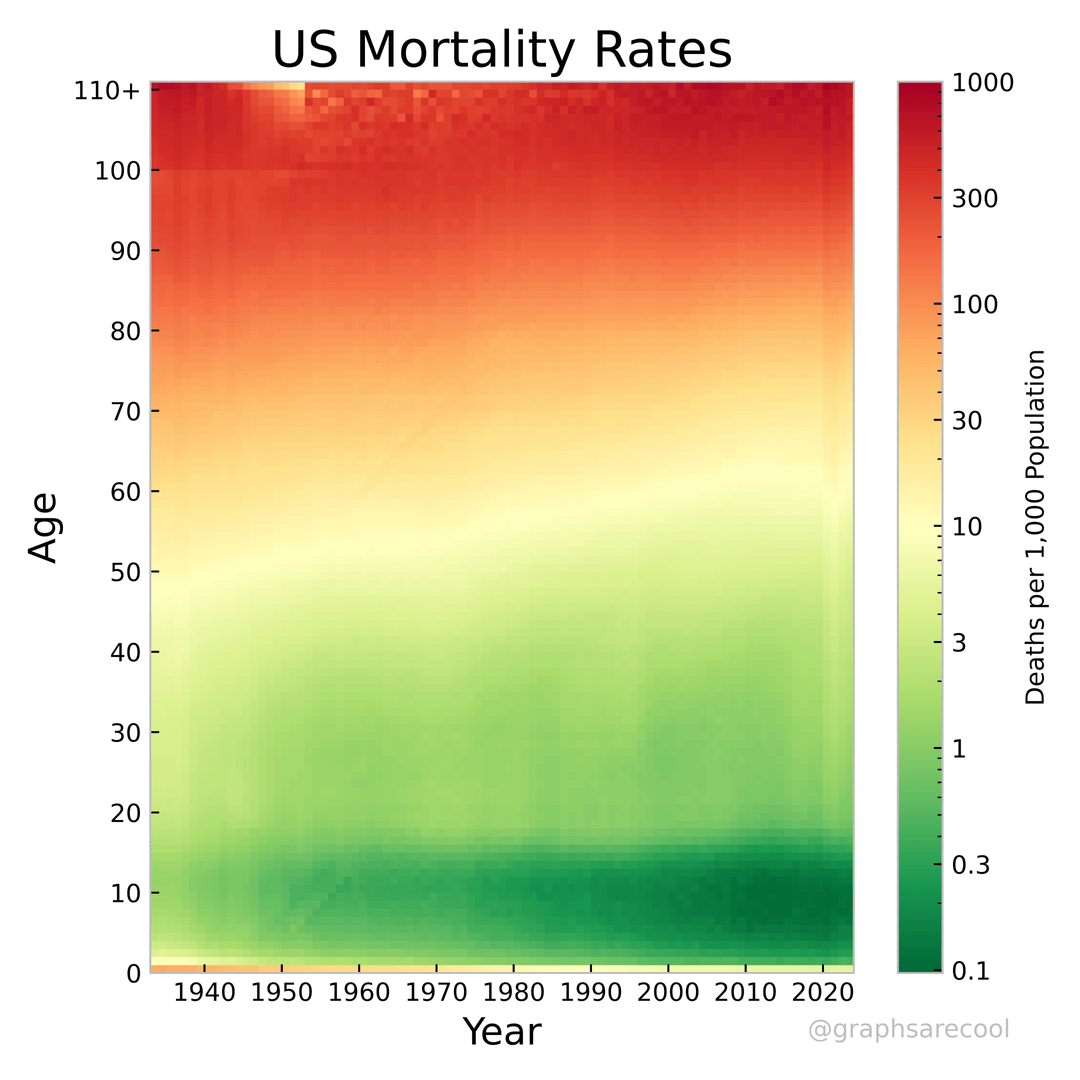
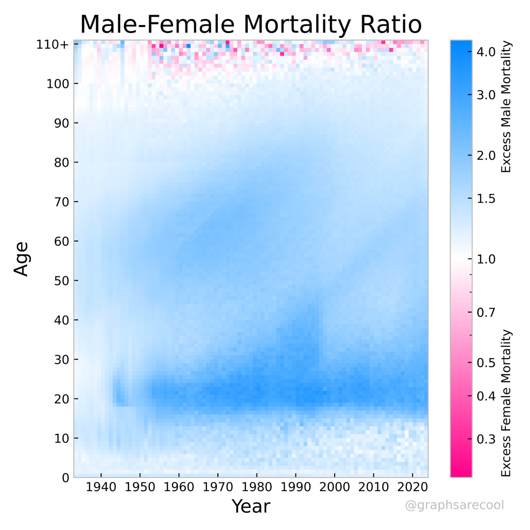
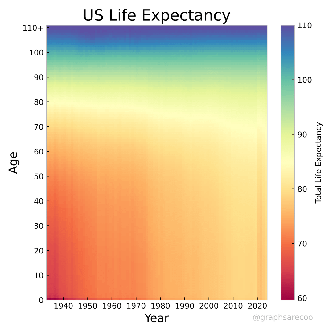
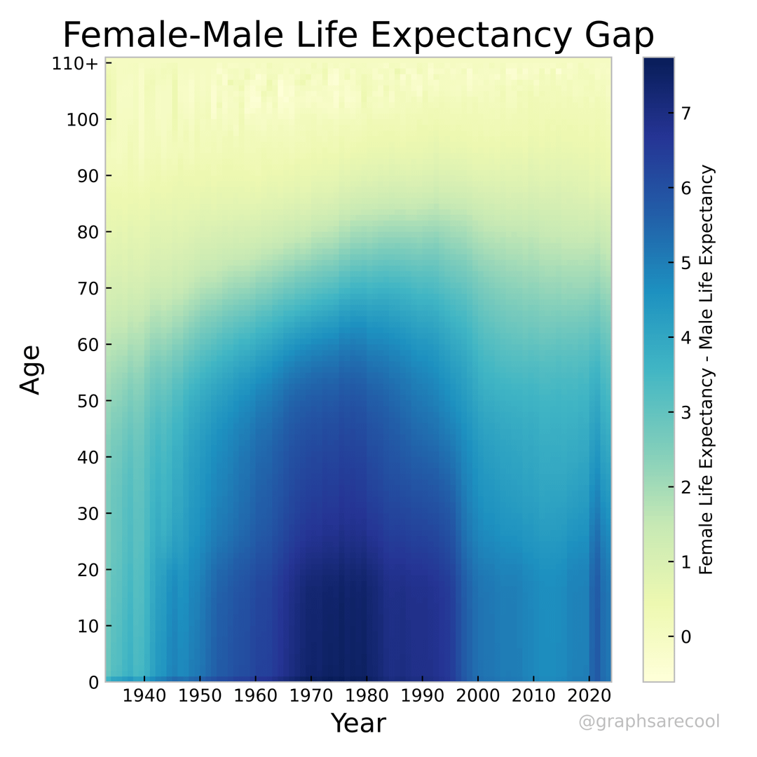
Data on US mortality rates and lie expectancy. Data from HumanMortalityDatabase, 1933-2023. Original mortality data is in 1 year*age divisions. Per the Human Mortality Database, data from very early years and old ages has been smoothed slightly to account for low sample sizes. Life expectancy is calculated from death probabilities which are in turn calculated from the raw mortality numbers. Mortality ratio is defined as male mortality rate/female mortality rate, life expectancy gap is simply the difference in female and male life expectancy in years. If you are interested in more graphs, I post them on Instagram.
Posted by graphsarecool
11 Comments
Source: [mortality.org](http://mortality.org), Tools: Python with NumPy and matplotlib. Color maps are also from matplotlib.
How do you end up with what appears to be excess male mortality through the entire lifespan?
The spike in female – male life expectancy around COVID was the most surprising thing in here to me. Very cool graphs!
what happened to stop killing boys in the early 90s?
That blue diagonal of excess male mortality of baby boomers (looks like birth years in the 40s-50s) is very interesting that it keeps extending into their old ages
These are beautiful graphs, they pack a lot of data in, and they’re intriguing. Remarkable work. Thank you!
I was surprised that I couldn’t identify any impacts from WWII, the Vietnam War, or other conflicts. Do the graphs reflect the deaths of Americans, or only those deaths that occurred in the US?
I like how you can see one very old person who died in 1954
I think instead of a green-yellow-red colormap you should use one that uses more colors. That will make it easier to see more subtle details. For example, this one: [https://www.ncl.ucar.edu/Document/Graphics/ColorTables/MPL_gist_ncar.shtml](https://www.ncl.ucar.edu/Document/Graphics/ColorTables/MPL_gist_ncar.shtml)
interesting how as soon as men hit 18, they start dying faster. They are finally allowed to do stupid things and they do stupid things.
i find the excess male mortality with a really clear cut after 18 during WW2 interesting.
what i’m wondering is, what happened in 1950-1960 that would cause the people that were ~18 at that time to seemingly have a higher mortality rate till today?