Data Source: US Census Bureau, 2024 American Community Survey (ACS)
Tools Used: Python, D3
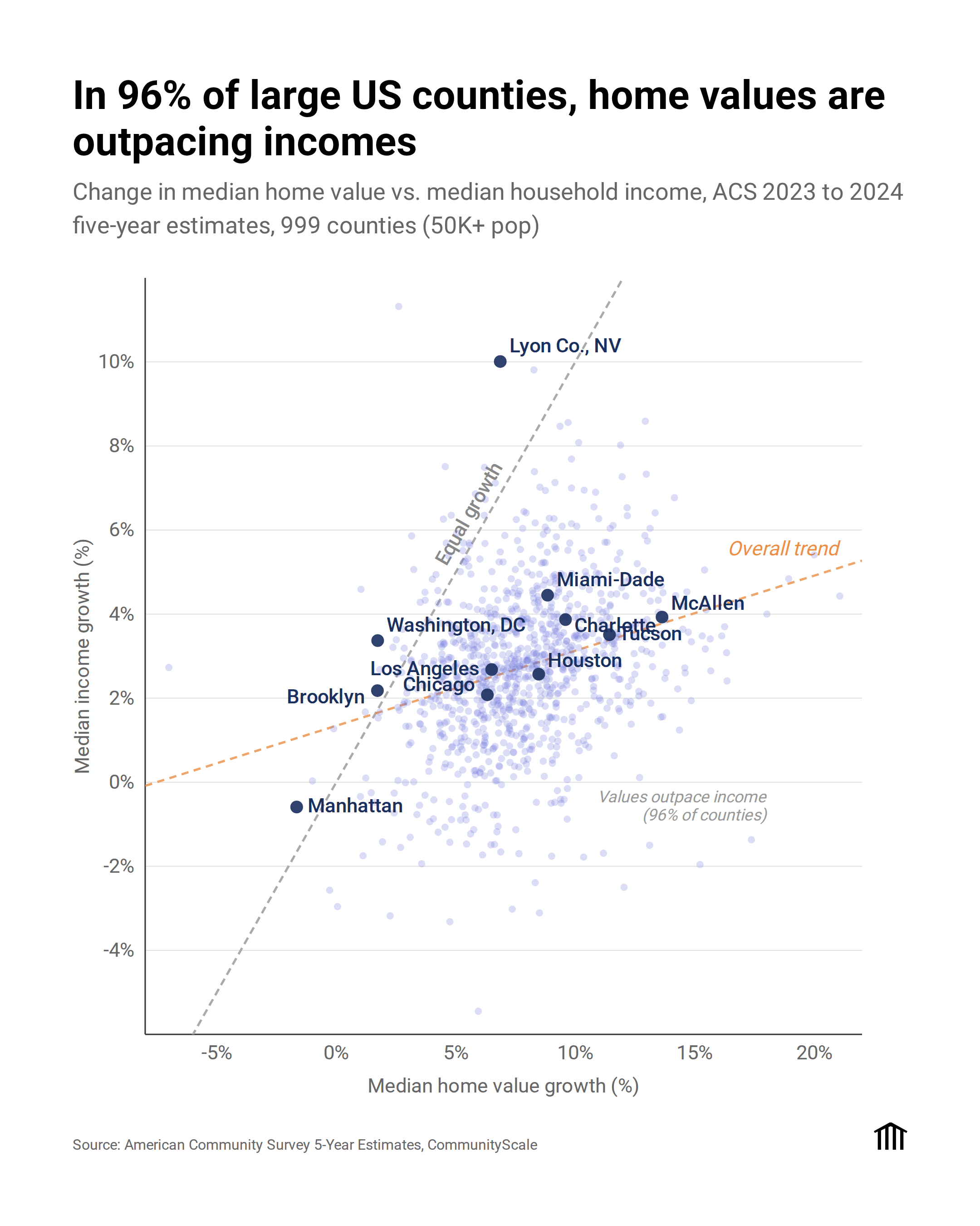
I wanted to visualize the growing gap between what people earn and what housing costs. In 96% of large US counties, home values are growing faster than incomes.
On this scatterplot, every dot below the equal-growth line represents a county where housing costs are pulling further ahead of wages. From fast-growing Sun Belt metros like McAllen and Miami-Dade to Midwest stalwarts like Chicago, the pattern is nearly universal. Interestingly, Manhattan and a handful of other counties actually bucked the trend.
We built an interactive version where you can explore the data and see how your specific community compares here: [app.communityscale.io](http://app.communityscale.io)
illathon on
Decrease the population of illegals and remove the ability for multi-national corporations to purchase single family homes. Problem solved.
rollduptrips on
If it were even, the slope would be 1. Am I reading that right?
[deleted] on
[deleted]
theemilyann on
I’m confused. The title says counties but these are cities. Some of them may also be county names, but Houston, TX, at least, is in Harris county. Houston county is a forest.
Ogar_the_Thrash on
What’s happening in Lyon Co Nevada that’s causing income to grow so quick?
turb0_encapsulator on
I would love to see the interactive version of this. What about places like Austin, Minneapolis, and Seattle that have had significant zoning reform?
brokenblinker on
Always always use an equal x and y scale if possible if you want the viewer to have any intuition for what you’re displaying.
ThinkOrDrink on
Data might be interesting but this plot is *not* beautiful.
– X and Y axes should be same scale.
– unity line should then be obvious 45deg from chart axes intersection
– X an Y should be swapped if message is “home value outpaces income” because home value > income is more intuitive to interpret if scatter is above unity line
– overall trend is.. a choice. Display that (terrible) R^2
SalvatoreEggplant on
The trend line isn’t really meaningful. † All you need are the 1:1 line and the data points. That 96% figure is also helpful.
_________________
† I actually think the trend line diminishes the figure, because there isn’t really a meaningful trend here. And it makes it look like the analyst doing something dishonest by fitting a line to a cloud of points. If anything, the mean or median ratio of *y* to *x* would be the appropriate summary statistic.
aggasalk on
the regression line is not a good or necessary addition, and the axes should be in equal size (so the identity line is at a 45 deg angle), but this is otherwise a nice, clear picture of the data
Mason11987 on
This is such a bad plot.
Why not make equal scales?
Why list cities when you say counties?
snigherfardimungus on
Most of those cities have no room for physical expansion in any direction, but their populations are increasing. People keep trying to move there despite no reasonable options for housing. Fixed (or near-fixed) supply and increasing demand drives up prices faster than anything else.
John Jacob Astor built his fortune on the idea of buying and holding property anywhere that people are pouring into – particularly the cheapest fringes.
michiplace on
> “ACS 2023 to 2024 five year estimates”
Oh no.
Comparing overlapping ACS periods is specifically anti-recommended: if you want to use the five-year data, compare 2024 (actually 2020-2024) to 2019 (actually 2015-2019).
But also, if you set your size threshold a little higher (65k instead of 50k — 50k isn’t really a “large county” anyways) then you can use 1-year ACS and do the 2023 to 2024 comparison you want.
Rough-Yard5642 on
Manhattan incomes dropped and home values dropped? That is completely not what I exepected.

![[OC] Home Value Growth vs. Income Growth in Large US Counties (2024 ACS Data)](https://www.byteseu.com/wp-content/uploads/2026/02/lx3yptqmoalg1-1229x1536.png "[OC] Home Value Growth vs. Income Growth in Large US Counties (2024 ACS Data)")
16 Comments
Data Source: US Census Bureau, 2024 American Community Survey (ACS)
Tools Used: Python, D3
I wanted to visualize the growing gap between what people earn and what housing costs. In 96% of large US counties, home values are growing faster than incomes.
On this scatterplot, every dot below the equal-growth line represents a county where housing costs are pulling further ahead of wages. From fast-growing Sun Belt metros like McAllen and Miami-Dade to Midwest stalwarts like Chicago, the pattern is nearly universal. Interestingly, Manhattan and a handful of other counties actually bucked the trend.
We built an interactive version where you can explore the data and see how your specific community compares here: [app.communityscale.io](http://app.communityscale.io)
Decrease the population of illegals and remove the ability for multi-national corporations to purchase single family homes. Problem solved.
If it were even, the slope would be 1. Am I reading that right?
[deleted]
I’m confused. The title says counties but these are cities. Some of them may also be county names, but Houston, TX, at least, is in Harris county. Houston county is a forest.
What’s happening in Lyon Co Nevada that’s causing income to grow so quick?
I would love to see the interactive version of this. What about places like Austin, Minneapolis, and Seattle that have had significant zoning reform?
Always always use an equal x and y scale if possible if you want the viewer to have any intuition for what you’re displaying.
Data might be interesting but this plot is *not* beautiful.
– X and Y axes should be same scale.
– unity line should then be obvious 45deg from chart axes intersection
– X an Y should be swapped if message is “home value outpaces income” because home value > income is more intuitive to interpret if scatter is above unity line
– overall trend is.. a choice. Display that (terrible) R^2
The trend line isn’t really meaningful. † All you need are the 1:1 line and the data points. That 96% figure is also helpful.
_________________
† I actually think the trend line diminishes the figure, because there isn’t really a meaningful trend here. And it makes it look like the analyst doing something dishonest by fitting a line to a cloud of points. If anything, the mean or median ratio of *y* to *x* would be the appropriate summary statistic.
the regression line is not a good or necessary addition, and the axes should be in equal size (so the identity line is at a 45 deg angle), but this is otherwise a nice, clear picture of the data
This is such a bad plot.
Why not make equal scales?
Why list cities when you say counties?
Most of those cities have no room for physical expansion in any direction, but their populations are increasing. People keep trying to move there despite no reasonable options for housing. Fixed (or near-fixed) supply and increasing demand drives up prices faster than anything else.
John Jacob Astor built his fortune on the idea of buying and holding property anywhere that people are pouring into – particularly the cheapest fringes.
> “ACS 2023 to 2024 five year estimates”
Oh no.
Comparing overlapping ACS periods is specifically anti-recommended: if you want to use the five-year data, compare 2024 (actually 2020-2024) to 2019 (actually 2015-2019).
But also, if you set your size threshold a little higher (65k instead of 50k — 50k isn’t really a “large county” anyways) then you can use 1-year ACS and do the 2023 to 2024 comparison you want.
Manhattan incomes dropped and home values dropped? That is completely not what I exepected.
Knoxville is that dot in the lower right