
![I mapped the cost of living across 24,000+ US cities using federal data [OC]](https://www.byteseu.com/wp-content/uploads/2026/03/rjukxq65vjmg1-1536x999.png "I mapped the cost of living across 24,000+ US cities using federal data [OC]")
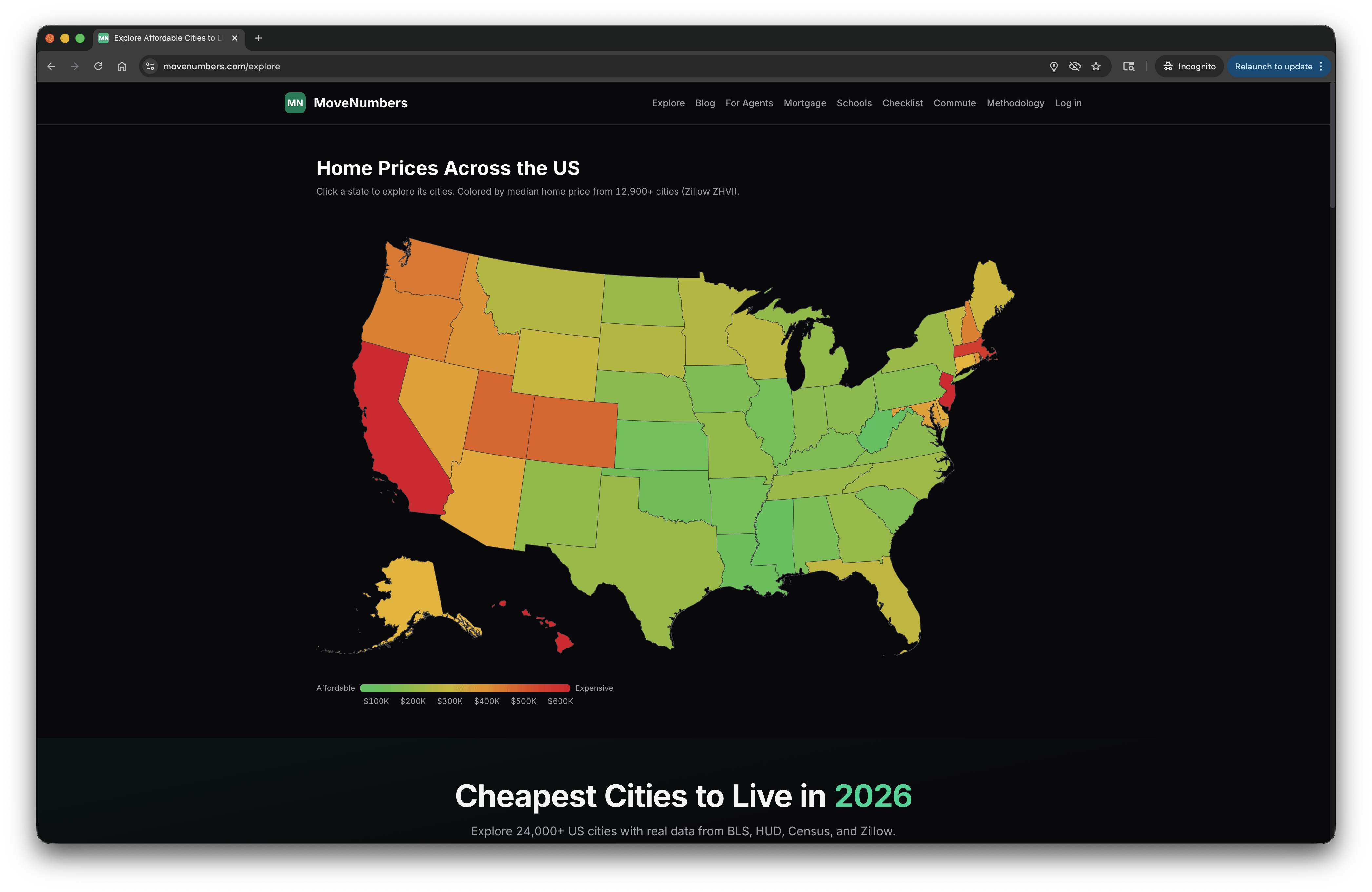
source: BLS, BEA, HUD, Census, Zillow. built an interactive version at movenumbers.com/explore where you can filter by region, salary, and toggle between rent/buy. the map uses COL index. (this can also help you compare your current city to others!)
Posted by supleezy
17 Comments
I could have told you this.
Source: am not American
It’s almost like a boringness or states map.
This map is irrelevant. A better map is by county.
It’s true. I pay extra to stay away from the rest of you.
Imagine having city data and the most granular you get is by state
You at least need a dot where the city is
Moved from Nebraska to South Carolina and my cost of living has almost tripled, and I’m only renting a house smaller than I used to own.
I’ll take places I want to live for 500 Alex
“Fairfax, VA
Pop. 25K”
this seems… not accurate. Also, Falls Church, Vienna and Alexandria are all within Fairfax.
I’m not seeing the country map at all on mobile iOS.
Is there a reason you seem to be missing data from Baltimore County? Is it because there are no cities in the county, because of a naming collision with the city, or for some other reason? with about 850,000 people, it seems like a pretty big area to leave out.
Is it just me or does the map not show up on mobile only desktop
Everyone already knows the worst states to live in are cheaper.
New York is green only because of upstate New York
I live in New Jersey. Help.
Why is Massachusetts so expensive? It doesn’t have the hiking of Colorado, sunshine of California, or near nyc like Jersey?
Dude lumping whole states together obviously does not work for this. Buffalo and NYC being lumped together for cost of living is ludicrous.