
")
Well the image quality seems to have been reduced significantly by reddit… Here is a link having the raw images. I don't know if mods would be able to update the images…
https://i.imgur.com/PooLjQo.png
https://i.imgur.com/OjOK905.png
https://i.imgur.com/PqPohY9.png
https://i.imgur.com/j9zz6Yl.png
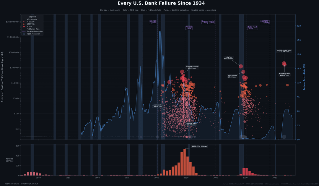
Image 1 — The Full Picture (scatter + bar)
Top panel shows all 4,114 FDIC bank failures since 1934 as a scatter plot. Each dot is a single bank failure. Dot size represents the bank's total assets at the time of failure. Color represents the estimated cost to the FDIC (gray = no data, pink = under $100M, orange = $100M to $1B, red = over $1B). The y-axis is log scale so SVB at $19B doesn't flatten everything else.
The blue line is the Federal Funds Effective Rate on a secondary axis. Worth noting how the major failure waves tend to follow periods of rapid rate increases. The S&L crisis followed the Volcker-era rate hikes, the 2008 wave followed the 2004-2006 tightening cycle, and SVB/First Republic came right after the fastest rate hikes in decades (2022-2023).
Purple dashed lines mark five major pieces of banking legislation. DIDMCA (1980) deregulated savings & loans. FIRREA (1989) was the cleanup act after the S&L crisis. Gramm-Leach-Bliley (1999) repealed Glass-Steagall separations. Dodd-Frank (2010) tightened regulation after 2008. EGRRCPA (2018) rolled back parts of Dodd-Frank, raising the threshold for enhanced oversight from $50B to $250B in assets. SVB had around $209B in assets at failure, which would have been subject to stricter oversight under the original Dodd-Frank threshold.
Shaded vertical bands are NBER-designated recessions.
Bottom panel is a simple bar chart of failure count per year. Orange bars are the S&L era, red bars are 2008 and 2023. The peak year is annotated.
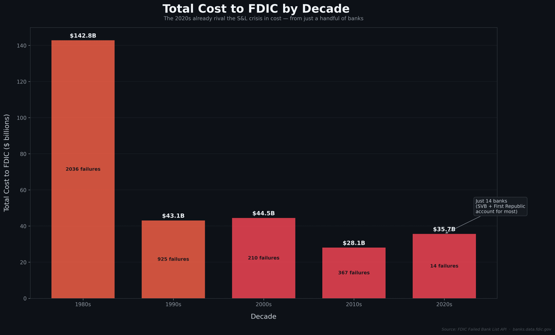
Image 2 — Cost by Decade
Total estimated cost to the FDIC broken down by decade. The 1980s S&L crisis is massive as expected. The interesting part is the 2020s, which with only a handful of failures (primarily SVB and First Republic) is already approaching comparable cost levels. The number of failures dropped dramatically but the cost per failure has skyrocketed.
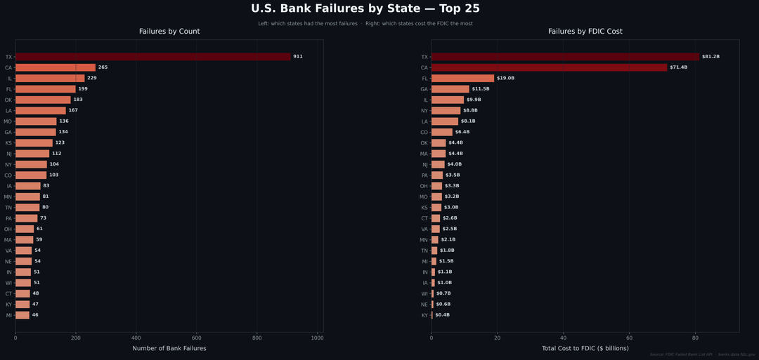
Image 3 — Failures by State
Two side-by-side horizontal bar charts showing the top 25 states. The left panel ranks states by total number of bank failures. The right panel ranks by total cost to the FDIC. The rankings shift significantly between the two. A state might have a lot of small failures or a few catastrophically expensive ones. California and Texas dominate both lists but for different reasons and in different eras.
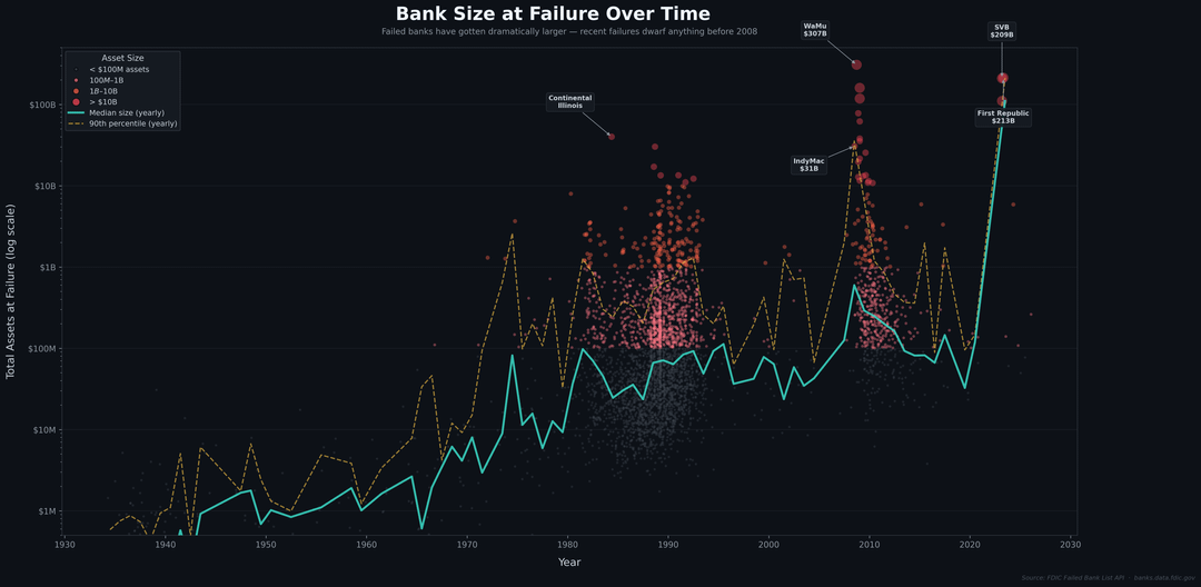
Image 4 — Bank Size at Failure Over Time
Every failure plotted by its total assets at the time of failure (log scale). The teal line is the yearly median asset size of failed banks. The yellow dashed line is the 90th percentile. Both trend upward over time, but the real story is the outliers. Washington Mutual ($307B), First Republic ($213B), and Silicon Valley Bank ($209B) are in a completely different category from anything that came before. The banks that fail today are orders of magnitude larger than the banks that failed during the S&L crisis.
Posted by Insight54
1 Comment
Well the image quality seems to have been reduced… Here is a link having the raw images. I don’t know if mods would be able to update the images…
[https://i.imgur.com/PooLjQo.png](https://i.imgur.com/PooLjQo.png)
[https://i.imgur.com/OjOK905.png](https://i.imgur.com/OjOK905.png)
[https://i.imgur.com/PqPohY9.png](https://i.imgur.com/PqPohY9.png)
[https://i.imgur.com/j9zz6Yl.png](https://i.imgur.com/j9zz6Yl.png)