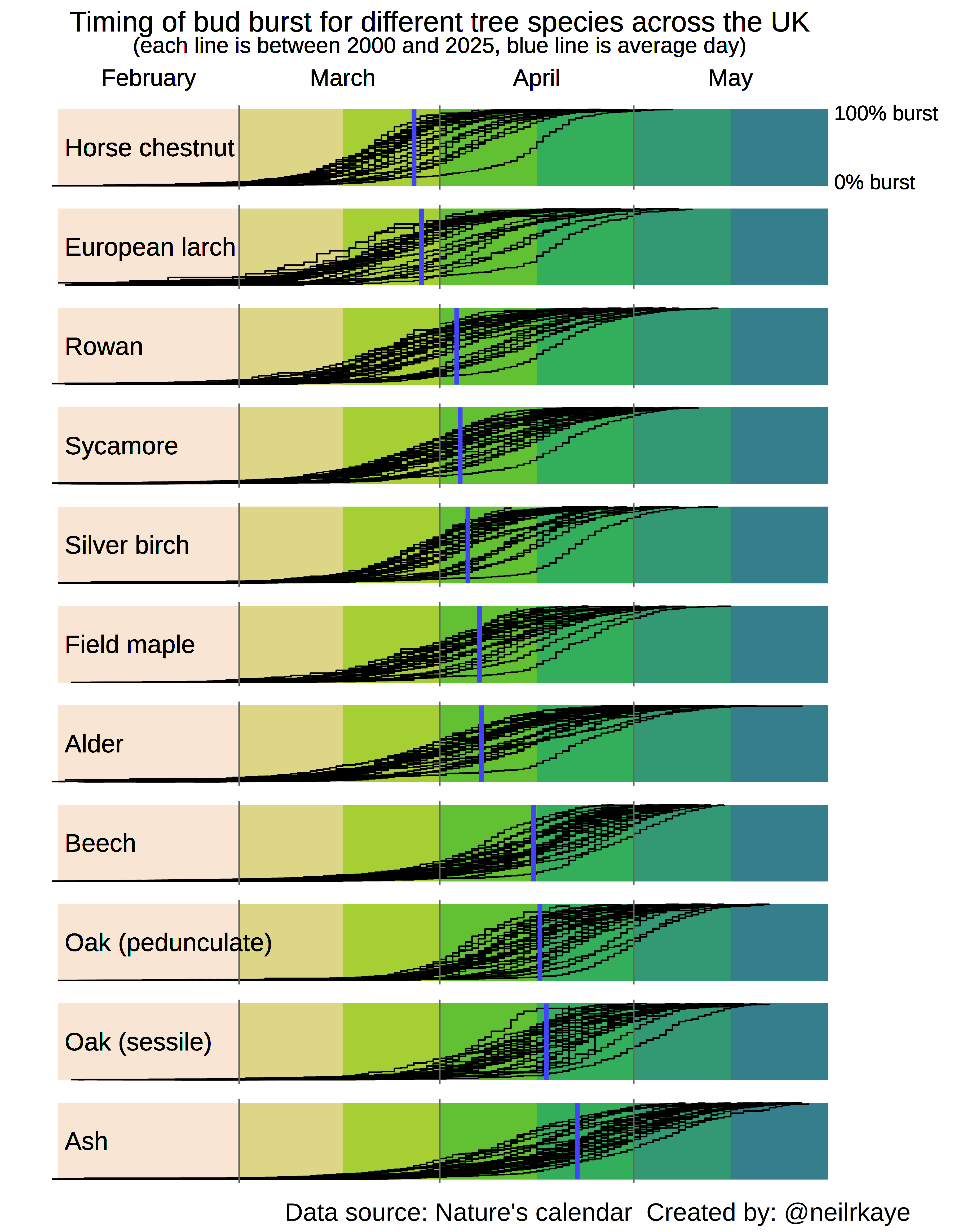
Timing of bud burst for different tree species across the UK. The black lines show the timing in the Spring for the years 2000 to 2025 and the blue line is the average day for that species. [OC]
Posted by neilrkaye

![Timing of bud burst for different tree species across the UK. The black lines show the timing in the Spring for the years 2000 to 2025 and the blue line is the average day for that species. [OC]](https://www.byteseu.com/wp-content/uploads/2026/03/4stbgum8seng1-1189x1536.png "Timing of bud burst for different tree species across the UK. The black lines show the timing in the Spring for the years 2000 to 2025 and the blue line is the average day for that species. [OC]")
Timing of bud burst for different tree species across the UK. The black lines show the timing in the Spring for the years 2000 to 2025 and the blue line is the average day for that species. [OC]
Posted by neilrkaye
7 Comments
Uses Nature’s calendar data from the Woodland trust and is created using ggplot in R.
Interesting, my beech are at least a month before my oak, but i guess thats possible from the data – just doesn’t look like it.
Wow there are insane outliers there. And I always thought it was just my imagination when I was having the impression that there was very little green out there in some years. But looking at this shows that there indeed are huge differences.
It would be interesting to see data as far back as possible and colour code by year.
This is interesting comparison between species. Would also be interested in a comparison between years
This is cool. Can really feel the hay-fever through it.
Where in the UK though? I live in Scotland and my parents in Devon are in a completely different season from me right now