
![[OC] Visualization of 477 pizza places in Brooklyn by average customer rating](https://www.byteseu.com/wp-content/uploads/2026/03/eh8mkp9t1gng1-1024x1024.jpg "[OC] Visualization of 477 pizza places in Brooklyn by average customer rating")
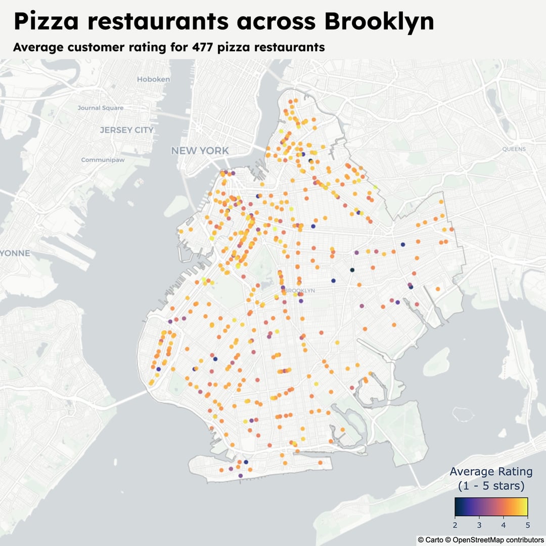
I fetched all the data from the Google Maps API (2026), and visualized it using Python and Plotly. You can read more about it and the code I used to get the data and visualize it here: https://www.memolli.com/blog/top-pizza-places-brooklyn/
Posted by Alive-Song3042
8 Comments
Nice. Since the vast majority seem to be rated >4, feels like this needs a greater visual range between 4 and 5 otherwise they all blend together. Maybe make <3.5 one end of the range?
Is there a clear story to the 2’s and 3’s?
What’s a pizza place? Is this counting convenience stores that sell slices or restaurants with a cheese pizza on a kids menu against specialty pizza restaurants or is it somehow limited?
Man, I’m here only to read the reviews of those 2* pizza places, that’s always entertaining to read horror stories.
I can’t find them though, you can only filter 2* and up but not the opposite on GMaps, would need to scrap them all like you did to find them 🙁
Care to share a few? I’m here for the drama.
Fun chart but the colors are nearly useless, not beautiful
How many judges mouth feel?
Looks like you need to be relatively good or relatively isolated to survive in the Brooklyn pizza game, but not both.
Awesome! That makes me want to do the same thing for Paris!
per /u/pocketdare , maybe consider
1. reversing the colour scale direction. IMO the dark stands out more.
2. based on your fig 3 frequency distribution you could potentially take the log of the scores then plot for colour then rescale back to 2-5 for the legend. This way the unusually high scores would pop.