
![violent crime rate by county across the US [OC]](https://www.byteseu.com/wp-content/uploads/2026/03/bnnehg1w2wng1-1536x1335.png "violent crime rate by county across the US [OC]")
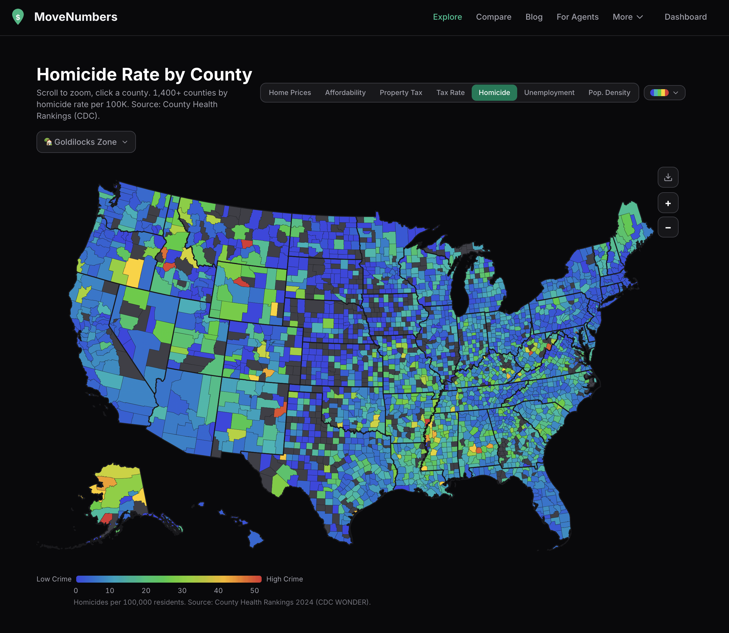
data from CDC WONDER + County Health Rankings, mapped by county. homicides per 100,000 residents (2018-2022 average, anyone know where to get more recent data?).
interactive version at movenumbers.com/explore you can toggle between 7 different map layers (home prices, affordability, property tax, tax rate, homicide, unemployment, pop density)
Posted by supleezy
26 Comments
if anyone has any suggestions on things they’d like to see added/improved, i’m all ears!
Look at all those rural areas shining like beacons
Grey is no data? That’s a lot of missing counties.
Distribution of county size seems to be the biggest factor here. Graphic is pointless.
Surprised by: Maine, Idaho, Utah (seem high). Illinois and Florida (seem low)
Kinda surprised: Alaska, New Mexico (seem a bit high)
Not surprised: the South
Can you overlay voting patterns?
Title says violent crime rate and the image says homicide rate.
St Louis is a nice red spot.
Republican states seem to have a great problem with violent crime.
Any way to add a “homicide by population density” as well. Feels like we see the same “X per capita” visualizations here a lot so that would mix it up a bit.
Does this include suicide? It must, all the yellow in Idaho Montana Wyoming Alaska
What’s the red county on the east edge of Arkansas? Don’t see much of an explanation when pulling up a map as to why that specific area would be red.
Interesting, although raw numbers often provide more context, e.g. showing count of homicides with the rate per 100k. This table shows data from 2023.
https://preview.redd.it/bze36y1vowng1.png?width=712&format=png&auto=webp&s=7d3d69f7209193e98a4fcfa5815bd9abaa9411ad
This says highish crime in counties in Maine and NH with little to no people….. Same with Alaska. This map is not useful.
Ancorage AK is one of the most dangerous cities in the country yet it’s county is blue, while the counties up north with nobody living there is yellow and orange. This is misleading.
So like red counties are the worst? Tell me something I didn’t know
The rate is clouding the data here. The highest rate counties are in the lowest population areas. This tells us very little about trends and more about specific events.
I feel like homicides per capita isn’t really the best metric for a map like this indicating low-to-high crime over a broad area. Lower populations massively inflate the per capita rate. There’s some fairly brutal cities here with hundreds of murders per year that are shown in blue just because they’re in metropolitan areas, while some other small cities with maybe one homicide show up red because nobody lives in the county. Which one really has “higher” crime?
I’m willing to bet all or nearly all the “hot spots” are just outliers with a tiny population that happened to spike for whatever reason (if they meaningfully spiked at all).
For example, the red spot in Montana appears to be Musselshell County which, according to the [CDC](https://hdpulse.nimhd.nih.gov/data-portal/mortality/table?age=001&age_options=age_11&cod=247&cod_options=cod_15&comparison=states_to_us&comparison_options=comparison_statename_to_us&race=00&race_options=race_6&ratetype=aa&ratetype_options=ratetype_2&ruralurban=0&ruralurban_options=ruralurban_3&sex=0&sex_options=sex_3&statefips=30&statefips_options=area_states&yeargroup=5&yeargroup_options=yearmort_2), has a death rate barely above the US average, a bit fewer than 5000 inhabitants and on average 66 deaths *per year.*
The overall trends might be meaningful, but the extreme highs are almost certainly just noise.
Boise County by no stretch of the imagination warrants this bullshit map.
WTF
a few counties are orangush red in WV
Wayne county, home of DETROIT is a lite blue
WV is more dangerous than DETROIT.
Wtf
why is green not the best?
In some of this counties you can follow where interstates or major highways flow through, at least in West Virginia and Kentucky
I have a theory that there is some baseline number of murders you are going have any time you have any society at all, so the relationship between population and number of murders is shaped like a hockey stick. That is how you get these low-population outliers. Possibly there is also some relationship between tendency to murder and the kind of person who is going to choose to live somewhere with negligible population density.
We all know what that red spot in Montana means.
That’s the good ‘Ol “Train Station”
Wow, the size of St. Louis kinda exemplifies how skewed the crime stats are there because the county and the city divided!