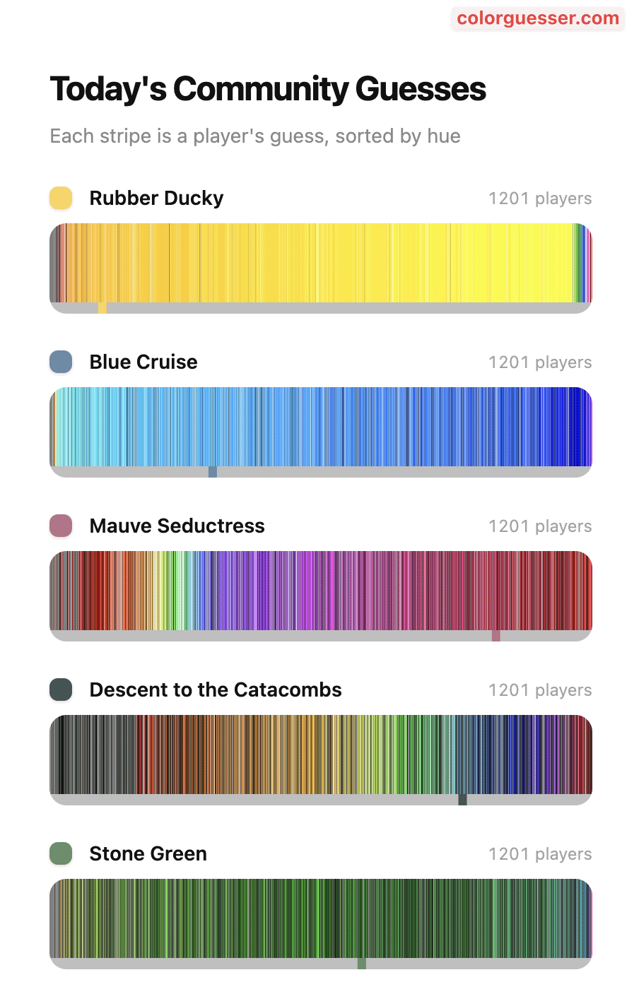
This graphics shows what players guessed for a given color name (e.g. Rubber Ducky). The data is collected by me and processed with SQL. The graphics is generated with JavaScript.
Posted by kkiru

![[OC] Color name to their color perception guessed by players of ColorGuesser](https://www.byteseu.com/wp-content/uploads/2026/03/ylfku98lh6og1-666x1024.png "[OC] Color name to their color perception guessed by players of ColorGuesser")
This graphics shows what players guessed for a given color name (e.g. Rubber Ducky). The data is collected by me and processed with SQL. The graphics is generated with JavaScript.
Posted by kkiru
7 Comments
The data is collected by me on [colorguesser.com](http://colorguesser.com) (specifically the new beta version).
It shows a subset of the users guesses from a few days ago.
The tools used to analyse and create this charts were:
SQL to filter and get the data.
JavaScript to create the timeline view (no other frameworks were used).
I wonder what game the people who read “rubber ducky” and “blue cruise” and chose red were playing
The way the data is presented doesn’t make much sense to me can you explain more?
I really like this. However, I have one criticism: why is the spectrum split in the reds? This representation works really well for the rubber duck, the blue cruise, and the stone green but the mauve the colors just look random in comparison to the others. I think the major reason for that is that the range which the majority of people voted for (I.e. actual mauve color) is split into two, because it crosses the ends of the spectrum. I’m not even sure why you split it in the reds, as opposed to in the violets like an actual rainbow.. but maybe that’s not actually my point, I would make that split dynamic, so that the color most people vote for is always in the center of the spectrum.
I hope that makes sense, it was hard to describe…
I’m reminded that a lot of people actually don’t know what colour mauve is
Very cool! Would be cool to see as histograms as well
There’s some fancy catacombs out there.