

For those of you who don’t know yet: Electoral Compass based on a quiz, it shows you with which party your views match the most. No accounts, no tracking, no ads.
To date, a total of 67,000+ quizzes have been solved. Thanks to everyone for the solution and feedback.
What’s new?
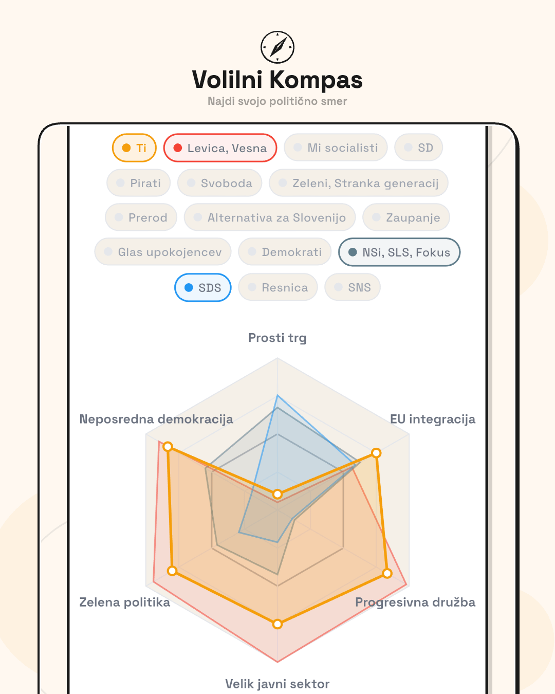
- In-depth quiz (64 questions) — twice as many questions, covers topics that a shorter one cannot: tax policy, pensions, housing cooperatives, e-voting, biometric control, etc. In addition to the matching scale, you also get spider graph on 6 dimensions — so you can see where you agree with the client and where you differ.
- 3rd edition of the short quiz was released last week and is the default for new users.
Customer views are determined solely on the basis of official election programs — not on the basis of television statements, media or personal opinions. The programs are also accessible in the application itself. If the client does not mention the topic in the program, he gets a lower level of trust and has less influence on your result in this question. The goal is for the quiz to tell you which party your views most align with purely on the basis of programs, without noise.
Try on volilnikompas.si — short quiz ~5 min, in-depth ~10 min.
Any comments or suggestions will be appreciated.
A large part of the changes was made precisely on the basis of your comments on previous post.
EDIT:
There were a couple of comments regarding the difference between match percentage, compass and spider graph:
Match percentage (scale) — compares your answers with each customer across all 64 questions. Each client’s point of view has its own level of confidence, which determines how strongly this issue affects the outcome for that client. If the client clearly addresses a topic in the program, it has a greater impact — if it is barely mentioned or not at all, less.
Compass (2D graph) — takes into account only questions that belong to the economic or social axis. Therefore, it can happen that you are far from the customer on the compass, but you have a high percentage with them, because you agree on topics that do not affect the compass.
Spider graph (6 dimensions) — divides the issues into 6 areas: economy, sovereignty/EU, society, public sector, ecology and democracy. Each area has its own axis from one extreme to the other (e.g. national economy ↔ free market). Here you can see exactly where you and the client match and where you differ. Two parties can be very close in total percentage, but on the spider you can see that they match in completely different areas.
In practice, this means that you can have two clients with a very similar match percentage, but when you look at the spider graph, you see that you match with one on the economy, and with the other on society — the overall percentage is similar, but the reasons are completely different.
https://i.redd.it/qz1e5mqsvkpg1.png
Posted by uranmaj
12 Comments
Ni potrebe po nobenem kompasu.. Če si normalen, deloven in imaš rad sebe, voliš NSi… Za ostale so Pirati.
Če voliš kar koli drugega se pa ne joči naslednjih 4 leta 🙂
Papir vse prenese. V program se lahko marsikaj napiše, v praksi pa potem nekaj drugega.
Uf a Levica in Svoboda ostajata na programih iz 2022? Damn….
Kje pa je uvedba mojega predloga: “Koga boš volil?” pred začetkom kviza (lahko tudi prve tri stranke, ki bi jih volil, da dodaš malo širine) in potem primerjava z rezultati kviza. Tukaj dobiš dinamiko, kako so ljudje odločeni danes, kaj pokaže kviz in primerjavo med tem – časovni trend. Pa še z malo truda lahko poiščeš tudi največje diskrepance po strankah (volilci katere stranke imajo najbolj različna stališča od stališč te stranke 🙂 )
Odlično, po mojem daleč najboljši in verodostojen kviz/kompas. Kompas tudi lepo prikaže razlike/enakosti med strankami.
Npr. to da so Demokrati veliko bližje NSi kot pa SDS. Da sta si Svoboda in SD zelo blizu, pa Levica in Socialisti in Resnica ter SNS.
Mogoče v razmislek kako vključiti v prihodnje tri stvari.
1. Papir vse prenese in prav tako lahko v program vsak vključi karkoli želi, drugo je realnost. Ali je stranka sploh kompetentna in ali ima ljudi, da bi program izvedli? Ali so zadaj za ukrepi/obljubami tudi konkretne številke, da so ukrepi vzdržni in izvedljivi?
2. Nivo politične komunikacije/odnosov. Stališča in programi ne vključujejo nivoja komunikacije, ki ga politiki kažejo do ostalih. Spoštljivost, konstruktivnost, razumskost, potencial povezovanja, sprejemanje drugačnih mnenj in podobno. To je za marsikoga pomembno.
3. Integriteta, korupcija in nekaznovanost. Ali so stranka in njeni vidni predstavniki obremenjeni ali bili obremenjeni s strani kakšnih institucij?
A imajo pri končni analizi vsi odgovori enako težo?
Če ja je vse skupaj bolj tako tako. Ker ukinitev prodaje ICE avtomobilov realno nima enakega vlpliva kot pa recimo zmanjšat javni sektor.
Solidno, edino kar imam v pripombo so na koncu % unemanja proti pajku. V primeru procentov imam top 3 stranke 2-3 procente narazen, medtem ko sodeč po pajku niso niti blizu
Eh…
69 svoboda, 68 demokrati, 62 SDS, pa se ene par vmes, ne prou uporabno
Dobro narejeno, samo ne vem, zakaj mi vedno najbolj predlaga Resnico, v prejšnji in sedanji verziji – pa jih videti ne morem :-))
Poleg tega na kompasu pokaže da sem enako oddaljen od Resnice kot od Demokratov, ampak na drugo mesto predlaga SNS, ki je na kompasu daleč od mene. Tukaj je za pogledat, zakaj je tako.
Vsekakor pa fajn pokaže, zakaj sem povsem nekompatibilen s trenutno koalicijo…
https://preview.redd.it/zhkq0uqwelpg1.png?width=874&format=png&auto=webp&s=2751c59296b0fa3fd1d3be7e874918b41505bc97
Jaz bi pričakoval bolj proti desni pa še dol
Kaj pravi statistika vseh rešitev, kdo vodi?
Dovolj natancno, vsaj pri meni. Je pa treba za vsako trditev napisati pojasnilo ker 60% folka ne ve kaj je progresivna obdavcitev niti ni napisano kaksna progresiva, koga se bo tičala itd.