

When the Lithuanian design studio Praktika began working on the branding for the National Institute of Architecture – a new centre in Kaunas, Lithuania, which is dedicated to architectural research, heritage, initiatives, ideas and discussion – the team looked to incorporate “authentic Lithuanian architectural elements”.
To do this they took inspiration from the Unesco World Heritage-listed Kaunas Central Post Office, “where national style meets functionalism,” says Praktika. In particular their branding makes reference to the Post Office’s distinctive flooring.
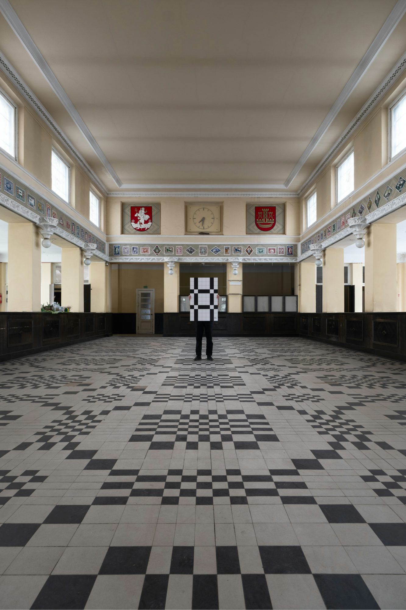 Original tiling in the Kaunas Central Post Office
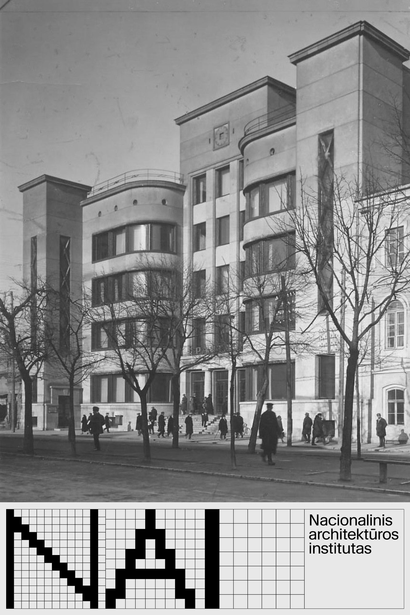 National Institute of Architecture branding
 National Institute of Architecture branding
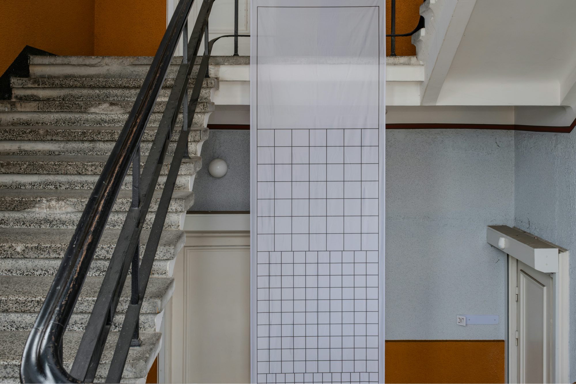
“The black and white folk pattern embedded in the building’s floors is reinterpreted as both a decorative national reference and a functional modernist graphic system,” says Praktika. “This turns the historical motif into a contemporary part of global architectural and artistic language.
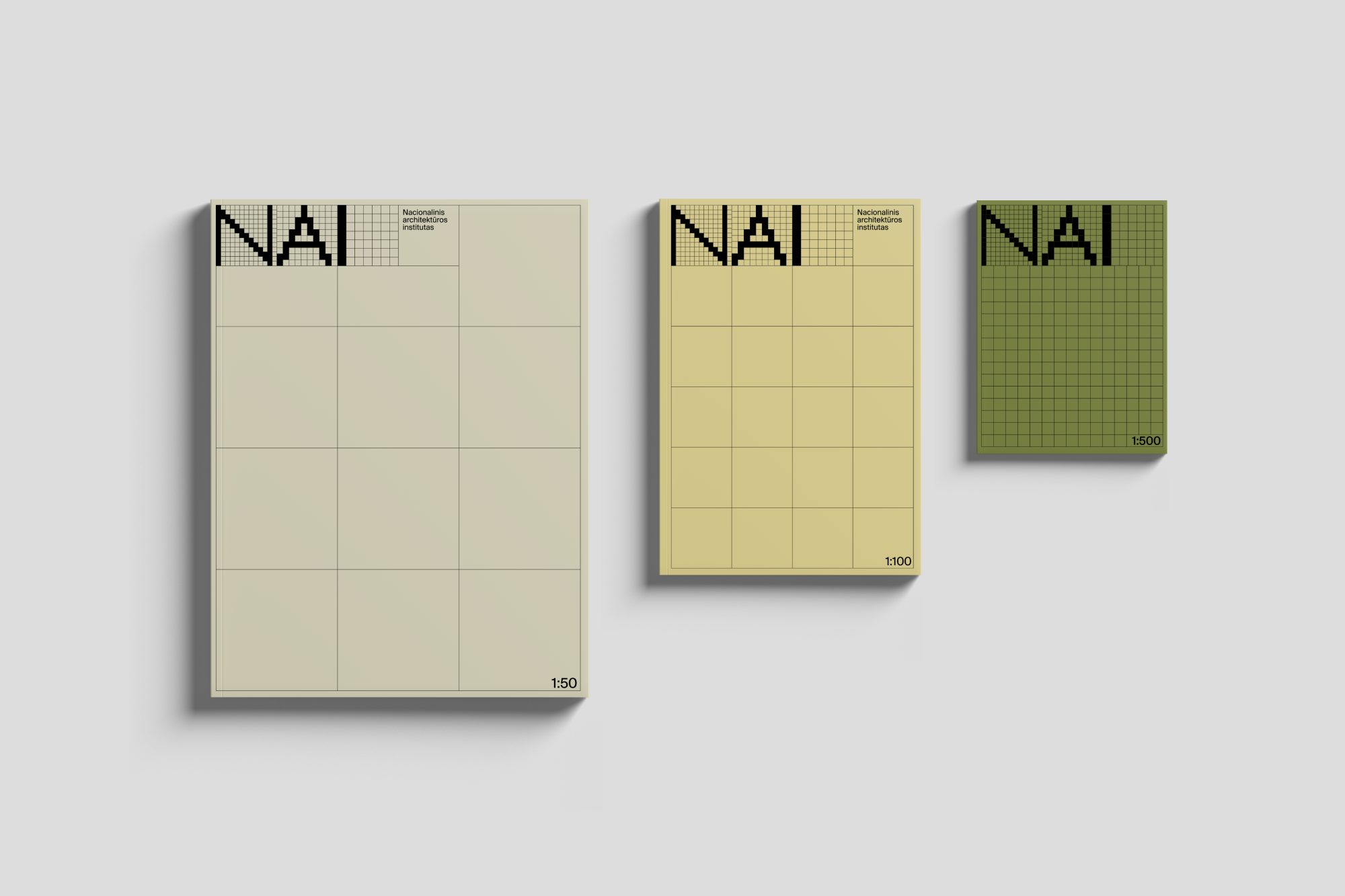
“In the logo, the pattern is expanded through a scale-based construction guided by an architectural grid. All graphic elements are placed within four grids that grow progressively from the smallest to the largest. This scaling principle creates a structural rhythm and reflects the institute’s mission to operate across all levels of architecture, from human environments to large-scale urban and theoretical fields.”
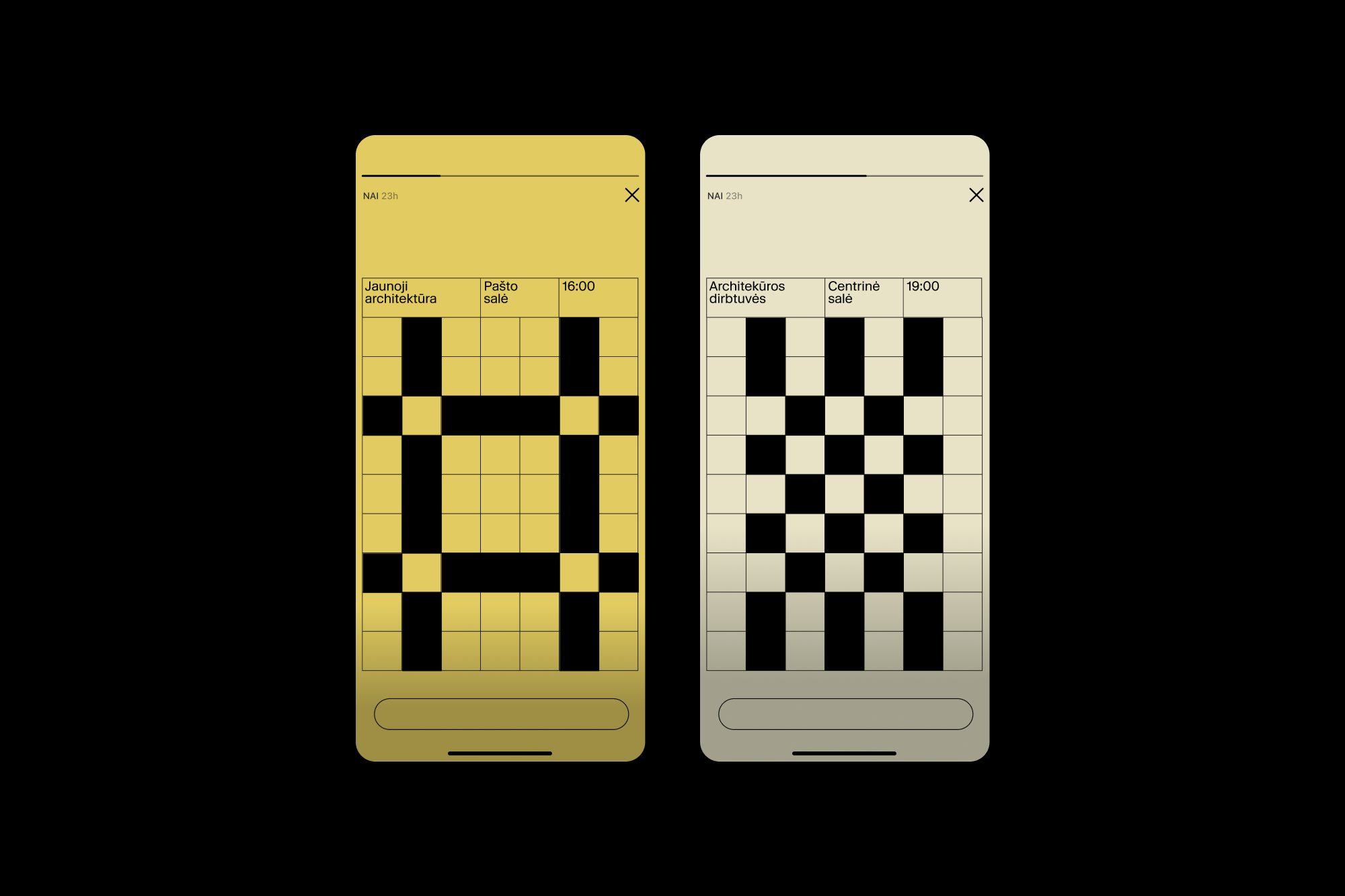
The distinctive pattern appears throughout the branding for the National Institute of Architecture, from within the building itself to its use on merch and social media.
 National Institute of Architecture branding
 National Institute of Architecture branding
 National Institute of Architecture branding