– Population and Life Expectancy: Data from IHME extended to 2025 with UN Population Prospects 2024 forecasts.
Tools: gapminder.org/tools and Inkscape
blackandwhitenod on
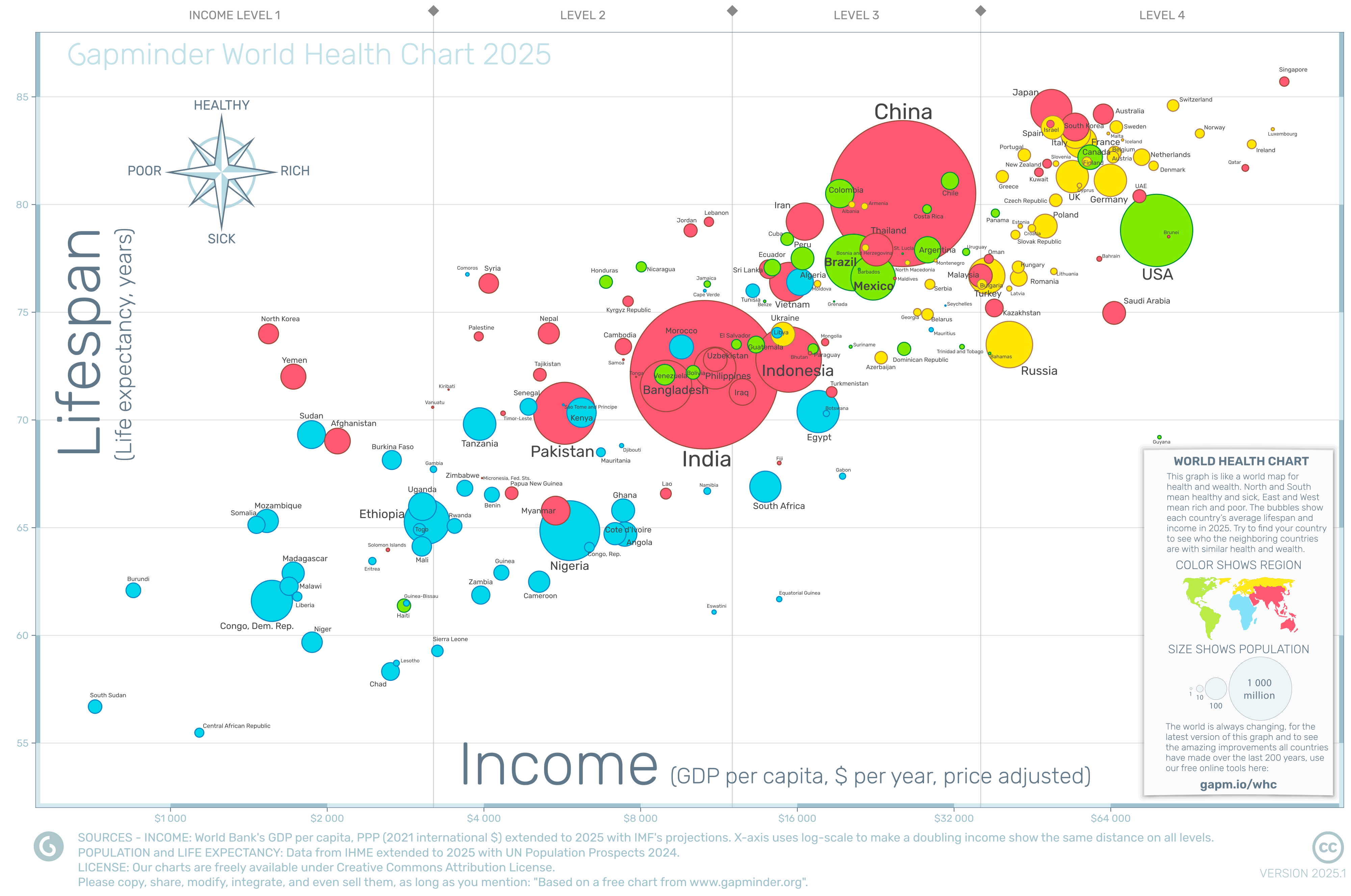
North Korea is surprisingly high in life expectancy, I wouldn’t have expected that.
PandaDerZwote on
Don’t know if the bubbles are helping to compare countries here. Am I looking at the upper edge or the center for the value?
If the latter, places like China are very hard to compare to others. If the former, thats pretty unintuitive.
These_Rest_6129 on
What ? China have higher lifespan than the USA ?
patmax17 on
Can I say I actually like this graph a lot? It packs a lot of information (population, geographical area,…) in a way that’s easy to read. Well done!
on4aa on
The compass dial is a nice touch.
Loki-L on
Iran has (or at least had) a similar life expectancy as the US and below that of places like Colombia?

![[OC] The World Health and Wealth Chart. How Income and Lifespans relate in 2025 for countries on the World Health Day 7th April, 2026.](https://www.byteseu.com/wp-content/uploads/2026/04/eygsmljkhutg1-1536x1019.png "[OC] The World Health and Wealth Chart. How Income and Lifespans relate in 2025 for countries on the World Health Day 7th April, 2026.")
7 Comments
Sources:
– Income: Gapminder’s calculations of GDP per capita, in constant PPP dollars with 2021 prices. Based on [World Bank’s data](https://data.worldbank.org/indicator/NY.GDP.PCAP.PP.KD) published in July 2025 in their World Development Indicators, extended with forecasts from IMF, published in [World Economic Outlook 2025, July edition. ](https://www.imf.org/en/publications/weo/issues/2025/07/29/world-economic-outlook-update-july-2025)
– Population and Life Expectancy: Data from IHME extended to 2025 with UN Population Prospects 2024 forecasts.
Tools: gapminder.org/tools and Inkscape
North Korea is surprisingly high in life expectancy, I wouldn’t have expected that.
Don’t know if the bubbles are helping to compare countries here. Am I looking at the upper edge or the center for the value?
If the latter, places like China are very hard to compare to others. If the former, thats pretty unintuitive.
What ? China have higher lifespan than the USA ?
Can I say I actually like this graph a lot? It packs a lot of information (population, geographical area,…) in a way that’s easy to read. Well done!
The compass dial is a nice touch.
Iran has (or at least had) a similar life expectancy as the US and below that of places like Colombia?