
![[OC] Life expectancy has increased at all ages](https://www.byteseu.com/wp-content/uploads/2026/04/jgtgkuku3ytg1-1229x1536.png "[OC] Life expectancy has increased at all ages")
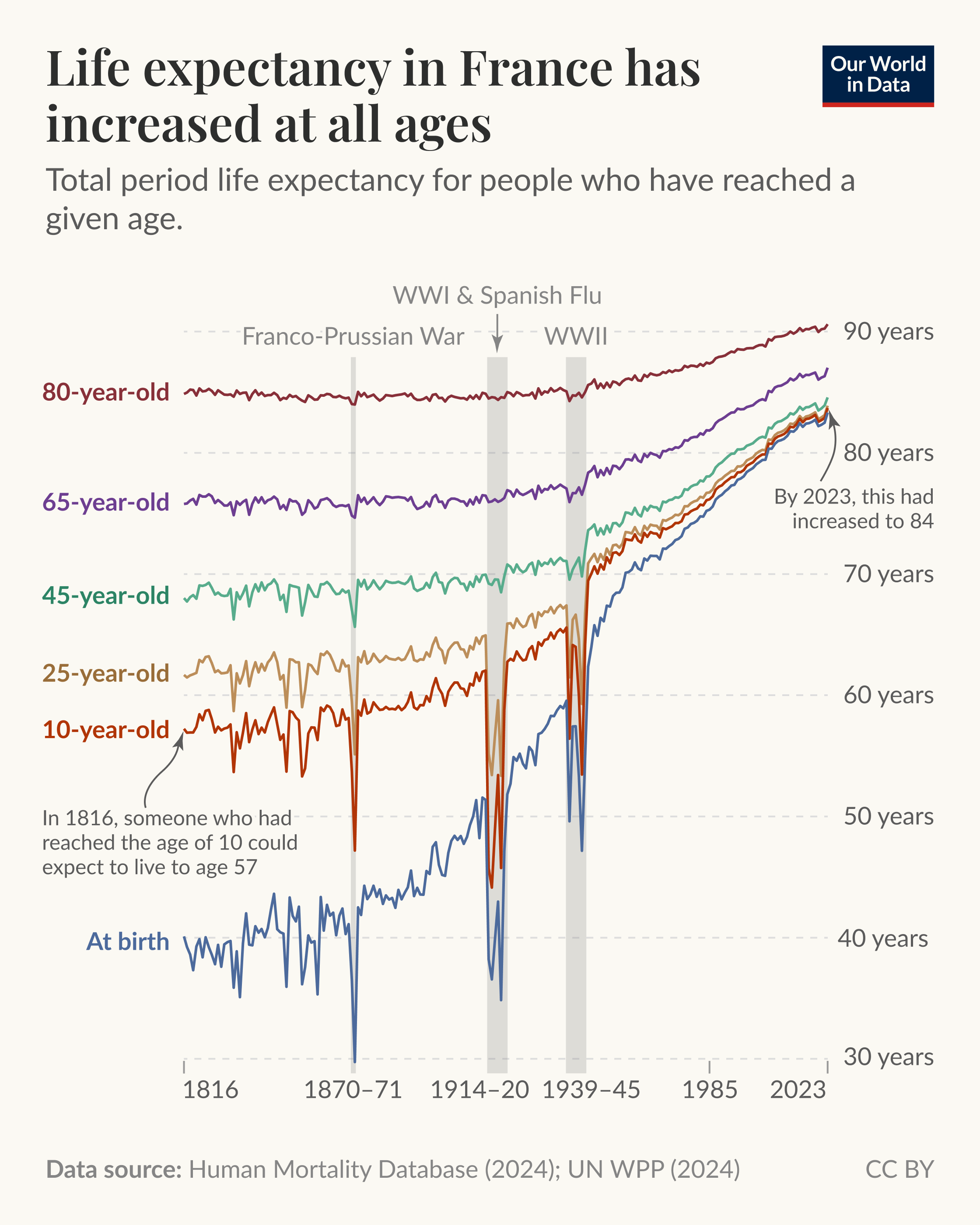
It’s a common misconception that life expectancy has increased only because fewer children die. Historical mortality records show that adults today also live much longer than adults in the past.
It’s true that child mortality rates were much higher in the past, and their decline has greatly improved overall life expectancy. But in recent decades, improvements in survival at older ages have been even more important.
The chart shows the period life expectancy in France for people of different ages. This measures how long someone at each of those ages would live, on average, if they experienced the death rates recorded in that year.
As you can see, life expectancy in France has risen at every age. In 1816, someone who had reached the age of 10 could expect to live to 57. By 2023, this had increased to 84.
For those aged 65, it rose from 76 in 1816 to 87 in 2023.
The data for many other countries shows the same. This remarkable shift is the result of advances in medicine, public health, and living standards.
Posted by ourworldindata
24 Comments
**Data sources:** [Human Mortality Database](https://www.mortality.org/Data/ZippedDataFiles) (2024); [UN World Population Prospects](https://population.un.org/wpp/downloads?folder=Standard%20Projections&group=Most%20used) (2024)
**Tools used:** OWID-Grapher with finishing in Figma
Is there any country where the general trend over the last 200 years has not been positive across all ages?
Why did the 45year graph instead of dip during the world war make a big leap after it?
Can someone explain why 10 year old lifespan goes down so much in WWI? They weren’t impacted by the front line shouldn’t they be similar to 40 year olds?
Long living human is not a good news all things considered.
Don’t forget the flue that started in Kansas and spread to europe through all the military bases the U.S.A had yes that is called spanish. You filthy pigs.
1st time seing this kind of graph, it’s very interesring, thanks
The Spanish Flu really F-up 25 year olds huh.
Thats a nice fucking chart. So easy to read.
Is this world based? Country based? Region based?
ETA: I’m an idiot that can’t read
This is a great graph, I love how you’ve split it by age group to show how mortality truly works.
Super interesting graph. There’s a tiny dip visible for covid too.
so someone who is 80 now will live to 90, but someone that is 65 will only live till 85?
why?
The UK has seen a decline in healthy life expectancy over the last decade: [https://www.theguardian.com/commentisfree/2026/mar/06/uk-death-healthy-life-expectancy-decline-state](https://www.theguardian.com/commentisfree/2026/mar/06/uk-death-healthy-life-expectancy-decline-state)
80-year-old French People are invincible; war and plague can barely make a dent.
Graphs like this should be the only proof beeded to stop war mongering. The leaders start them, and the young pay the price with their life.
80 year olds are like ‘what war?’.
And that, dear children, is the reason why conductors *seem* to have a longer life!
(Conductors for an orchestra start to become one earliest at an age of 35 years. Their life expectancirs are therefore higher then the average population as there are all ages included.)
In retrospect we really blew covid a bit out of proportion huh
My brain has trouble with the way these charts are “aligned”. For example, at the 1816 starting point, I understand that the “at birth” line tells us “a child born in 1816 would on average die at 40 in 1856”, but does the “10-year-old” line tell us (a) “of those same children born in 1816 from the blue line, those who make it to 1826 would on average die at 57 in 1873” or does it tell us (b) “of a completely different cohort of children born in 1806, those who have made it to 1816 would on average die at 57 in 18**6**3”?
Kinda surprised to see such a dramatic dip in 1870-71, I figured that war wouldn’t be anywhere near the WWI and WWII dips
I always use this data to explain that humans are _not_ getting continuously older. We are just not dying that early anymore 🙂
Am I reading this right? Does this mean that if you make it to 10 years old, on average you will survive till 80?
Really like the age breakouts. Actually the misconception, perhaps until VERY recently has been that everyone’s life expectancy has increased equally – so it’s good to be able to compare with this chart and see the differences in magnitude.
It’s great to see how the rate of improvement has changed in relation to various world events. Apparently peace time and medical advances made a huge difference after WWII, especially for older cohorts.