
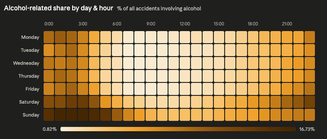
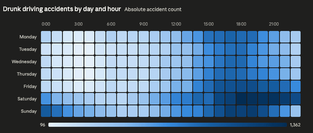
I took the exports of police accident database from https://sewik.pl/ , but as it was missing the drunk driving data, I scraped the official maps at https://obserwatoriumbrd.pl/mapa-wypadkow/ – these are data for 2018-2024. Loaded all into duckdb, and wrote a custom chatbot + map visualization tool (the chatbot can actually prepare/export data for this kind of heatmaps) – the only think is styling courtesy of Claude's chat (raw heatmap is plotly, nowhere as nice).
Quite interesting to see that the absolute vs relative number of accidents tells a slightly different story – weekend nights are by far the worst. And – to add some context – Polish police frequently do a "sober morning"-type alcohol tests, missing the point entirely.
Posted by mucherek
5 Comments
Interesting how the relative share spikes late night even midweek, but the absolute counts really blow up on weekend evenings. Feels like two different problems, habitual vs volume.
Curious if you checked variance by holidays too, I’ve seen those skew patterns a lot more than expected.
It’d be cool to visualize with the days starting in wed and the hours starting at 7am so that the weekend/night are not broken up and one could see the drunkness blob
Whoa, the dark background of the first two charts messes with my brain. I *know* that darker areas means higher values, but somehow in combination with the black background color my brain doesn’t want to read that. No such problem, though, with the white background.
Pretty, pretty, pretty nice job! Thanks for sharing
Somebody should print this on textile and make something out of it and sell it and proceeds would go to victims of drunk drivers… the color scheme looks very cool but once u know whats behind it