
![[OC] GDP of the USA (1790-2025), With Forecast to 2050](https://www.byteseu.com/wp-content/uploads/2026/04/mgd3hqaig0vg1-1536x828.png "[OC] GDP of the USA (1790-2025), With Forecast to 2050")
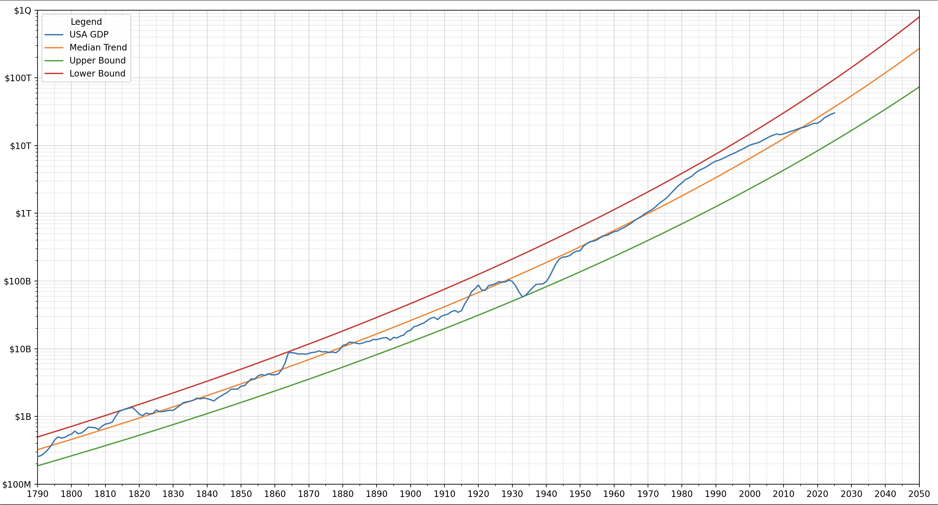
This chart shows the Gross Domestic Product (GDP) of the United States of America from 1790 to 2025, with a forecast to the year 2050. The median trend line is generated by performing a Q50 quantile regression on the BoxCox-transformed GDP data, and then inverse-BoxCox-transforming the results. The upper and lower bounds are based on the highest and lowest residuals (note these lines are mislabelled in the graph – the lower bound line should be labelled the upper bound line and vice versa). Python, Numpy, Scipy, Statsmodels, Matplotlib, and FRED API were used for data analysis and charting.
Data sources:
Pre-1930 GDP data: CBO – Historical Data on Federal Debt Held by the Public
1930 and later GDP data: FRED – FYGDP
Posted by Interesting-Cow-1652
10 Comments
Why is the lower bound trend line above the higher bound?
You should rerun this model in some years (maybe 5) and show us the original today’s trend line
How accurate can an upper bound be at predicting the future if the only data points that set it are from over 150 years ago?
So in 2050 it will be somewhere between $70 trillion and $700 trillion
I suspect the GDP will begin to plateau for the US. You cannot have infinite growth with a declining population and weakening economy.
How is a mislabeled excel chart created from a simple easily accessible dataset beautiful?
exponential processes are the shortest-lived ones
This data is not beautiful, because it is nominal dollars, not inflation adjusted dollars
The US economy is larger than in the 1980s, but it is not 6x larger, only about 2x in real terms
Now do it in real terms please…
It’s crazy how the 2008 financial crisis was a bloodbath but is only a little blip in the grand scheme of things.