
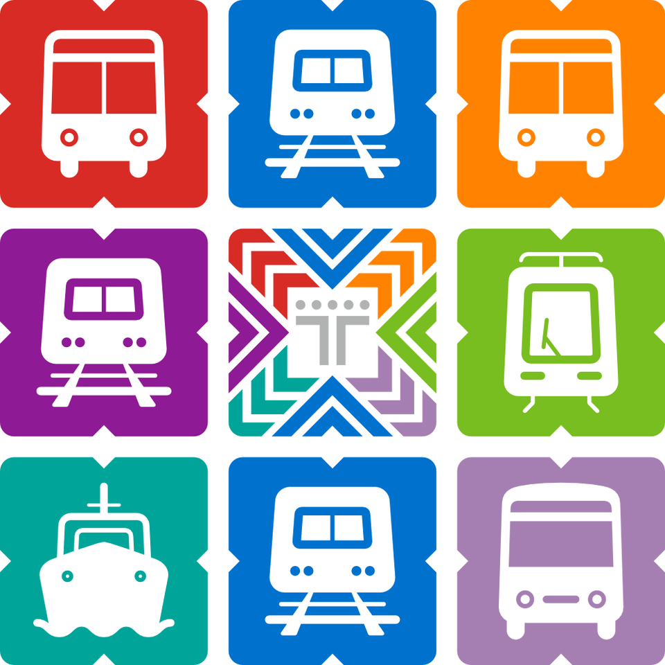


As an funemployment project, I recreated the visual identity of Transport Victoria as if it was Mexico City's Integrated Mobility (Mobilidad Integrada). See all the pictograms and more on my website: https://www.victorcrespo.xyz/stuff/2026-04-17-ptv-mexico-city-style
Posted by viktorepo
11 Comments
What’s the Balaclava logo?
Sorry man, but it’s a no from me. Ugly and bad design. Horrible typeface, ugly icons. Flinders Street looks like the Taj Mahal.
This is sick! I thought the Mexico City pictograms were such a great idea for allowing the (presumably, don’t @ me) relatively large proportion of the population with lower literacy to easily navigate. Your icons are awesome, well done 🙂
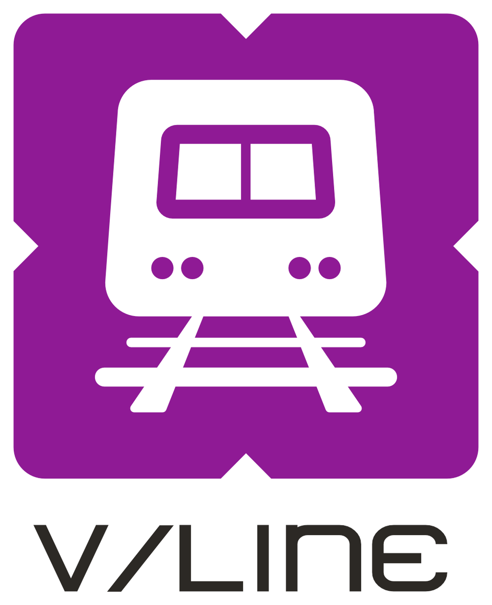
Good effort but I am not sure why you have two metro and two buses and I am not sure if the below right is a minibus. Being Transport Vic, i think you should have integrated a bicycle and car into it as well.
What program did you use?
It’s a cool look!
I would say that my biggest issue would probably be the font that you’ve chosen; it’s certainly distinctive, but it’s got very poor readability, and in particular for a public transport service you’d want a font that’s highly readable from as distant as possible.
much better than the current designs. clear and direct design with colour separation
why does the seagull have a thumbnail?
Cool! But kinda ambiguous whether the colour scheme designated type of transport or individual lines or stops?
I’m a big fan of this. Awesome concept.
I have the CDMX card! I love it 🥹