
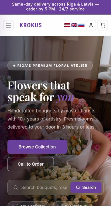
I’ve been looking at different Latvian e-commerce shops lately and noticed Krokus.lv. They have amazing flowers, but the mobile site feels a bit clunky and outdated when you try to order on a phone.
I spent the last few days hand-coding a completely new, modern mobile concept for them from scratch to see if the user experience could be improved. You can see the full interactive flow, the stem count selection grid, and the checkout loop in the video.
(Just to be clear: I don’t work for them, this was just an independent project for my portfolio and practice).
Even if you have never used their website before, you can still check out the video and give me your honest feedback. I will be very grateful!
Which style do you honestly prefer using? The current live website or this modern layout flow?
https://v.redd.it/3za7x6evft2h1
Posted by AssignmentEven8258