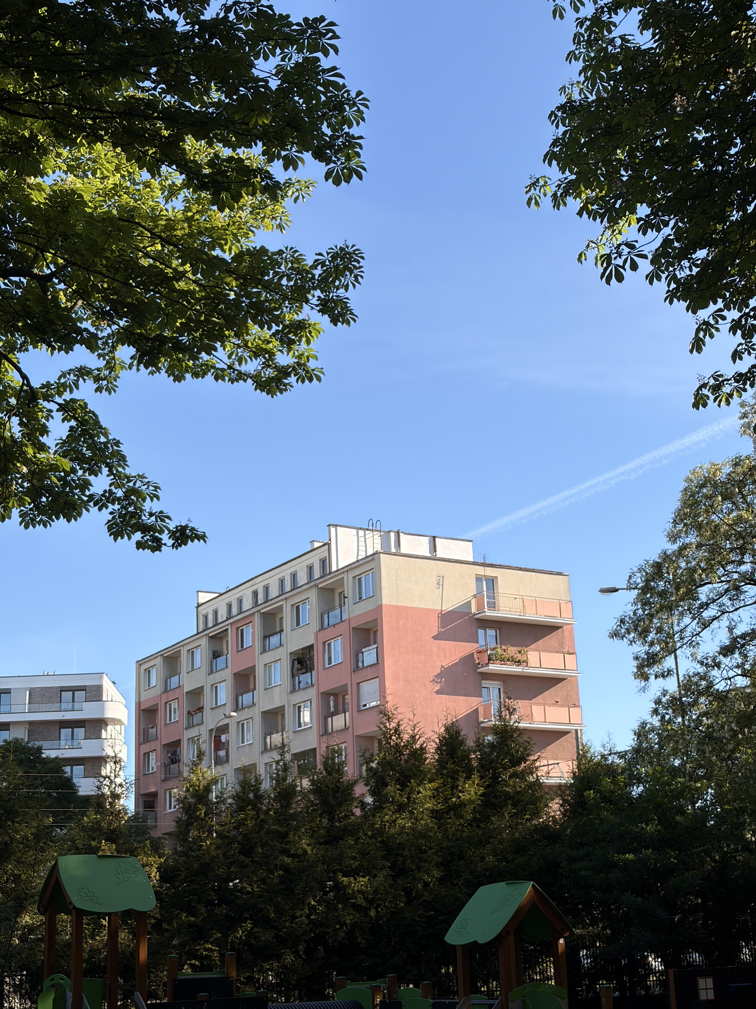
It may be old style but this building is much more colorful and full of life than newer buildings where they only use black and grey colors.
https://i.redd.it/opkpf6fw0b3h1.jpeg
Posted by PhalanxGaius

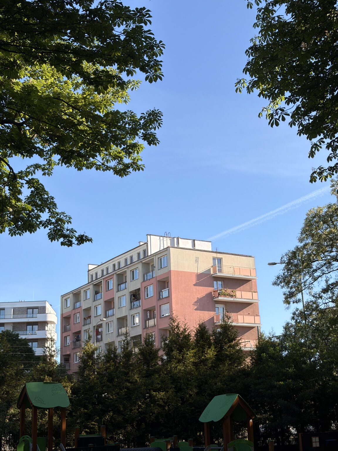
It may be old style but this building is much more colorful and full of life than newer buildings where they only use black and grey colors.
https://i.redd.it/opkpf6fw0b3h1.jpeg
Posted by PhalanxGaius
10 Comments
Those pesky communists! They wanted to make people happy instead of depressing them with architecture. /s
Its fugly and it would look just fine if it was painted white. All the soviet buildings should be painted white with black or white balconies. Fuck this “we’re a poor post soviet country so it’s our duty to put the ugliest pastel color shades that exist on our buildings, so noone gets confused where they are” scheme. Czechs, Slovaks and Ukrainans have the same “style” on their architecture. You can bring color to the mix by planting trees and flowers all over the place.
Whaaat? Ugly. Colours of vomit. Zero style and taste
I’m from the US and I personally love Poland’s Soviet era buildings. Not because I actually like the style, they’re a little kitschy, but they have a life to them that we’re afraid of in the US. Everything in my country has to be grey or black and white because it serves the tastes of the least common denominator and is designed to be as inoffensive as possible. Enough of that and you begin to live in a grey wasteland where nothing stands out. In Poland, the buildings are brave enough to offend my sensibilities or someone else’s sensibilities and, in a weird kinda way, a world that is designed for itself and its creators and not pander to everyone at once is the preferable world.
This building was the color of wet cement when it was finished. Renovations and painting them in different patterns and colors started maybe 20 years ago, so depends how “old style” you want to go, 70-80s were grey.
Mamy Polish peeps, myself in that number, absolutely hate this. It has a name: pasteloza (pastelosis) and it was a 90s knee jerk reaction after the dull gray times of communism. Suddenly colours were available, unfortunately selection and layout was typically done by random office workers or technical staff or cheapest-first. You ended up with minty vomit colour on top of toxic green vomit with a dash of whatever was left in the store, painted in whatever pattern made you look away quickest. And while it sounds fun to visit and poke fun at, it is pretty bad to live in. Calm colors, rhythm and harmony improve wellbeing – meanwhile both lead gray graveyards and random loud patterns make people unhappy in the long run.
The best thing we are learning now is that there need to be reasonable colours and trees everywhere. Still have a long way to go in terms of density and city planning, tho
Pastelosis is ugly af. Almost as ugly as gray. Almost. But much less depressing… so I’d stay with ugly but not causing me to think about cutting my own veins.
Unironically the buildings that have the most soul in the country despite being made only of concrete, rebar, and depression.
I dig these colourful buildings. I know they’re not well liked but it could be way worse. At least they resist the passing of time.
It breaks my balls when Poland is in its Gold Age, and Poles drag it down. What the fuck