

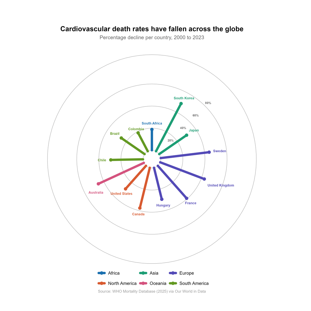
Chart 1 – Radial Spoke Chart
-
What is the main message you took away from this chart?
-
Was anything confusing, misleading, or hard to read?
-
Overall, how would you rate the difficulty of reading this chart? (1 = Very difficult, 7 = Very easy)
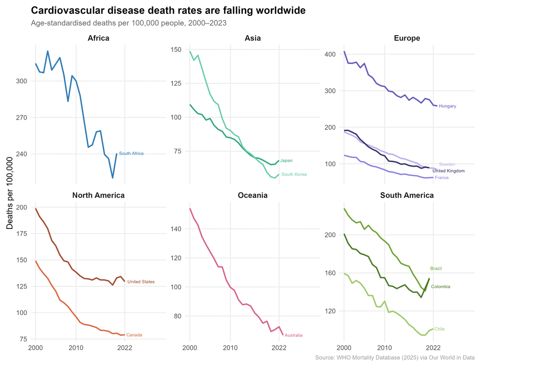
Chart 2 – Small multiples line chart
-
What is the main message you took away from this chart?
-
Was anything confusing, misleading, or hard to read?
-
Overall, how would you rate the difficulty of reading this chart? (1 = Very difficult, 7 = Very easy)
Posted by ha1ls
8 Comments
1) radial should be in order right?
Crazy how low death rates are where there’s universal healthcare
Clear to me. I like how taken together, the graphs show both relative and absolute decreases.
I’m actually quite surprised at the data. I wouldn’t have expected the last 20 years to be this dramatic.
Chart 1:
1. It is hard to take any message from the chart, I had to trust the title.
2. Radial spokes suggest absolute quantities, not a change in quantity. This is hard to interpret, especially since information is missing, specifically the start and end values. Also, if interpreting as a change the spokes radiating outward suggest that something is increasing rather than decreasing.
3. I rate this a 2, pretty difficult to read.
Chart 2:
1. Message is clear that cardiovascular death rates have been trending down in the regions shown, although there is a suggestion that the trends may be ending or leveling off in some cases.
2. The only confusing/misleading part is the difference in scales on the vertical axis of each chart. Also it would be helpful to add the percent decrease to the labels at the right end of each plot.
3. I rate this a 6, pretty easy, not a 7 due to the problems identified.
Radial spoke seems wildly inappropriate for this data. My main takeaway from that chart is that the person who made it is either a moron, or trying to fleece their audience with an uninterpretable mess.
Line charts seem quite clear, the interpretation matches the title and is instantly recognizable, leading easily to looking for second order pieces of information like e.g. the variation within a region such as Hungary vs the other European countries.
Apologies for formatting, mobile is a pain.
1.1) South Korea death rates are falling the most and South Africa and Colombia the least, out of the countries presented.
1.2) Due to the order of the spokes, South Korea looks like an outlier, or that it is notably higher than everyone else. It’s hard to tell if it’s actually much higher than Australia because of their location. I imagine this would be much easier to read if ordered by size across all spokes. The chart type is also generally unintuitive for the data it is presenting. It took me longer than it should to figure out what I was actually looking at, and I’m still not certain that’s actually what I’m being told, or what those (barely visible) percentages mean.
1.3) 2.
2.1) Death rates in all countries presented are falling overall. South Africa’s death rate is particularly uneven, which could be interesting to understand further. Hungary has a particularly high death rate compared to the other European countries presented. In general, there is far more potentially useful information in here that could highlight areas to investigate further.
2.2) The axes of each chart not being consistent makes it much harder to compare the data across continents. The steepness of the curves for Australia and South Korea make it look like the death rate is falling more rapidly than other countries, but in practice the min and max data values are just closer together than on other charts. It’s also hard to quickly see that these countries have a much lower death rate, again because of the difference in axis scales.
2.3) 5.
Interestingly, I instinctively assumed your 1 to 7 rating would have 1 at very easy and 7 at very difficult. I had to re-read and update, and that is on me for not following the text well enough, but I do wonder if others might expect the same – it just feels wrong to me to have it the other way around.
Some other thoughts:
I note that you have colour-coded and grouped by continent. On the first chart especially I was somewhat blind to this – I instinctively wanted to compare all countries and not really care which continent they’re in, hence preferring it to be ordered by size overall. I’m only just now noticing that it is actually ordered by size within continent. Maybe there’s some intent to compare within continent, and that’s certainly easier in this presentation than looking across the world, especially on chart 2. If that is the intent then the titles should reflect that (e.g. “by continent” since it just refers to the whole world), and it may be interesting or helpful to see a continent average presented (at least on chart 2) as well. Also interesting that your language for the world changes between titles – “across the globe” vs “worldwide”. Consistency is key.
Another thing I would be questioning if looking at these in a formal setting is how the given countries were selected. Why only South Africa in Africa? Why those specific European countries? And so on for the other continents.
I appreciate this may seem harsh, but hopefully it’s also constructive. I just want to see people use data well to tell meaningful stories, and it’s not always as easy as it seems.
The first chart is one of the worst data visualizations I’ve ever seen.
Radial charts should be reserved for use with cyclical data.