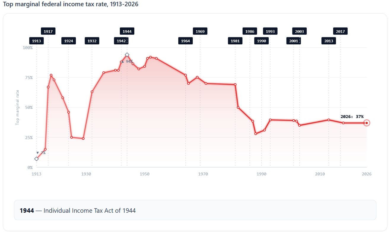
[OC] U.S. top marginal federal income tax rate, 1913-2026 — peaked at 94% during WWII
Posted by jfk2127

![[OC] U.S. top marginal federal income tax rate, 1913-2026 — peaked at 94% during WWII](https://www.byteseu.com/wp-content/uploads/2026/06/khaqgexidw4h1-1024x616.png "[OC] U.S. top marginal federal income tax rate, 1913-2026 — peaked at 94% during WWII")
[OC] U.S. top marginal federal income tax rate, 1913-2026 — peaked at 94% during WWII
Posted by jfk2127
8 Comments
**Sources:** IRS Statistics of Income historical tables, Tax Foundation, Joint Committee on Taxation legislative history.
Tool: SVG rendered client-side from a static JSON dataset.
Each data point is the top marginal federal income tax rate for the year: the rate paid on the highest dollar of income in the highest bracket. Not the average rate or the effective rate.
Event markers at the top of the chart mark major tax acts:
* Revenue Act of 1913
* WWI expansions
* WWII peak in 1944-45
* Kennedy-Johnson cuts of 1964
* ERTA in 1981 and TRA86 in 1986 under Reagan
* Bush cuts of 2001 and 2003
* ATRA in 2013
* TCJA in 2017
One thing that doesn’t fit on the chart but is worth knowing: the 94% top rate during WWII applied to income above approximately $200,000 of the day, which is around $3.5M in 2026 dollars. Essentially nobody actually paid 94%. The bracket structure tells you a lot about how the country chose to fund the war, but not much about what typical filers experienced.
Full write-up with descriptions of each major tax act, year-by-year data table, and methodology: https://pennycalc.com/tax-brackets/history/
please not this post again
[https://daughternumberthree.blogspot.com/2020/01/graphing-reagan.html](https://daughternumberthree.blogspot.com/2020/01/graphing-reagan.html)
Should put a Reagan face on it.
Ah, Reagan. Is there anything he didn’t fuck up?
but for labour, right? Wealthy people never had to pay that much on their income from_other_ people’s work, right? Capital gain tax was never even close
What was the average effective tax rate for millionaires back then, though?
I feel like a line graph isn’t the best way to display this information. With a line graph, it looks like the tax rate is changing between data points, rather than just being the tax rate of the most recently data point.
Maybe a bar graph could work better.
For reference, the period between 1945 and 1973 when taxes were highest on the billionaires of the time is known as [The Golden Age Of Capitalism](https://en.wikipedia.org/wiki/Post%E2%80%93World_War_II_economic_expansion).
When Republicans try to tell you that *taxing the wealthy leads to economic failure*, remind them of this.