

Hi everyone,
I'm working on a map poster feature and I'm looking for inspiration and honest feedback from people who enjoy maps.
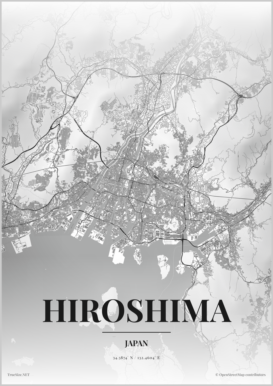
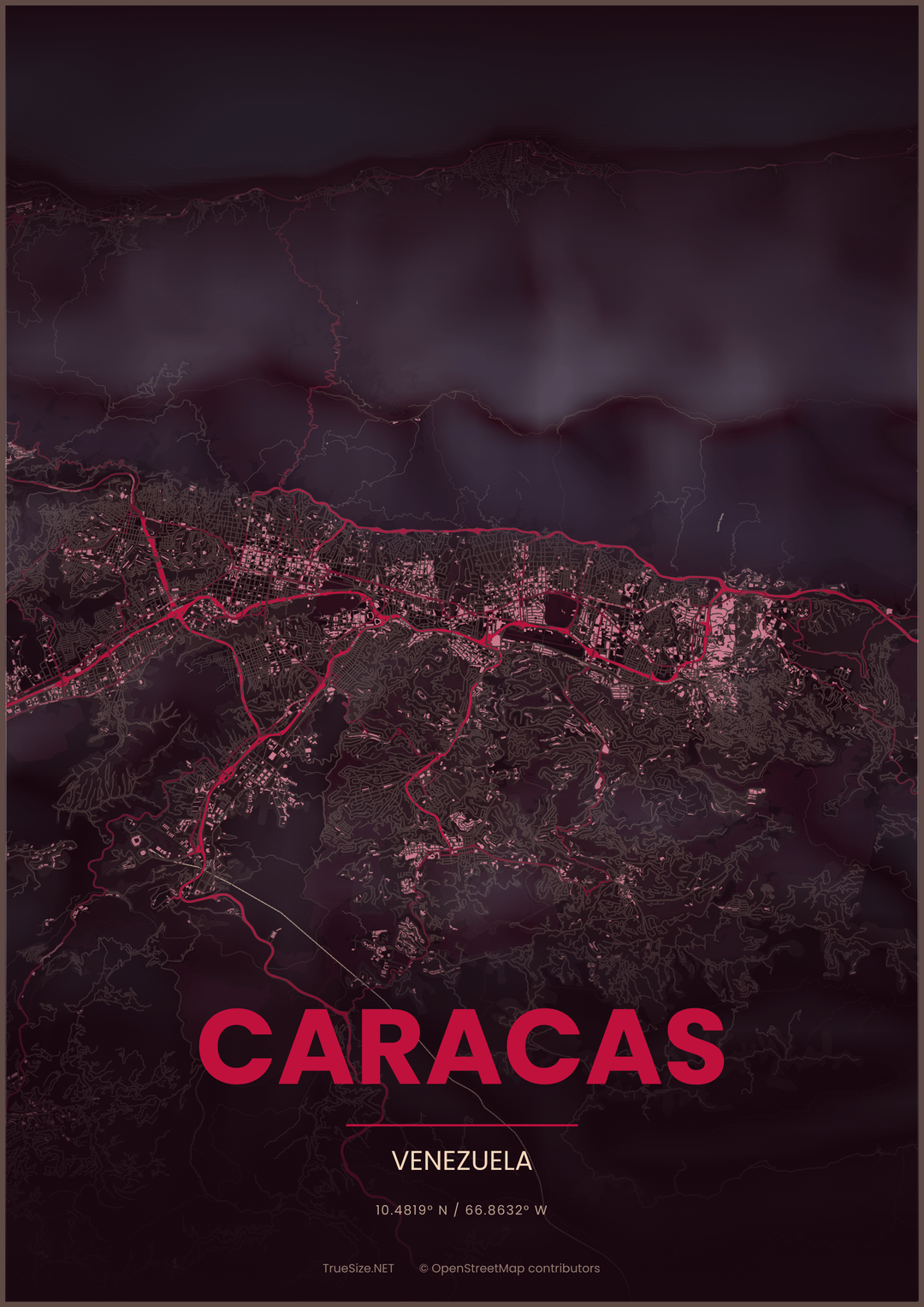
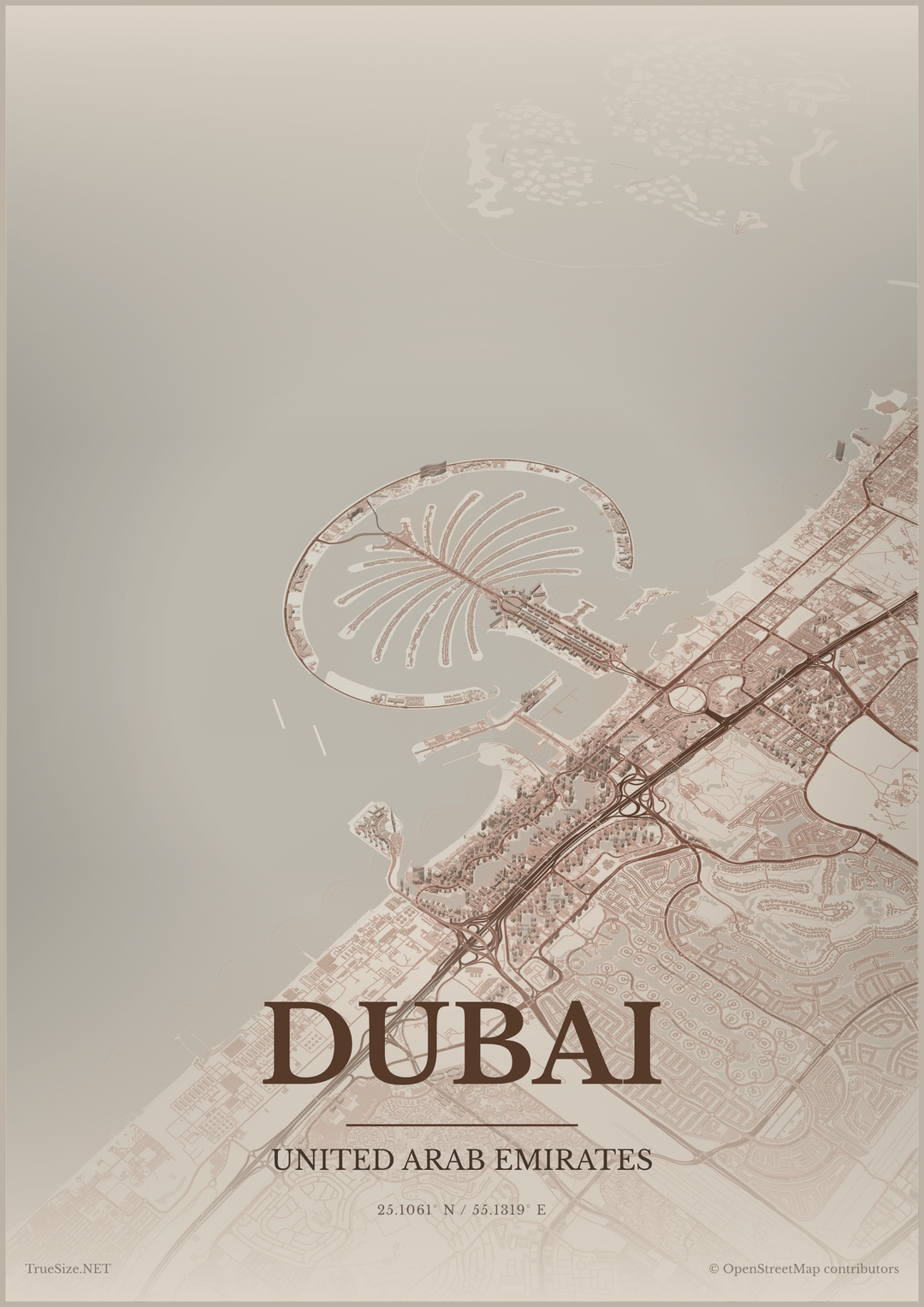
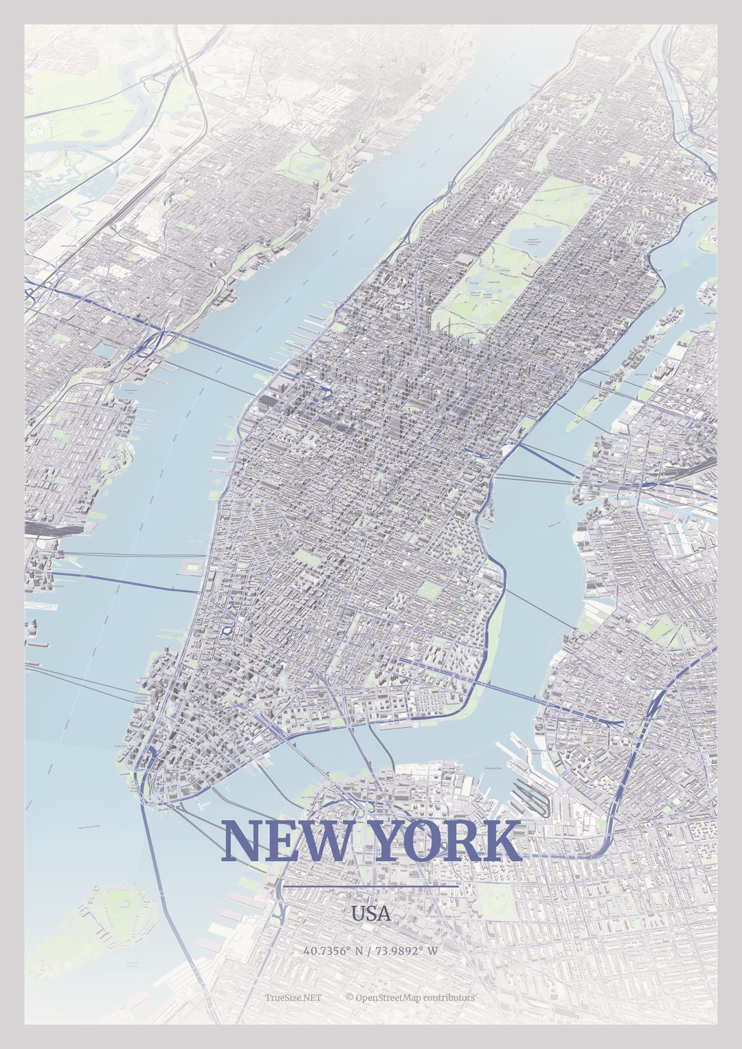
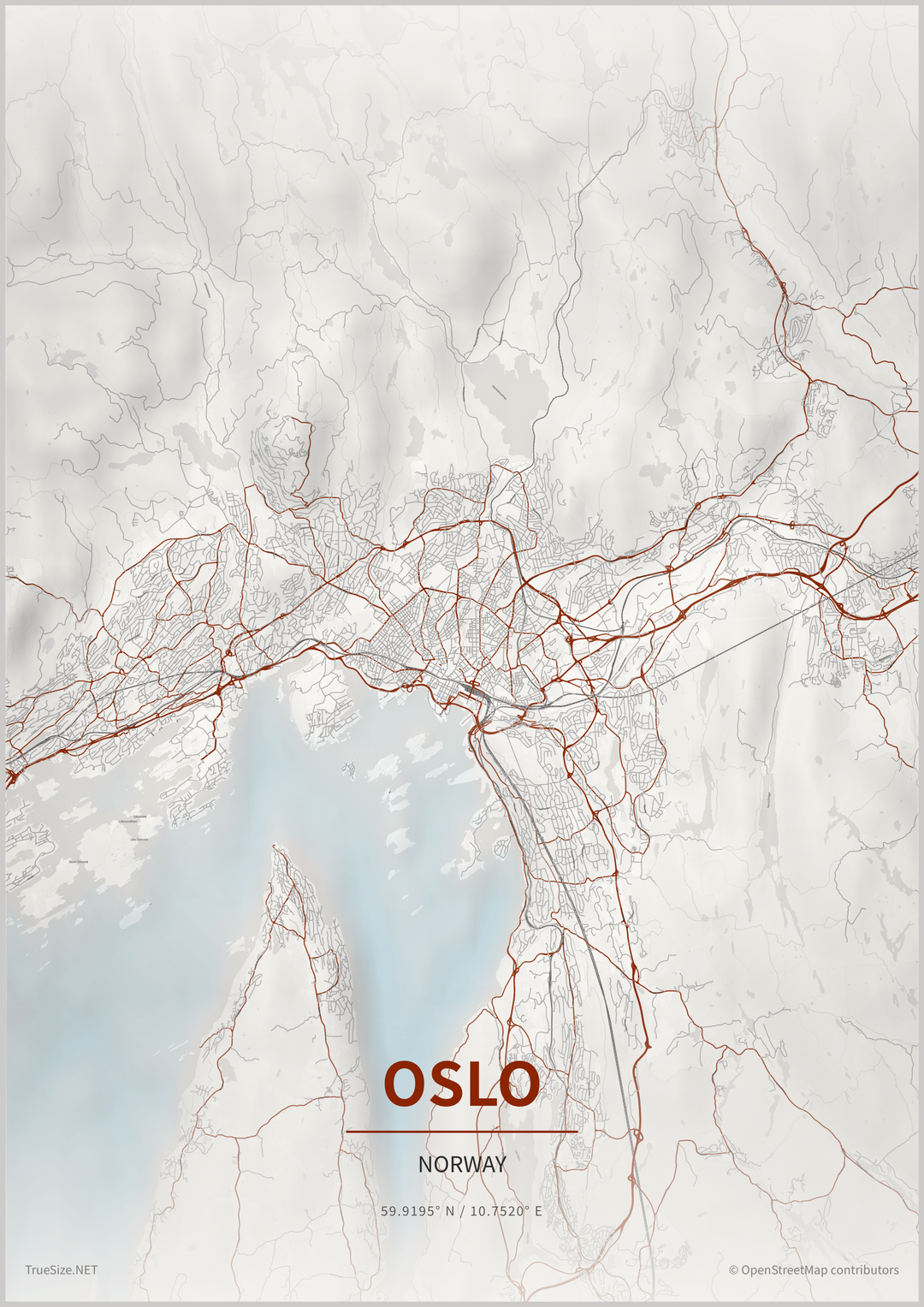
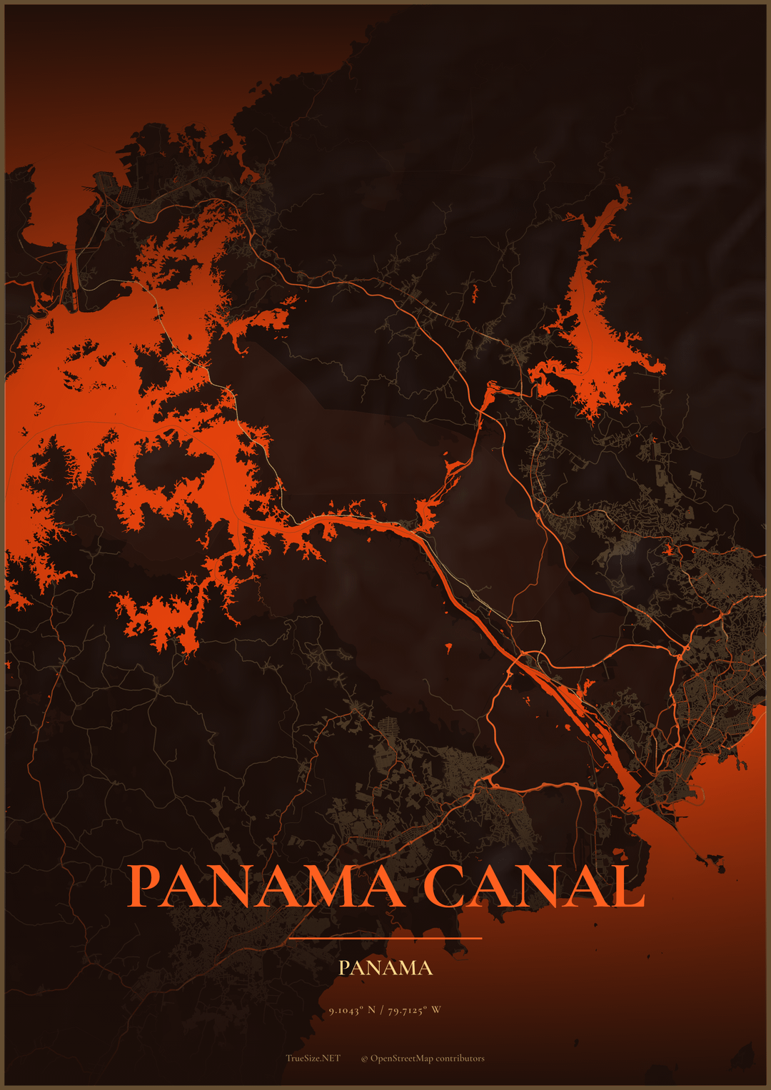
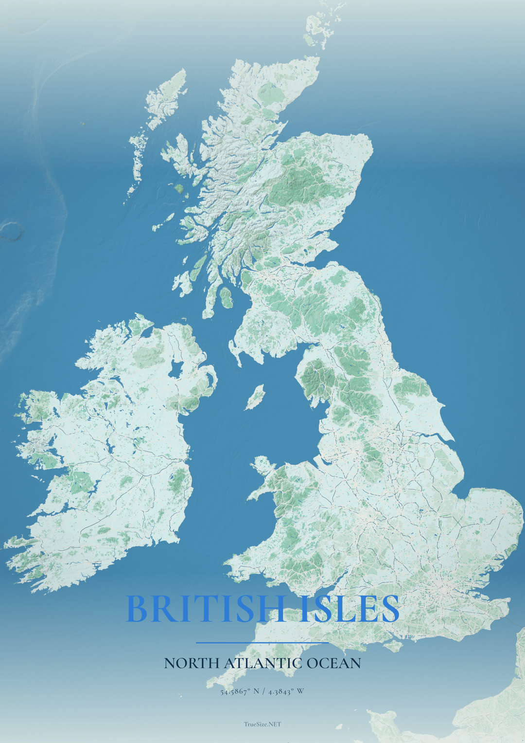
I've attached a few examples I've created so far with my tool. My goal is to make posters that look visually appealing rather than just being screenshots of maps, but I feel like there are still many styles and layouts I haven't explored.
Some questions I'd love feedback on:
- Which of these posters looks the most appealing?
- What styles or design elements are missing?
- Are there any map poster examples you've seen elsewhere that you particularly like?
- What customization options would you expect from a tool like this?
I'm interested in both cartographic and graphic design perspectives. Any ideas, examples, or criticism are welcome. Thanks!
Posted by No-Property-6778
33 Comments
Not a style issue, but as an outer borough pedant you have more New Jersey than you do Brooklyn. And the Bronx and SI are completely missing.
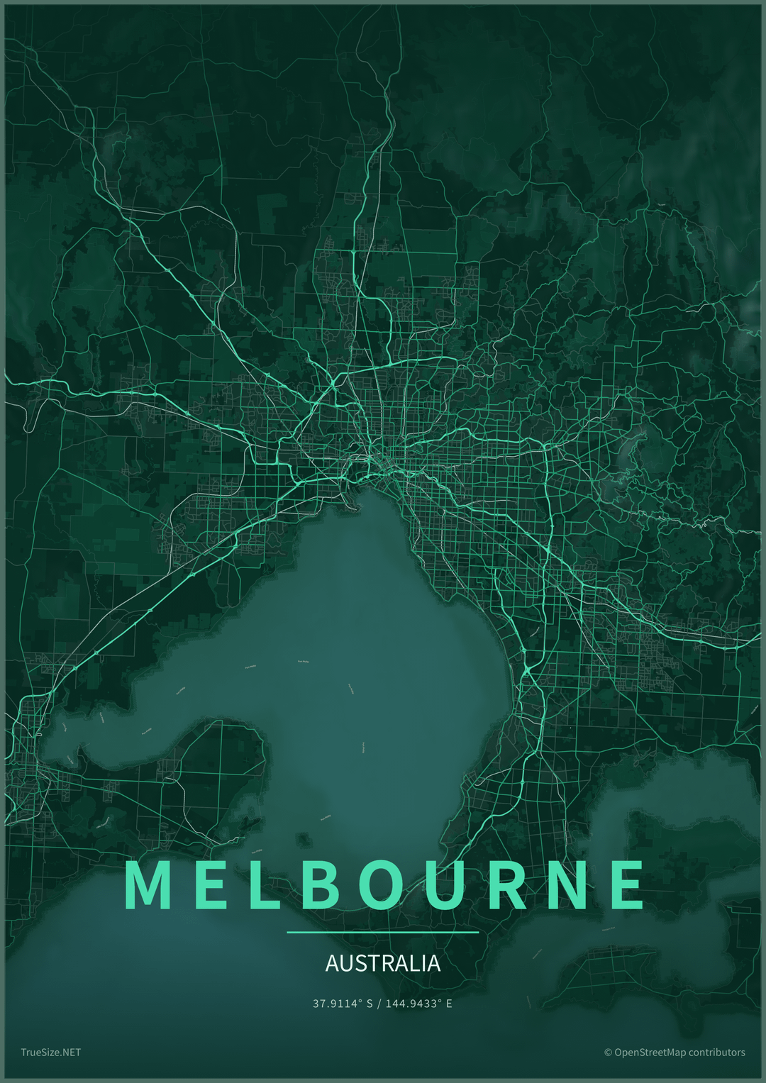
The Melbourne one looks like a screenshot from a sci-fi movie from the 2000s.
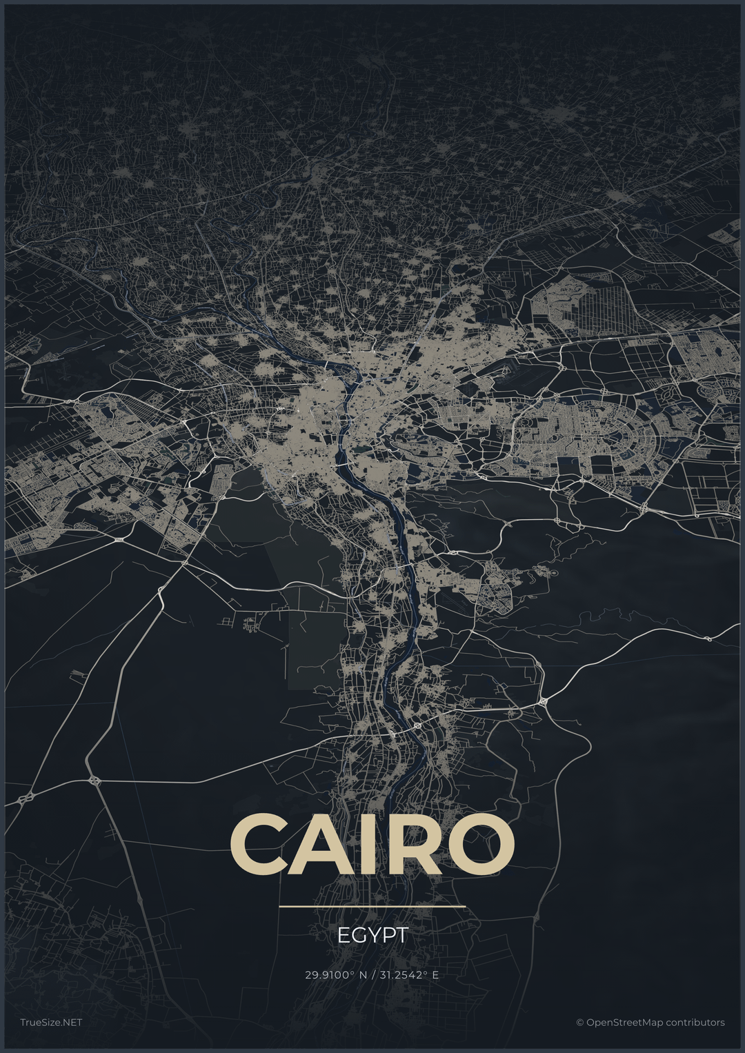
And I’m sorry, I hate to be saying this, but I didn’t like any of them. The least bad one was Cairo.
I can’t quite explain why I didn’t like them, but I didn’t.
Try Chicago
I like maps because they communicate informations visually.
Althought your posters definetly have an esthetic element, they don’t convey any useable information.
These look vaguely threatening. I’m sorry I don’t have more constructive criticism.
Melbourne and Panama 🔥🔥🔥
I think the color choices might need to be more deliberate.
Panaman Canal looks like a drone view of a lava lake, Melbourne looks like a Fallout screenshot, Caracas looks like a horror movie poster.
The Melbourne one is giving off some major fallout game series vibes.
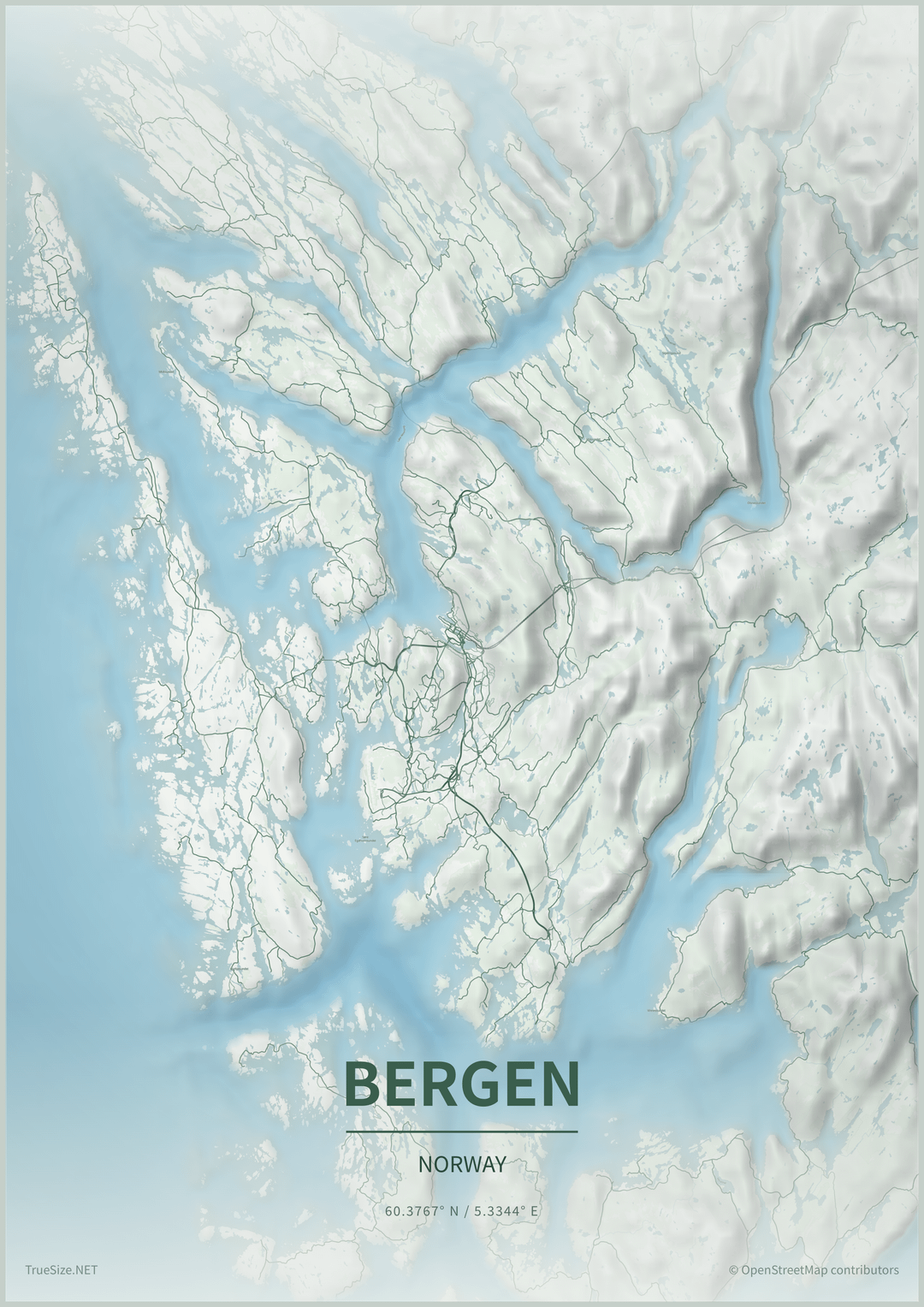
The Bergen one works because it highlights the physical geography which is pretty unique.
The Melbourne one almost works because at least it informs you that the city has a large natural harbour.
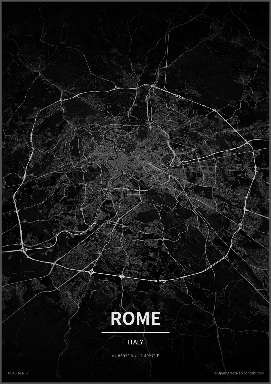
But all the Rome one tells me is that it is a city with a lot of roads (true of pretty well all cities?).
And the Cairo one is seriously offputting – it just looks congested and dirty.
Graphically, they are all interesting combinations of mass, detail colour and tone but surely a poster should to some extent advertise the destination and none of these do that.
Madison, WI. One city between 4 lakes.
I’m surprised how accurate the Cairo is, I can even recognize my street
LOVE Melbourne’s, I’d commission you for a map of my own city in that style if I could
I like the Cairo map. It’s a fascinating sprawl into the distance.
It’s useful
As a child I had a poster of every single river and lake in my city , I absolutely loved it. Have seen some maps of countries as defined by their watersheds and those are right cool aswell.
Honestly they all look like AI slop and have no visual appeal whatsoever.
Cairo is insane…
Dubai look not good this way…
Don’t use boring layout
I like the Rome one ☝️ and I am a bit stoned so I cant explain why its my favorite
Ugh showing only roads is really depressing
For instance the Rome one, the focus is really put on the ring highway. Idk but I’m pretty sure Rome has better things to offer than a highway. My point is that the core energy of the city that I seek, is usually completely opposite to road
This but highlight the F1 track
British isles is my city
These feel like Netflix political thrillers
No Winnipeg?
I like Bergen and Melbourne. They show what the earth is like there. I’m not a fan of Rome just showing roads. And I agree with others that the colours make a huge difference – Caracas looks pretty threatening in the red light. So it depends what you’re trying to depict
I love all of these except Bergen. You have hit a really well matching style. I image you mean these to be more art than cartography; which is a big business in my opinion. I have bought several such maps as gifts in the past. My advice is don’t try to guess the taste, just provide 10 or so options for people to choose.
There are some cool spots in Alaska that are coastal, topographical wonders
Get a Jason Melbourne one
Yesterday i saw huge geographical, highly detailed map of the recent region printed on canvas.
I think I will order that for me too.
I don’t mean this to be mean but these feel kind of cheap? to me. They remind me of a graphic that would be on a video game loading screen or info cards for a game like Pandemic.
I think it mostly depends on what the customer is looking for.
Personnaly I love a good map that communicate information just by design, but for poster I think many people would like a more artistic approach, my fav here is most definitely the Panama canal, I love the contrast of color and maybe you should experiment more with it :3
Manhattan was the only one I liked. Leaving out Amsterdam is a crime though
Currently living in Melbourne, and your map looks fantastic
Next do London and Sydney