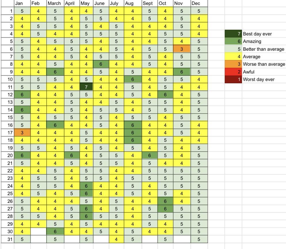
[OC] I tracked how I felt every day in 2024. Very thankful to only have had 2 “bad” days this year 🙏🏻
Posted by zrelish

[OC] I tracked how I felt every day in 2024. Very thankful to only have had 2 “bad” days this year 🙏🏻
Posted by zrelish
20 Comments
What happened on May 11 tho
How does one get this happy?
Tell us the story!
Need some context behind the numbers
You’re “better than average” color reads grey to me and, I can’t explain it, but grey is super average.
Glad you had a pretty good year though!
What happened on January 17th, May 11th, and November 6th? If you don’t mind us asking.
Question: Do you feel keeping track has had an impact on your general wellbeing?
What in the world are you doing to be so happy?
Ah yes the classic Reddit 7 point scale. 5/7 as “better than average” is perfect
Referencing this famous reddit thread for anyone unaware: https://www.reddit.com/r/OutOfTheLoop/s/azIfAzm4tk
You should probably adjust your average if you seem to feel better than average for a large chunk of the year
If it were me, this will be mostly red and orange with sprinkle of yellow. 😭
It looks like your average day is better than average. I think you might need to recalculate your average.
Was this an app or did you do this in excel? Would love to try this if it’s an iPhone app
Love the data.
Although technically it’s inaccurate. (Yes, I’m being annoying.)
But if you’re using the word “average”, then half the days should be above, and half should be below.
If only 1 out of 365 days was below average, then ‘average’ isn’t average at all.
3,4,5 should be something like:
5 Good
4 OK
3 Not very good
what is the actual calculated average of all these? it’s looking like your actual average day might be “better than average”
Today isn’t Monday
Bad use of colors, why wouldn’t average be gray? And better than average be slightly green
I literally cannot imagine having only 2 bad days even in a month lol. Good for you OP
I think, on average, you are happier than you think you are… or you typically expect your days to be worse
I think November 6 was a bad day for a lot of people.
It would be interesting to see if the avg is really 4.