- I used R's native Dataframe called "Titanic".
- I used R and the ggplot2, ggthemes and dplyr libraries
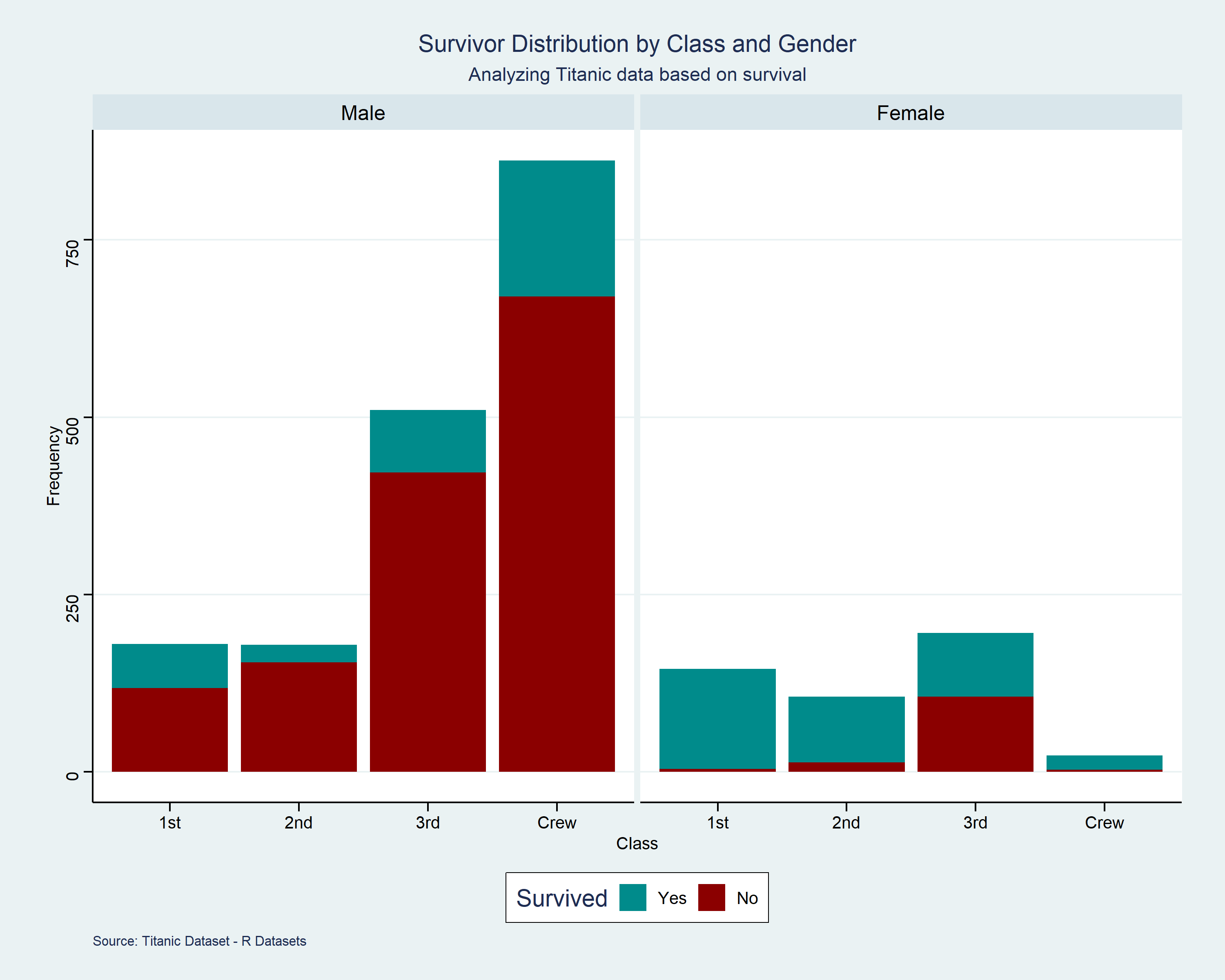
This is the improved version.
(I'm still learning how to use R xD)
Posted by runner_silver

![[OC] Titanic: Survivors and non-survivors by gender and class](https://www.byteseu.com/wp-content/uploads/2025/01/rz3amaad7tae1-1536x1229.png "[OC] Titanic: Survivors and non-survivors by gender and class")
This is the improved version.
(I'm still learning how to use R xD)
Posted by runner_silver
17 Comments
[removed]
Kinda crazy how many more males were on that boat and Jack was one of the lucky ones who found a woman
Wow, that’s a shit ton of crew
The women in first class took all the floating doors..
It’s weird that this is used as an intro dataset on Kaggle, because each improvement you make on a model is so marginal (and because small numbers, might take you backwards). After all that effort, you realising coding “Everyone died” is basically good enough.
Or you use a lookup table, which is of course the right approach for a small dataset with known answers.
Were most of the male survivors were under the age of 18? Women and children first.
Also, I read that this skew happened because the life boats happened to be closest to the first class cabins. So when everyone got in line, anyone walking from first class was naturally at the front of it. Which I suppose is a systemic issue, though the ship designer probably only saw it in practical or aesthetic terms since he presumed they’d never get used anyway.
And the gate scene from “Titanic” is inaccurate. The only partitions on the ship were knee-high, more of a suggestion than a restraint. Any adult could walk over it. It’s just that by the time 3rd class did, the lifeboats were mostly launched.
Changing the number of people to percent of people would be way more informative.
[deleted]
It’d be interesting to see similar charts made of maritime disasters that happened more recently, for comparison
I’d like to see that chart with the survivors above the x-axis and the died in below the x-axis. The x-axis could be a wavy line. Above the line the women would be pink and the men in powder blue. Everyone below the x-axis is dark blue/grey. I’d have the men and women alternate: first class women to the far left, next the first class men, then second class women and so on to the right.
This data is simple enough and has graphics arts potential.
I find it odd that the 3rd class passengers were just supposed to die as the life boats were for the 1st class passengers.
All First class woman survived.
Remember that ladies. Marry up
Source: “Titanic”, R’s native dataframe.
Tools: R, Rstudio, ggplot2, dplyr and ggthemes
This is an interesting project for a person learning, however, it is far from beautiful.
I wish this wasn’t separate by gender and it was a percentage
Someone’s first R project 🙂
Without normalizing for the people onboars this is useless.