Our house is equipped with a basic solar hot water panel that feeds into the supply side of the water heater (which is mounted outside (which is not uncommon here))
It wasn’t terribly surprising to see when mapped out, just mildly interesting to me, and I’m glad the panels are doing their thing.
There is a lack of data on the amount of hot water used: it may be that less was used in the warm months.
the_original_Retro on
Canadian here. Our daily temp bell curve would be a sweet heck of a lot more bell-like. 🙂
Would be interesting to convert this into actual costs and see how long it would take to pay off your solar hot water system. How much is a kWh where you live?
This would be impractical in my city, the outside temps and lack of sun would just bleed all the heat away for much of the year. But we pay about 12 cents per kWh here so that’s 40 bucks a month for an average water heater, I’ll do 50 bucks because we are a family of four. Your graph looks like it’s around a 30% net savings, meaning it would save about $180 per year here.
cryptotope on
A good start with a small-but-interesting data set, but the data isn’t quite ‘beautiful’ yet. A few thoughts:
From a data-presentation standpoint:
* There’s no indication which curve is power usage and which is temperature. (I can *guess*, but the reader shouldn’t have to.)
* It’s probably worthwhile to specify whether you’re reporting temperatures in degrees Canada or degrees Freedom. (Again, I can *guess*, but the reader shouldn’t have to. And when you do, please make the effort to find the degree symbol.)
* Excel-default text labels that require the reader to tilt their head are usually a poor design choice.
* The month labels don’t need to all include the year, if you’re only showing one year’s data. (The categories could be something as simple and clean as J-F-M-A-M-J….)
* The y-axis on a line graph doesn’t have to start at zero; it’s up to you as a style choice.
Data content and context:
* Do you have access to hot water usage information, and how did it change from month to month? (Did someone in your household take more hot baths, or longer hot showers, or prefer to use warmer water, during the winter?)
* What was the setpoint for your hot water heater, and how did it compare to the ambient temperature?

![[OC] Effect of solar hot water panels on electric water heater usage](https://www.byteseu.com/wp-content/uploads/2025/01/2i6bmjdg55ee1-1536x1052.jpeg "[OC] Effect of solar hot water panels on electric water heater usage")
5 Comments
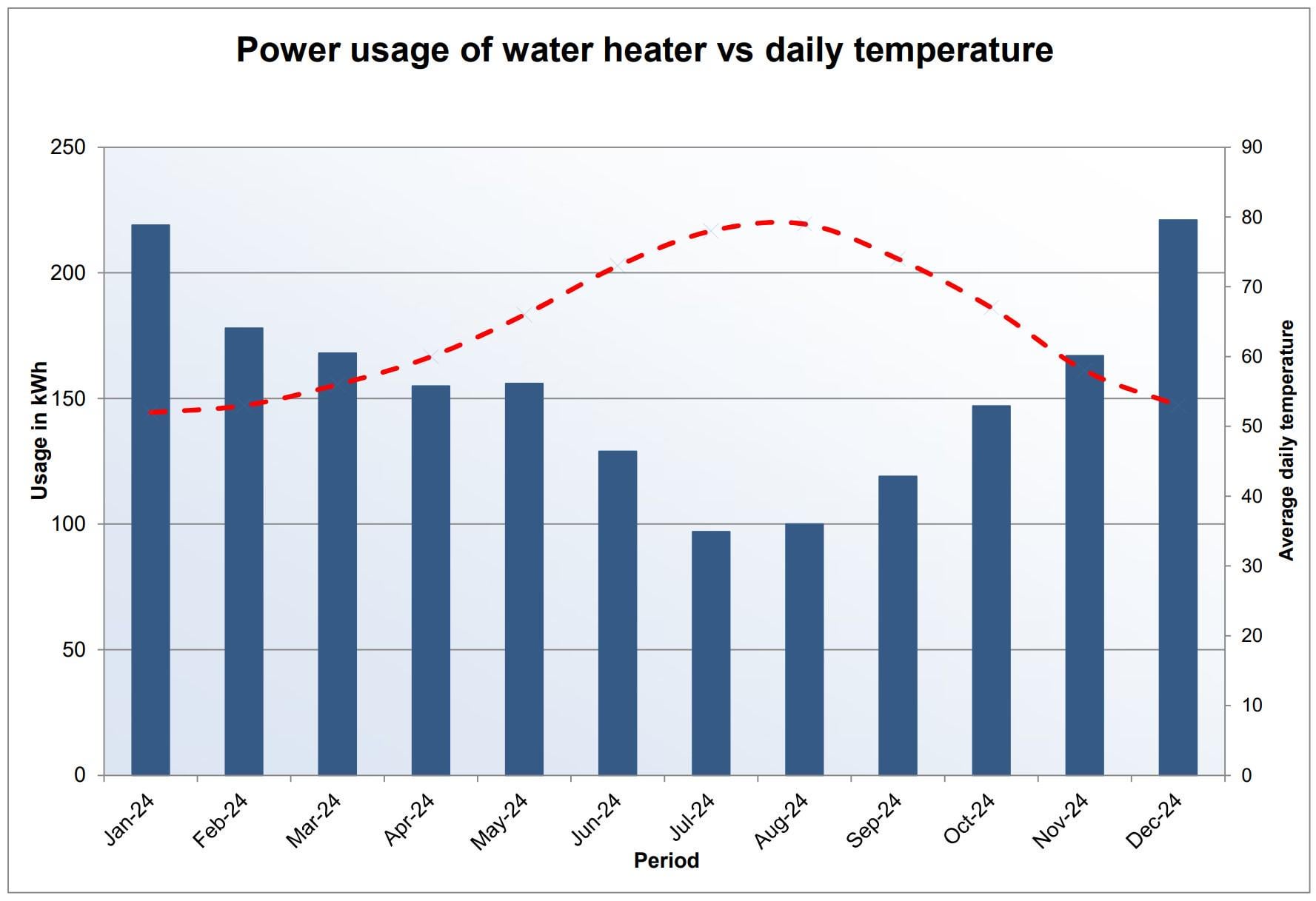
This data comes from the Meross smart plug app that our water heater here is plugged into here in Valencia Spain, with temperature data from [WeatherSpark](https://weatherspark.com/h/y/42614/2024/Historical-Weather-during-2024-in-Valencia-Spain#Figures-Temperature), charted in Excel.
Our house is equipped with a basic solar hot water panel that feeds into the supply side of the water heater (which is mounted outside (which is not uncommon here))
It wasn’t terribly surprising to see when mapped out, just mildly interesting to me, and I’m glad the panels are doing their thing.
More detail on the monthly usage (rounded):
Jan: 219 kWh
Feb: 178 kWh
Mar: 168 kWh
Apr: 155 kWh
May: 156 kWh
Jun: 129 kWh
Jul: 97 kWh
Aug: 100 kWh
Sep: 119 kWh
Oct: 147 kWh
Nov: 167 kWh
Dec: 221 kWh
Where’s the key to signify which is which?
There is a lack of data on the amount of hot water used: it may be that less was used in the warm months.
Canadian here. Our daily temp bell curve would be a sweet heck of a lot more bell-like. 🙂
Would be interesting to convert this into actual costs and see how long it would take to pay off your solar hot water system. How much is a kWh where you live?
This would be impractical in my city, the outside temps and lack of sun would just bleed all the heat away for much of the year. But we pay about 12 cents per kWh here so that’s 40 bucks a month for an average water heater, I’ll do 50 bucks because we are a family of four. Your graph looks like it’s around a 30% net savings, meaning it would save about $180 per year here.
A good start with a small-but-interesting data set, but the data isn’t quite ‘beautiful’ yet. A few thoughts:
From a data-presentation standpoint:
* There’s no indication which curve is power usage and which is temperature. (I can *guess*, but the reader shouldn’t have to.)
* It’s probably worthwhile to specify whether you’re reporting temperatures in degrees Canada or degrees Freedom. (Again, I can *guess*, but the reader shouldn’t have to. And when you do, please make the effort to find the degree symbol.)
* Excel-default text labels that require the reader to tilt their head are usually a poor design choice.
* The month labels don’t need to all include the year, if you’re only showing one year’s data. (The categories could be something as simple and clean as J-F-M-A-M-J….)
* The y-axis on a line graph doesn’t have to start at zero; it’s up to you as a style choice.
Data content and context:
* Do you have access to hot water usage information, and how did it change from month to month? (Did someone in your household take more hot baths, or longer hot showers, or prefer to use warmer water, during the winter?)
* What was the setpoint for your hot water heater, and how did it compare to the ambient temperature?