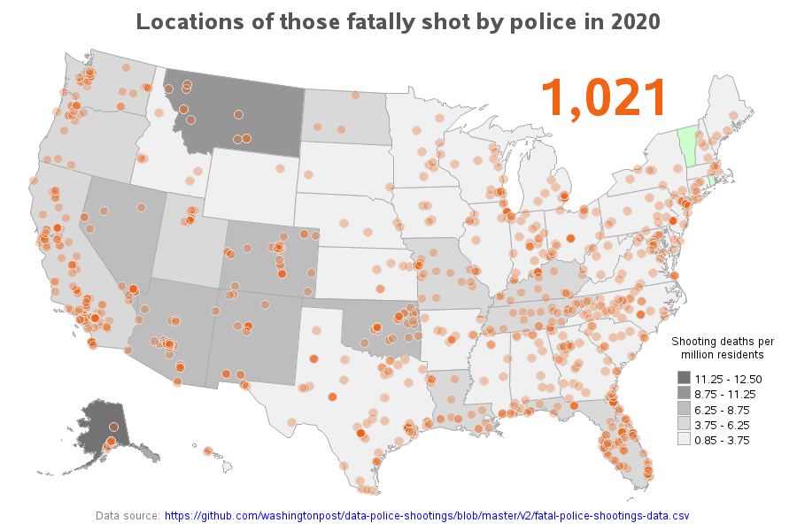
The original data is in text form, and I thought it might be interesting to see it plotted on a map (to look for geographical trends, etc). I plot an orange marker on the map at the location of each death (geocoded to the city centroid level). I use transparent orange markers, therefore if multiples stack up in the same location they become a ‘brighter’ orange. If you view the ~interactive webpage version (link above) you can click the markers to jump to that city in the table below the map (via HTML anchors). In the table, you can click the person’s name to launch a Google search to look for news articles about the shooting. I also assigned gradient shading to the states in the map, to show the per capita deaths (I’m using the default SAS legend binning algorithm … sometime in the future I might hard-code some bins so that the same ones are use in the maps from different years, to make it easier to compare). I use the 2020 census for the state populations in per capita calculation in the 2020 to 2024 maps, and the 2010 census for the maps before 2020. You can change the year in the URL to see the maps for other years – I’ve created maps for all the years data was available (2015-2024).
I wouldn’t call this beautiful. Your scale is grey, your orange dots aren’t labeled, we have to guess that green means states where nobody was killed, and quite frankly 2020 is not the best year to get data from. You should either go one year earlier to get a year that wasn’t a year of lockdowns, or several years later to get post-covid data.
Flolania on
And can you overlay citizen’s shooting police? I’d like to know for “officer safety”.
ANameForThisShite on
No police shootings in Vermont and Rhode Island?
bigmanlittlebike89 on
Are your orange dots total individual shootings or what? Also- how is the data not completely skewed for example- if there were 11 shootings in MT and they have a population of 1M, of course it’s gray. But 11 shoots in CA is a drop in a bucket.
I wouldn’t call this beautiful, more misleading than anything.
Busted_Knuckler on
So… All of the places where most of the Americans live. Makes sense.
ima-bigdeal on
We should overlay this with one of those who shot first.
3rrr6 on
If your data looks like a population map, you need to factor population into your data.
Op almost got there by showing the shading of states, but that metric could have been incorperated directly into the dots.
Negative_Total6446 on
Needs to be scaled for number of overall police interactions
funkyfishwhistle on
OP is the epitome of just throwing data up there without thinking
AbsolutelyFascist on
Interesting how there isn’t really a red/blue correlation with this. KY, TN, and FL are in the same category as WA, OR, and CA. NY, MS, MN and TX all the same.
chubbytitties on
I’m curious how this overlays with a pop diversity map.
[deleted] on
[deleted]
Flipmstr2 on
can we also get a map of times cops have had guns pulled on them?
Poly_and_RA on
This is (mainly) just a population-density map. Coloring each state by people shot by the police per million inhabitants or some such, would give a much more informative map.
jackscfloripa on
On this topic, the US will never beat Brazil. In 2020, 5,958 people were killed in clashes with
police. In 2020, Brazil’s population was estimated at 211.8 million. Population of US 331 million in 2020.
snailz69 on
Vermont lets serial arsonists run the streets so I wouldn’t say it being green means they have good police just absolutely trash policies preventing actual criminals from facing punishment
Benobo-One-Kenobi on
Were the Calufornia shootings attributed to DEI hires yet?!?!

20 Comments
Data source: https://github.com/washingtonpost/data-police-shootings/blob/master/v2/fatal-police-shootings-data.csv
Software used: SAS
Interactive/web version: https://robslink.com/SAS/democd85/us_police_shootings_map_2020.htm
The original data is in text form, and I thought it might be interesting to see it plotted on a map (to look for geographical trends, etc). I plot an orange marker on the map at the location of each death (geocoded to the city centroid level). I use transparent orange markers, therefore if multiples stack up in the same location they become a ‘brighter’ orange. If you view the ~interactive webpage version (link above) you can click the markers to jump to that city in the table below the map (via HTML anchors). In the table, you can click the person’s name to launch a Google search to look for news articles about the shooting. I also assigned gradient shading to the states in the map, to show the per capita deaths (I’m using the default SAS legend binning algorithm … sometime in the future I might hard-code some bins so that the same ones are use in the maps from different years, to make it easier to compare). I use the 2020 census for the state populations in per capita calculation in the 2020 to 2024 maps, and the 2010 census for the maps before 2020. You can change the year in the URL to see the maps for other years – I’ve created maps for all the years data was available (2015-2024).
How does this compare to a population map?
Here is a population density map for those who want to compare. https://ecpmlangues.unistra.fr/civilization/geography/map-us-population-density-2021
I wouldn’t call this beautiful. Your scale is grey, your orange dots aren’t labeled, we have to guess that green means states where nobody was killed, and quite frankly 2020 is not the best year to get data from. You should either go one year earlier to get a year that wasn’t a year of lockdowns, or several years later to get post-covid data.
And can you overlay citizen’s shooting police? I’d like to know for “officer safety”.
No police shootings in Vermont and Rhode Island?
Are your orange dots total individual shootings or what? Also- how is the data not completely skewed for example- if there were 11 shootings in MT and they have a population of 1M, of course it’s gray. But 11 shoots in CA is a drop in a bucket.
I wouldn’t call this beautiful, more misleading than anything.
So… All of the places where most of the Americans live. Makes sense.
We should overlay this with one of those who shot first.
If your data looks like a population map, you need to factor population into your data.
Op almost got there by showing the shading of states, but that metric could have been incorperated directly into the dots.
Needs to be scaled for number of overall police interactions
OP is the epitome of just throwing data up there without thinking
Interesting how there isn’t really a red/blue correlation with this. KY, TN, and FL are in the same category as WA, OR, and CA. NY, MS, MN and TX all the same.
I’m curious how this overlays with a pop diversity map.
[deleted]
can we also get a map of times cops have had guns pulled on them?
This is (mainly) just a population-density map. Coloring each state by people shot by the police per million inhabitants or some such, would give a much more informative map.
On this topic, the US will never beat Brazil. In 2020, 5,958 people were killed in clashes with
police. In 2020, Brazil’s population was estimated at 211.8 million. Population of US 331 million in 2020.
Vermont lets serial arsonists run the streets so I wouldn’t say it being green means they have good police just absolutely trash policies preventing actual criminals from facing punishment
Were the Calufornia shootings attributed to DEI hires yet?!?!