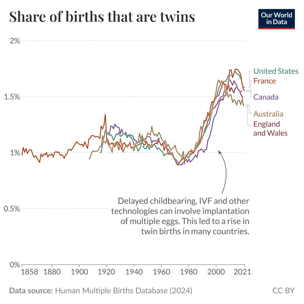
That’s cool. I wonder what caused the drop in all those countries in the 50s and 60s
KillaWallaby on
Standard line graph, so not sure this really belongs here. It’s clear and does tell the story. A couple suggestions to make this more impactful.
1. All the countries move basically together, so differentiation doesn’t really work.
2. The scale doesn’t help the data being presented. I’d suggestb starting the axis at .5% or something. Could also change to a “rate of increase in” metric which would make the while thing a much more readable and interesting visual.
3. Fundamentally, this does show huge growth in twins from IVF — why include data all the way back to 50 years before then? And why so many years after? This won’t make your data more beautiful, but it will make it cleaner.
teh_ash on
It would be really interesting to see a dual axis with mothers’ average age.

3 Comments
That’s cool. I wonder what caused the drop in all those countries in the 50s and 60s
Standard line graph, so not sure this really belongs here. It’s clear and does tell the story. A couple suggestions to make this more impactful.
1. All the countries move basically together, so differentiation doesn’t really work.
2. The scale doesn’t help the data being presented. I’d suggestb starting the axis at .5% or something. Could also change to a “rate of increase in” metric which would make the while thing a much more readable and interesting visual.
3. Fundamentally, this does show huge growth in twins from IVF — why include data all the way back to 50 years before then? And why so many years after? This won’t make your data more beautiful, but it will make it cleaner.
It would be really interesting to see a dual axis with mothers’ average age.