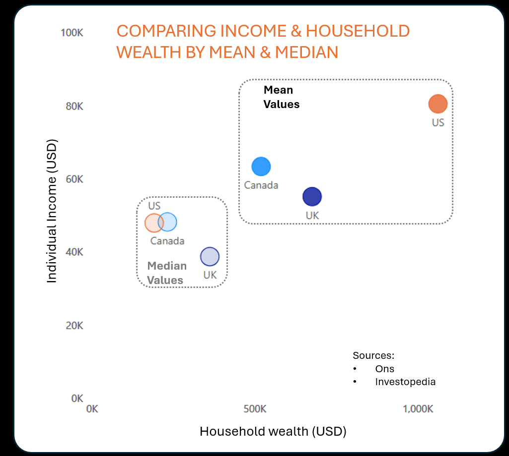
Just something i thought was interesting’s. I have always been surprised by how much high the GDP/capita in the US was vs the UK. Then it occurred to me that GDP/Capita is an average value (yes…not a revolutionary thought), and I decided to compare mean and median values for these countries.
It really highlights (In my opinion) the impact that the super wealthy have on these metrics. The data i used was a bit..scatty…but the premise seems sound.
Numerous_Recording87 on
If a mean and a median are very different, then the data almost certainly has a large standard deviation and the mean needs to be treated with caution.
hache-moncour on
Yep, the US is mostly an average-wealth western country, plus some billionaires owning the government and not paying their share.
In fact I feel that if you want to look at how pleasant a country is to live in, you should look at the bottom 10% in relation to purchasing-power. The quality of a nation is found in how it treats its weakest, not its strongest or even the majority.
Joosh93 on
I wonder how the individual income is higher in NA, but household wealth is higher in the UK in the median values. Perhaps more social safety nets in the UK, or things like healthcare not being covered in income but not coming out of a persons savings?
MrEHam on
This is an excellent point OP. Just another way we’ve been fooled to believe that we have it so great in America compared to other countries like UK and Canada.
We’re near the top of the list when it comes to being overworked too. And what do we have to show for it? Not even universal healthcare like most other countries.
The rich are robbing us blind, and they’re about to get another massive Trump tax cut, while programs that benefit us are cut to make financial room for the billionaire tax cuts.
Please_HMU on
another awful post in this sub!
Spanky2k on
Interesting chart! Can I ask if the values are all true comparisons though? I’ve been interested in similar stuff before to compare countries and I found it really hard to get valid comparisons as some countries will publish stats on individual earnings and wealth, some would publish stat on household earnings and wealth, some would do individual earnings and household wealth or vice versa and some would only include earners instead of everyone. And then not everyone would have up-to-date information.
For example, the UK median earnings of full-time employees in April 2024 was £37.4k ($47.5k, which isn’t the number on this chart obviously). But that doesn’t include anyone that is part-time employed, receives income from benefits, receives income from dividends or is self-employed. Getting data on the US was a lot harder as they seem to really favour house-hold income in their data sources although the department of labor did state that median weekly earnings in Q1 2024 was $1192 for full-time workers ($59k annually, again which doesn’t correspond to this chart).
It’s frustrating as based on what I always see in the news or how people talk about their problems in the US versus the UK or other Western countries, my hypothesis is that in terms of quality of life (and possibly also actual disposable income after taxes, healthcare, benefits etc are all accounted for), people in the top 10-20% in the US are likely better off than people in the top 10-20% of other developed countries, however, everyone else is worse off. Trying to prove that hypothesis has just seemed impossible though with the limited amount of spare time I’ve been able to account to the problem.
AscendingAgain on
That disparity between US mean wealth & median wealth is very unsurprising.
allthenewsfittoprint on
Excellent graph. Simple and easy to read, thought provoking, and with good colors and labels. I’d add in axis lines and maybe(?) grid lines. But this was very well done
AlwaysLosingAtLife on
You mean the redditors cherry-picking stats – like the wages of a senior heavy equipment operator in new york paired with housing from minnesota and food prices from kansas – aren’t being honest??!?

10 Comments
I used powerBI, excel, and my lunch break.
Just something i thought was interesting’s. I have always been surprised by how much high the GDP/capita in the US was vs the UK. Then it occurred to me that GDP/Capita is an average value (yes…not a revolutionary thought), and I decided to compare mean and median values for these countries.
It really highlights (In my opinion) the impact that the super wealthy have on these metrics. The data i used was a bit..scatty…but the premise seems sound.
If a mean and a median are very different, then the data almost certainly has a large standard deviation and the mean needs to be treated with caution.
Yep, the US is mostly an average-wealth western country, plus some billionaires owning the government and not paying their share.
In fact I feel that if you want to look at how pleasant a country is to live in, you should look at the bottom 10% in relation to purchasing-power. The quality of a nation is found in how it treats its weakest, not its strongest or even the majority.
I wonder how the individual income is higher in NA, but household wealth is higher in the UK in the median values. Perhaps more social safety nets in the UK, or things like healthcare not being covered in income but not coming out of a persons savings?
This is an excellent point OP. Just another way we’ve been fooled to believe that we have it so great in America compared to other countries like UK and Canada.
We’re near the top of the list when it comes to being overworked too. And what do we have to show for it? Not even universal healthcare like most other countries.
The rich are robbing us blind, and they’re about to get another massive Trump tax cut, while programs that benefit us are cut to make financial room for the billionaire tax cuts.
another awful post in this sub!
Interesting chart! Can I ask if the values are all true comparisons though? I’ve been interested in similar stuff before to compare countries and I found it really hard to get valid comparisons as some countries will publish stats on individual earnings and wealth, some would publish stat on household earnings and wealth, some would do individual earnings and household wealth or vice versa and some would only include earners instead of everyone. And then not everyone would have up-to-date information.
For example, the UK median earnings of full-time employees in April 2024 was £37.4k ($47.5k, which isn’t the number on this chart obviously). But that doesn’t include anyone that is part-time employed, receives income from benefits, receives income from dividends or is self-employed. Getting data on the US was a lot harder as they seem to really favour house-hold income in their data sources although the department of labor did state that median weekly earnings in Q1 2024 was $1192 for full-time workers ($59k annually, again which doesn’t correspond to this chart).
It’s frustrating as based on what I always see in the news or how people talk about their problems in the US versus the UK or other Western countries, my hypothesis is that in terms of quality of life (and possibly also actual disposable income after taxes, healthcare, benefits etc are all accounted for), people in the top 10-20% in the US are likely better off than people in the top 10-20% of other developed countries, however, everyone else is worse off. Trying to prove that hypothesis has just seemed impossible though with the limited amount of spare time I’ve been able to account to the problem.
That disparity between US mean wealth & median wealth is very unsurprising.
Excellent graph. Simple and easy to read, thought provoking, and with good colors and labels. I’d add in axis lines and maybe(?) grid lines. But this was very well done
You mean the redditors cherry-picking stats – like the wages of a senior heavy equipment operator in new york paired with housing from minnesota and food prices from kansas – aren’t being honest??!?