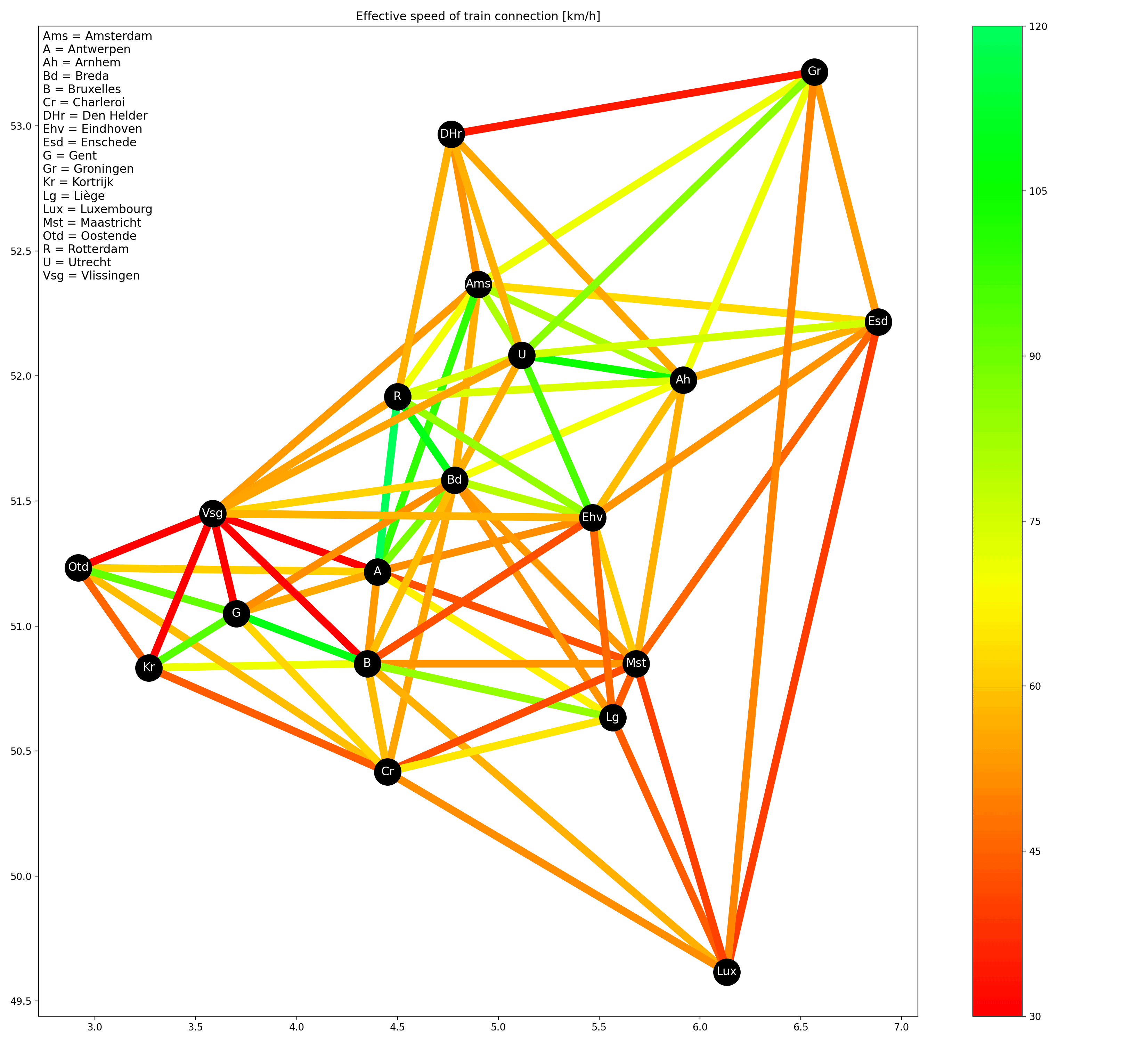
[OC] How fast is the train? Effective speed (as-the-crow-flies distance divided by travel time of fastest connection) of train connections between 19 cities in the Benelux
Posted by midnightrambulador

![[OC] How fast is the train? Effective speed (as-the-crow-flies distance divided by travel time of fastest connection) of train connections between 19 cities in the Benelux](https://www.byteseu.com/wp-content/uploads/2025/02/f5ygmjzi1dje1-1536x1395.png "[OC] How fast is the train? Effective speed (as-the-crow-flies distance divided by travel time of fastest connection) of train connections between 19 cities in the Benelux")
[OC] How fast is the train? Effective speed (as-the-crow-flies distance divided by travel time of fastest connection) of train connections between 19 cities in the Benelux
Posted by midnightrambulador
3 Comments
Sources:
* Coordinates: Wikipedia
* Distances: [haversine formula](https://www.movable-type.co.uk/scripts/latlong.html)
* Travel time (NL-NL): https://www.ns.nl/
* Travel time (BE-BE): https://www.belgiantrain.be/
* Travel time (NL-BE & BE-LU): https://www.b-europe.com/
* Travel time (NL-LU): https://www.nsinternational.com/
All travel times were requested manually from the various route planners (probably I could have done something fancy with API calls but figuring that out would have taken a lot longer). All requests were made today (February 15th, 2025). Reference date was Tuesday morning March 4th. I took the fastest connection I could find without clicking “earlier/later”.
For the plot I manually pruned away a lot of lines which were on top of each other and/or cut through 3rd cities. I do have the speed values for every combination of cities, these are [here](https://i.imgur.com/PIY9hzC.png).
Plot was made with Python (pandas and matplotlib).
Very cool vis! Somehow the journey from Utrecht to Eindhoven feels super slow but apparently I’m wrong.
What’s your source / methodology?
That’s a really cool visualization. It’s kinda obvious that Den Helder – Groningen is dark red, as there’s no direct connection over the Afsuitdijk and the train goes via Amsterdam and Utrecht (or Almere)