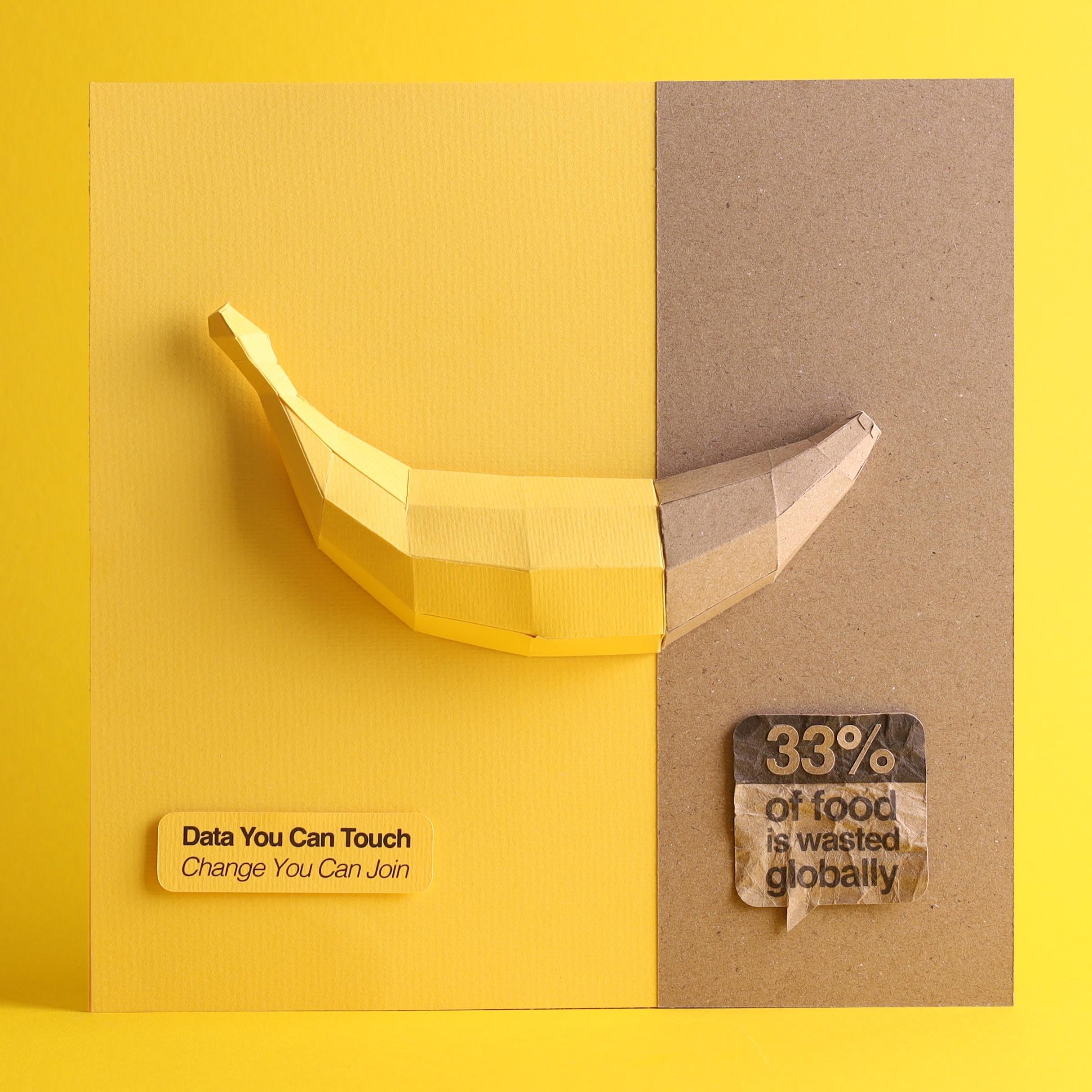
What does the yellow part illustrate? The amount of food consumed by people, consumed by animals and people, consumed by animals and people or processed into frozen food?
Romarto_Design on
Data source: open internet sources, google.
Tools: pastel paper, craft paper, inkjet printer, Cameo plotter, glue 🙂
NathaNRiveraMelo on
33% seems like a lot but also not that much when you think about all the food that spoils or is just at the wrong place at the wrong time. Idk, seems pretty alright. There’s obviously room for improvement but I wonder what’s most practical when it comes to food waste.
zeoNoeN on
Finally an actually beautiful visualization. Anywhere to see more OP?
BioFrosted on
I don’t know what people are nitpicking for. This is awesome, and clearly hard enough to make that it shouldn’t matter whether you don’t have a perfect explanation of what each part of the plot represents precisely.
I think it’s cool, I like it. It’s data, and it’s beautiful.
saschaleib on
For once a truly inspiring visualisation in this sub. I salute you! 🫡
nabiku on
Your title and statistic are the same size and style, making it confusing. When your audience reads “30% food wasted”, they’ll expect more information when they look to the similar yellow box on the left, but only find the title. I’d change the style and shape of the yellow box.
Overall, nice visual idea and texture use.
tomjames1234 on
Love this. Amazing work. Best thing I’ve seen on this sub.
SomeoneInQld on
I am a data guy have been for decades.
I am volunteering on a farm now. With our and our neighbours fruit crops. I would believe it’s higher that 33% is wasted. (Or fed to animals / composted.)
orangesherbet0 on
I remember a decade ago learning in low income countries, food is wasted due to a lack of infrastructure. In high income countries, it is just consumer-end waste. Yet the percentage is similar in both cases.
Bocote on
Visually pleasing, easy to understand, and straight to the point!
Time-Praline1995 on
Cool visualisation! Do you have any more data about what sorts of food are wasted and why? I’m trying to start an initiative using a flavour pairing algorithm to facilitate greater food preservation

![[OC] Combining my two passions: paper art and data visualization](https://www.byteseu.com/wp-content/uploads/2025/02/uhdntj5h7yje1-1536x1536.jpeg "[OC] Combining my two passions: paper art and data visualization")
12 Comments
What does the yellow part illustrate? The amount of food consumed by people, consumed by animals and people, consumed by animals and people or processed into frozen food?
Data source: open internet sources, google.
Tools: pastel paper, craft paper, inkjet printer, Cameo plotter, glue 🙂
33% seems like a lot but also not that much when you think about all the food that spoils or is just at the wrong place at the wrong time. Idk, seems pretty alright. There’s obviously room for improvement but I wonder what’s most practical when it comes to food waste.
Finally an actually beautiful visualization. Anywhere to see more OP?
I don’t know what people are nitpicking for. This is awesome, and clearly hard enough to make that it shouldn’t matter whether you don’t have a perfect explanation of what each part of the plot represents precisely.
I think it’s cool, I like it. It’s data, and it’s beautiful.
For once a truly inspiring visualisation in this sub. I salute you! 🫡
Your title and statistic are the same size and style, making it confusing. When your audience reads “30% food wasted”, they’ll expect more information when they look to the similar yellow box on the left, but only find the title. I’d change the style and shape of the yellow box.
Overall, nice visual idea and texture use.
Love this. Amazing work. Best thing I’ve seen on this sub.
I am a data guy have been for decades.
I am volunteering on a farm now. With our and our neighbours fruit crops. I would believe it’s higher that 33% is wasted. (Or fed to animals / composted.)
I remember a decade ago learning in low income countries, food is wasted due to a lack of infrastructure. In high income countries, it is just consumer-end waste. Yet the percentage is similar in both cases.
Visually pleasing, easy to understand, and straight to the point!
Cool visualisation! Do you have any more data about what sorts of food are wasted and why? I’m trying to start an initiative using a flavour pairing algorithm to facilitate greater food preservation