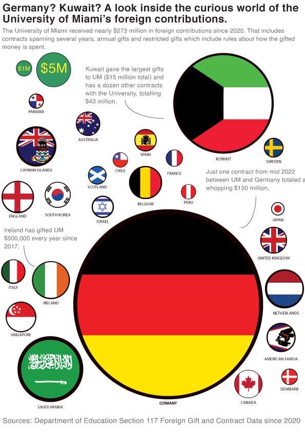
This chart was made with data made publicly available by the Department of Education. I used Pandas to clean and create a CSV which grouped contributions based on country, then used Illustrator to create a bubble chart. The flag graphics are sourced from a public Github repo of flag SVGs.
BaddyWrongLegs on
How is the UK contribution more than Scotland but less than England?

2 Comments
This chart was made with data made publicly available by the Department of Education. I used Pandas to clean and create a CSV which grouped contributions based on country, then used Illustrator to create a bubble chart. The flag graphics are sourced from a public Github repo of flag SVGs.
How is the UK contribution more than Scotland but less than England?