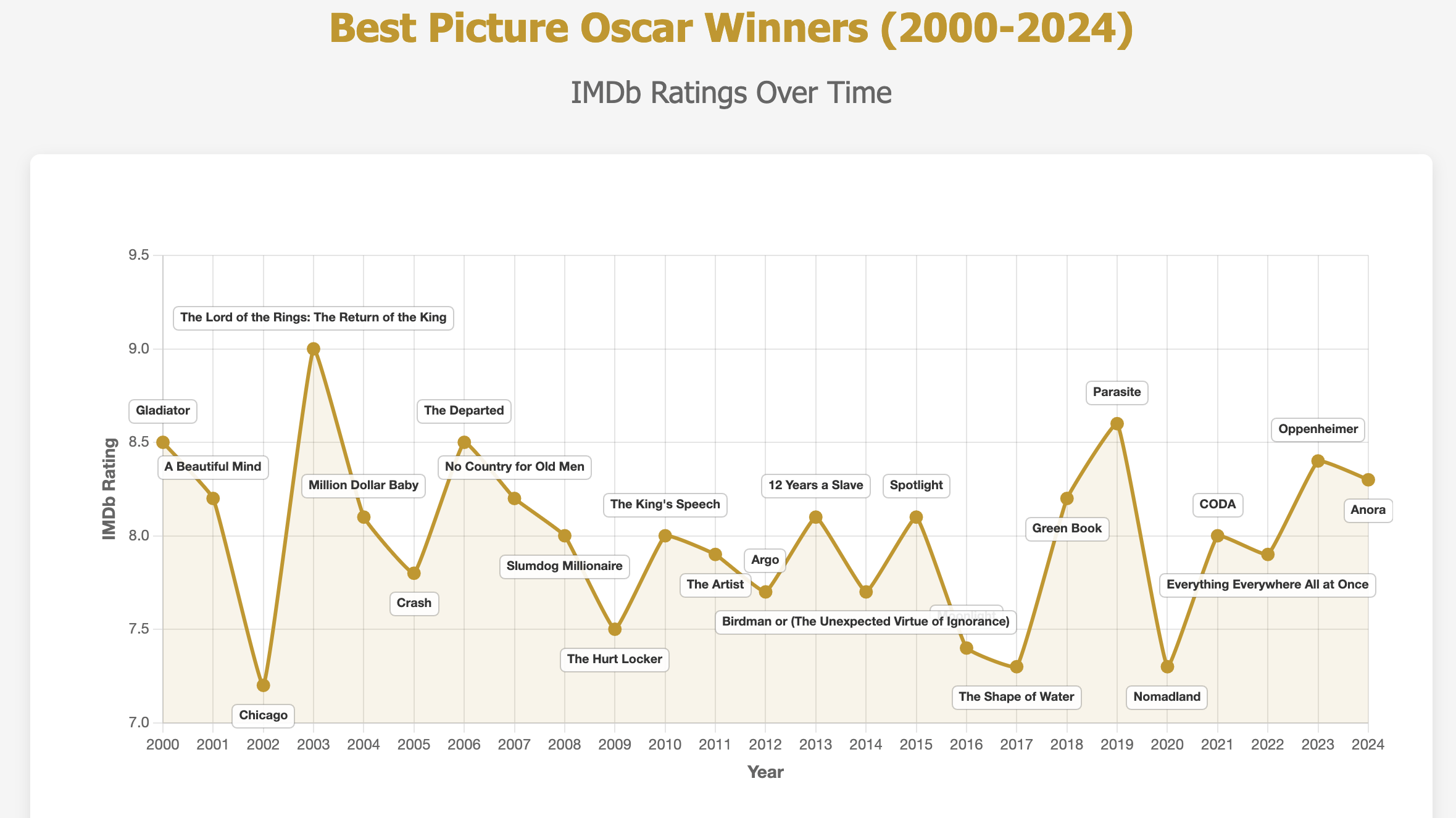
Not sure over time is the right description, and 2016’s title is obscured.
But interesting tidbit
MementoMurray on
What was wrong with Chicago?
tbeall131 on
How are you gonna block out Moonlight 😭
Hazzat on
This should be a bar chart, not be a line graph, as it doesn’t show a continuous change over time. The lines between the dots mean nothing.
repeatrep on
eh i think imdb user ratings are kinda off, i prefer letterboxd but i can see why one would use imdb (its more popular)
Natac_orb on
classical cheating method, it seems so extreme with the clipped yaxis.
SyrupyMolassesMMM on
Huh, TIL the shape or water won an oscar….i actually love that movie…
ThatSmokyBeat on
This is interesting data I suppose but a bad chart choice. Line charts are useful for interpolation, which makes no sense here. Is there a trend? Perhaps a better choice would be a scatter plot with a trend line and correlation stats, e.g. if the rating is declining or increasing over time.
BenUFOs_Mum on
How is crash not the lowest rated? A truly awful movie.
JimBowen0306 on
Crash gets a lot of hate (a lot of which is justified), but it’s innocuously placed here.
tysnails on
Were these the IMDb ratings at the time of winning the Oscar, or are they all as of today?
theangryfurlong on
Crazy that even considering its high rating, LotR:RotK is considered by many to be the weakest in the trilogy.
Absolute god-tier movie trilogy.
pizzapizzamesohungry on
After looking at this I realize I don’t fucking give a shit about IMDB ratings.

![[OC] Best Picture Oscar Winners (2000-2024)](https://www.byteseu.com/wp-content/uploads/2025/03/ma527izbj0ne1-1536x863.png "[OC] Best Picture Oscar Winners (2000-2024)")
13 Comments
Not sure over time is the right description, and 2016’s title is obscured.
But interesting tidbit
What was wrong with Chicago?
How are you gonna block out Moonlight 😭
This should be a bar chart, not be a line graph, as it doesn’t show a continuous change over time. The lines between the dots mean nothing.
eh i think imdb user ratings are kinda off, i prefer letterboxd but i can see why one would use imdb (its more popular)
classical cheating method, it seems so extreme with the clipped yaxis.
Huh, TIL the shape or water won an oscar….i actually love that movie…
This is interesting data I suppose but a bad chart choice. Line charts are useful for interpolation, which makes no sense here. Is there a trend? Perhaps a better choice would be a scatter plot with a trend line and correlation stats, e.g. if the rating is declining or increasing over time.
How is crash not the lowest rated? A truly awful movie.
Crash gets a lot of hate (a lot of which is justified), but it’s innocuously placed here.
Were these the IMDb ratings at the time of winning the Oscar, or are they all as of today?
Crazy that even considering its high rating, LotR:RotK is considered by many to be the weakest in the trilogy.
Absolute god-tier movie trilogy.
After looking at this I realize I don’t fucking give a shit about IMDB ratings.