These charts are part of a video I made about the impact of height in your life. You can find the video here: [https://youtu.be/h5p0tvniBhQ?si=EYBTuwtQf3vAiAvm](https://youtu.be/h5p0tvniBhQ?si=EYBTuwtQf3vAiAvm)
I bet the average height of women in Netherlands is taller than men in the US
hamstercheeks47 on
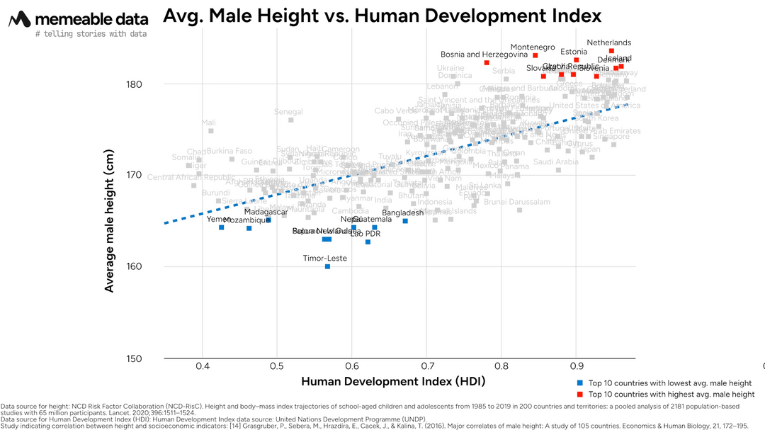
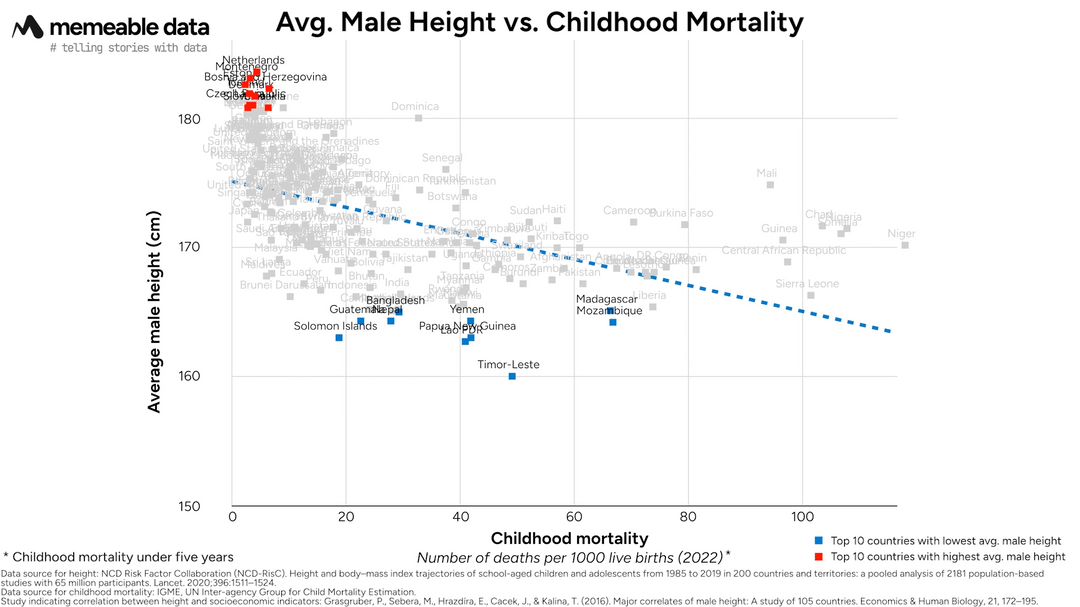
Interesting. I suspect there may be a third variable at play here—namely, money. A lot of the countries near the top are either European or of European descent/colonialism. Europeans (particularly Northern Europeans) tend to be taller than the rest of the global population. This apparent link between height/HDI might be reflecting the additional resources/money Europeans have (historically) had to invest in things like healthcare and medicine.
damienVOG on
It’s even more the case for Gen Z dutch guys, in my class of 8 guys I’m the second shortest guy at 6’0.. but all 16 girls are shorter than me lmao
galactictock on
This is pretty unsurprising. Malnourishment during development often results in shorter stature at adulthood. So countries that keep their youth healthy will have taller adults and, of course, lower childhood mortality and higher HDI. Of course, there is a genetic component to adult height, but that isn’t the driving factor here.
devnullopinions on
I feel like linear regression is not a very good fit for the data on your second graph
ThinNeighborhood2276 on
Interesting correlation! Did you find any significant outliers in the data?
HegemonHarbinger on
This chart has completely changed my mind, that just because a country doesn’t have camels, that it can still have a low HDI.
globbewl on
the key variable usually used to explain the over performance of africa on these graphs and the underperformance of india is usually sanitation. these look like quite consistent u-shaped curves though, which maybe suggest a model of stages of development countries go through wrt height, where urbanisation and poor sanitation initially make it much worse.

![[OC] Avg. Male Height vs Human Development Index and Childhood Mortality](https://www.byteseu.com/wp-content/uploads/2025/03/6hay8rlxcgoe1-1024x576.png "[OC] Avg. Male Height vs Human Development Index and Childhood Mortality")
9 Comments
These charts are part of a video I made about the impact of height in your life. You can find the video here: [https://youtu.be/h5p0tvniBhQ?si=EYBTuwtQf3vAiAvm](https://youtu.be/h5p0tvniBhQ?si=EYBTuwtQf3vAiAvm)
Tools used: Blender, Adobe Premiere Pro
Data sources:
* Height: [https://doi.org/10.1016/S0140-6736(20)31859-6](https://doi.org/10.1016/S0140-6736(20)31859-6). Dataset can be found here: [https://ncdrisc.org/data-downloads.html](https://ncdrisc.org/data-downloads.html)
* Human Development Index: Human Development Index data source: United Nations Development Programme (UNDP). [https://hdr.undp.org/data-center/human-development-index#/indicies/HDI](https://hdr.undp.org/data-center/human-development-index#/indicies/HDI)
* Childhood Mortality: IGME, UN Inter-agency Group for Child Mortality Estimation. [https://childmortality.org/](https://childmortality.org/)
I bet the average height of women in Netherlands is taller than men in the US
Interesting. I suspect there may be a third variable at play here—namely, money. A lot of the countries near the top are either European or of European descent/colonialism. Europeans (particularly Northern Europeans) tend to be taller than the rest of the global population. This apparent link between height/HDI might be reflecting the additional resources/money Europeans have (historically) had to invest in things like healthcare and medicine.
It’s even more the case for Gen Z dutch guys, in my class of 8 guys I’m the second shortest guy at 6’0.. but all 16 girls are shorter than me lmao
This is pretty unsurprising. Malnourishment during development often results in shorter stature at adulthood. So countries that keep their youth healthy will have taller adults and, of course, lower childhood mortality and higher HDI. Of course, there is a genetic component to adult height, but that isn’t the driving factor here.
I feel like linear regression is not a very good fit for the data on your second graph
Interesting correlation! Did you find any significant outliers in the data?
This chart has completely changed my mind, that just because a country doesn’t have camels, that it can still have a low HDI.
the key variable usually used to explain the over performance of africa on these graphs and the underperformance of india is usually sanitation. these look like quite consistent u-shaped curves though, which maybe suggest a model of stages of development countries go through wrt height, where urbanisation and poor sanitation initially make it much worse.