
![[OC] Affordable rental housing across the income spectrum since 1960](https://www.byteseu.com/wp-content/uploads/2025/03/cpgvh2k7mupe1-1024x767.jpeg "[OC] Affordable rental housing across the income spectrum since 1960")
From https://rentrentier.com/the-collapse-of-housing-affordability/
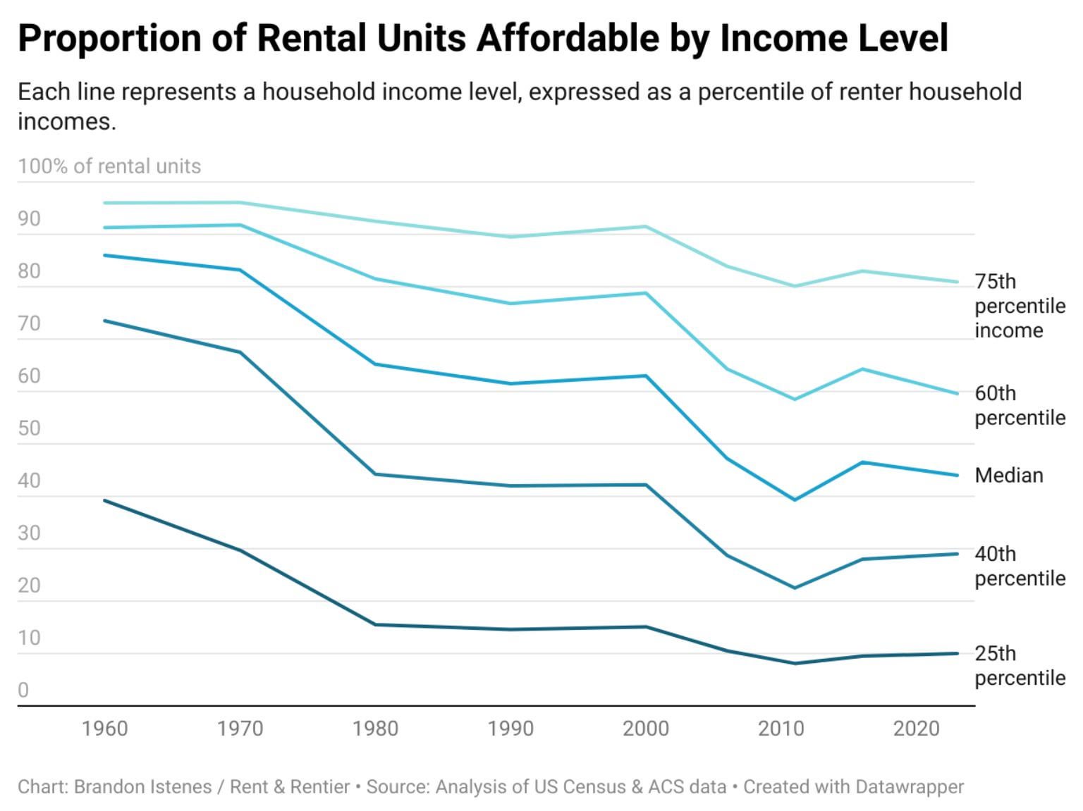
“Affordable” means rent is not more than 30% of household income.
Based on analysis of US Census and ACS data from IPUMS USA. To calculate the proportion of units: Data is split into submarkets by state and bedroom count. The proportion of units affordable at each income percentile is calculated. The numbers for the submarkets are then combined as a weighted average, weighted by the proportions of renters in that income percentile in each submarket. Visualization made with datawrapper.
Posted by rentyrentier
4 Comments
Based on analysis of US Census and ACS data from IPUMS USA. To calculate the proportion of units: Data is split into submarkets by state and bedroom count. The proportion of units affordable at each income percentile is calculated. The numbers for the submarkets are then combined as a weighted average, weighted by the proportions of renters in that income percentile in each submarket. Visualization made with datawrapper.de
Basically, anyone below 60% has proportionately fewer choices, which is interesting.
If this was done for homes for sale, based on implied mortgage payments, I suspect it would be basically anyone below 90% having proportionately fewer choices.
It’s a bummer that I didn’t invest my income into a property when I was 4 years old.
I’d like to this graph extended to at least 2024. A LOT has changed since 2020.