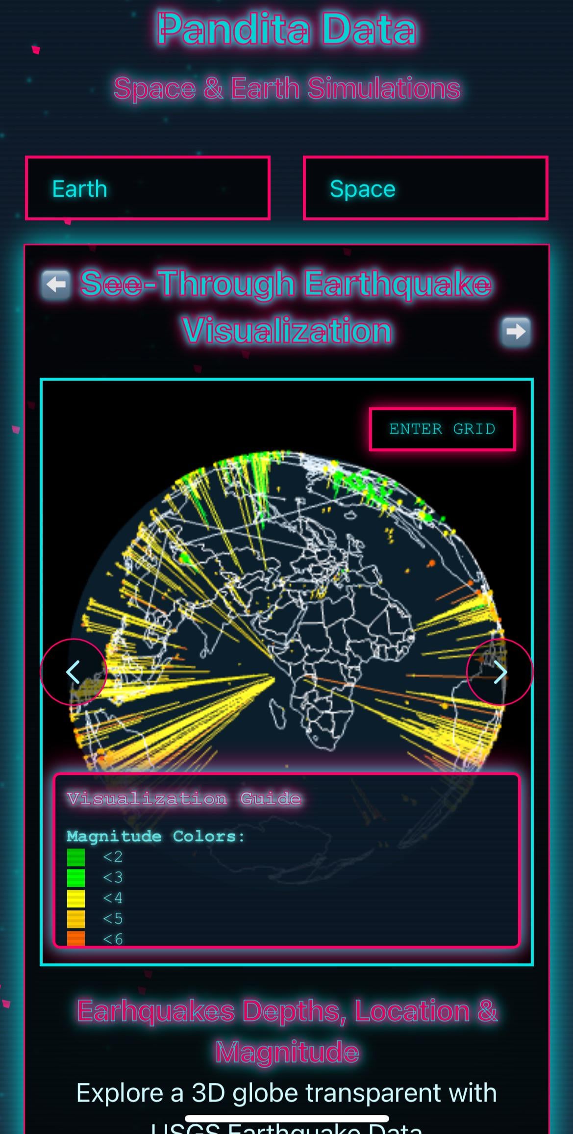
[OC] A 3D see through globe showing depths of Earthquakes from inside a transparent Earth
Posted by youandI123777

![[OC] A 3D see through globe showing depths of Earthquakes from inside a transparent Earth](https://www.byteseu.com/wp-content/uploads/2025/03/o5ppp1c4btqe1-777x1536.jpeg "[OC] A 3D see through globe showing depths of Earthquakes from inside a transparent Earth")
[OC] A 3D see through globe showing depths of Earthquakes from inside a transparent Earth
Posted by youandI123777
4 Comments
Data is fetch from USGS [uSGS](https://www.usgs.gov/)
The visualization is interesting, but without trying to be snarky, the rest of the presentation is hideous. I think I get that you wanted some kind of vaporwave aesthetics, but it doesn’t really work. Your choice of font doesn’t work with the outlines, and this is a jumbled mess of fonts, sizes, and Emoji.
80s neon vibe, good for games, not so much for graph.
presentation is weird, like all around it.
this makes me also unsure, if it really shows the depth but more chose to just visualize the strength this way?