– Are these numbers particularly high or low? What’s are number for the whole of Berlin? These probably make sense in relation to the number of residents on that district.
– Do we have data points between those years or are these only fancy interpolations?
For the 3rd chart:
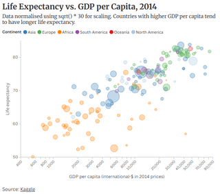
– Why normalize with the root and not use a logarithmic x axis? What does “*30” say, quantitatively?
– What’s the size of the bubble?
123kingme on
First one is overly bland and not at all ascetically pleasing.
Second one is boring. If you’re analyzing crime trends, might as well also analyze the total crime trends as well instead of just the proportion.
Also, it appears you smoothed the data curves. On a short time scale like this I would not recommend that. I’m assuming the data points are annual?
Third one is interesting but not sure what the sizes mean. I also don’t love nonlinear axes but that’s a personal preference and I see the justification here.
Maybe this is a nitpick but in all your charts something about your text, especially the axis labels, are just not easy on the eyes. I can’t pin point it exactly but I think it’s a combination of the gray on white color scheme and the low font weight and font size. Maybe try bolding the text to see if that makes a difference.
All 3 of your charts just don’t seem to be conveying enough information. It feels like you could include more information that would enhance the visualization without being distracting.
Atnevon on
Make it accessible!
Accessibility doesn’t just benefit those with impairments; it benefits all! By making your data more visually accessible you help the readability and interoperation by any reader. Depending on your presentation — making it more digitally friendly means those without vision or impaired vision will be able to access your data.
Its a rabbit-hole of learning, but [here is a small overview page](https://www.deque.com/blog/how-to-make-interactive-charts-accessible/) to give you an idea of how to optimize colors, labels, and scale to help your visual readers; and there are tips on how to help the digital context of the non-visual.
onward-and-upward on
Don’t center the crime trends. Gap on the bottom is weird. Also stacked is harder to decipher. You have to compare two lines rather than just look at the trend of one. Especially for data that isn’t changing much
mkaszycki81 on
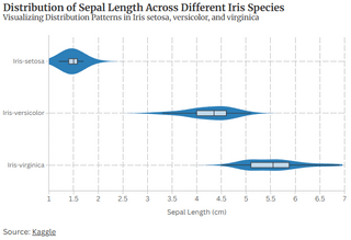
The first chart is meaningless without understanding what it is about. It’s pretty clear that there is a distribution (median, upper and lower quartiles and extremes), but what is the significance of the area behind it? What does it encode and why is the first one much thicker than the other two?
The second chart, why the wobble? Is there “other” below the area and “unknown” above? There’s no reason given for that. If it encodes absolute values, its significance is that the amount of crimes is roughly constant but types change? This seems extremely odd.
The third chart, what is the significance of bubble size? There’s no legend. Also, why normalize by square root rather than log?
Violin charts are stupid and ugly. They waste ink/space, because they are symmetric; they don’t aid comparisons, because you have to separate them; they are terrible and bad and should not exist.
Dissent21 on
Uploading this at such a low resolution feels like a prank

8 Comments
Maybe add some more pixels
For the second chart:
– Why does it wobble at the bottom?
– What’s the y-Axis?
– Are these numbers particularly high or low? What’s are number for the whole of Berlin? These probably make sense in relation to the number of residents on that district.
– Do we have data points between those years or are these only fancy interpolations?
For the 3rd chart:
– Why normalize with the root and not use a logarithmic x axis? What does “*30” say, quantitatively?
– What’s the size of the bubble?
First one is overly bland and not at all ascetically pleasing.
Second one is boring. If you’re analyzing crime trends, might as well also analyze the total crime trends as well instead of just the proportion.
Also, it appears you smoothed the data curves. On a short time scale like this I would not recommend that. I’m assuming the data points are annual?
Third one is interesting but not sure what the sizes mean. I also don’t love nonlinear axes but that’s a personal preference and I see the justification here.
Maybe this is a nitpick but in all your charts something about your text, especially the axis labels, are just not easy on the eyes. I can’t pin point it exactly but I think it’s a combination of the gray on white color scheme and the low font weight and font size. Maybe try bolding the text to see if that makes a difference.
All 3 of your charts just don’t seem to be conveying enough information. It feels like you could include more information that would enhance the visualization without being distracting.
Make it accessible!
Accessibility doesn’t just benefit those with impairments; it benefits all! By making your data more visually accessible you help the readability and interoperation by any reader. Depending on your presentation — making it more digitally friendly means those without vision or impaired vision will be able to access your data.
Its a rabbit-hole of learning, but [here is a small overview page](https://www.deque.com/blog/how-to-make-interactive-charts-accessible/) to give you an idea of how to optimize colors, labels, and scale to help your visual readers; and there are tips on how to help the digital context of the non-visual.
Don’t center the crime trends. Gap on the bottom is weird. Also stacked is harder to decipher. You have to compare two lines rather than just look at the trend of one. Especially for data that isn’t changing much
The first chart is meaningless without understanding what it is about. It’s pretty clear that there is a distribution (median, upper and lower quartiles and extremes), but what is the significance of the area behind it? What does it encode and why is the first one much thicker than the other two?
The second chart, why the wobble? Is there “other” below the area and “unknown” above? There’s no reason given for that. If it encodes absolute values, its significance is that the amount of crimes is roughly constant but types change? This seems extremely odd.
The third chart, what is the significance of bubble size? There’s no legend. Also, why normalize by square root rather than log?
[Don’t use violin charts](https://youtu.be/_0QMKFzW9fw)
Violin charts are stupid and ugly. They waste ink/space, because they are symmetric; they don’t aid comparisons, because you have to separate them; they are terrible and bad and should not exist.
Uploading this at such a low resolution feels like a prank