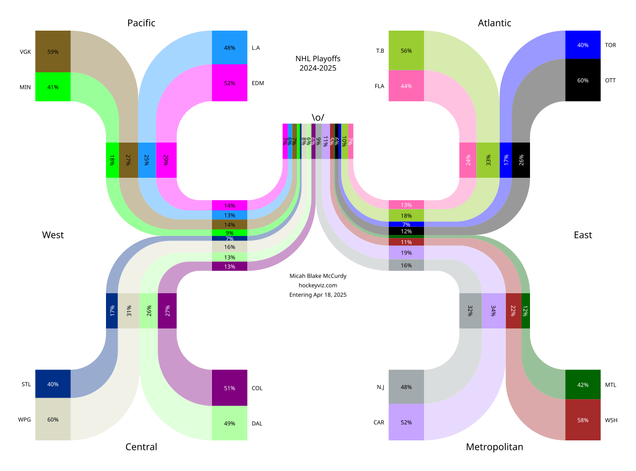
Probabilities for the upcoming NHL playoffs, computed from my various predictive models using data provided by the NHL. Viz made using the python library svgwrite.
Posted by mbmccurdy

![2024-2025 NHL Playoff Chances [OC]](https://www.byteseu.com/wp-content/uploads/2025/04/cstp6l0uksve1-1024x759.png "2024-2025 NHL Playoff Chances [OC]")
Probabilities for the upcoming NHL playoffs, computed from my various predictive models using data provided by the NHL. Viz made using the python library svgwrite.
Posted by mbmccurdy
11 Comments
Tool: svgwrite
Source: Raw data from the NHL + my own predictive models trained on that data.
Carolina is the stats darling yet they seem allergic to proper playoff success, this year will be no better for them (crazy that they have the highest chance of winning the cup over Tampa or Colorado)
[deleted]
Canes are always heavily favored and always come up short when it counts. Maybe this retooled roster will be different, but they always feel like the lovable frauds to me. As a longtime Sharks fan they are very reminiscent of the 2008-16 teams we had. Which sucks for Brent Burns..
Why not use team colors or alternates here? If you did that and added the team logos this would go viral in the hockey world
I think a lot of experts would disagree with you on Toronto and LA being that low.
What sort of inputs did you use for the predictive models?
Okay sure, give the Sens a better chance then the east leading Capitals. Looks cool but I’d rather it done with implied odds.
Carolina’s goaltending is going to be a problem. For them.
Biblically accurate Sankey diagram
To be frank, this is ugly as shit.
It’s data, but I wouldn’t call it beautiful. Moneypuck does a way better job