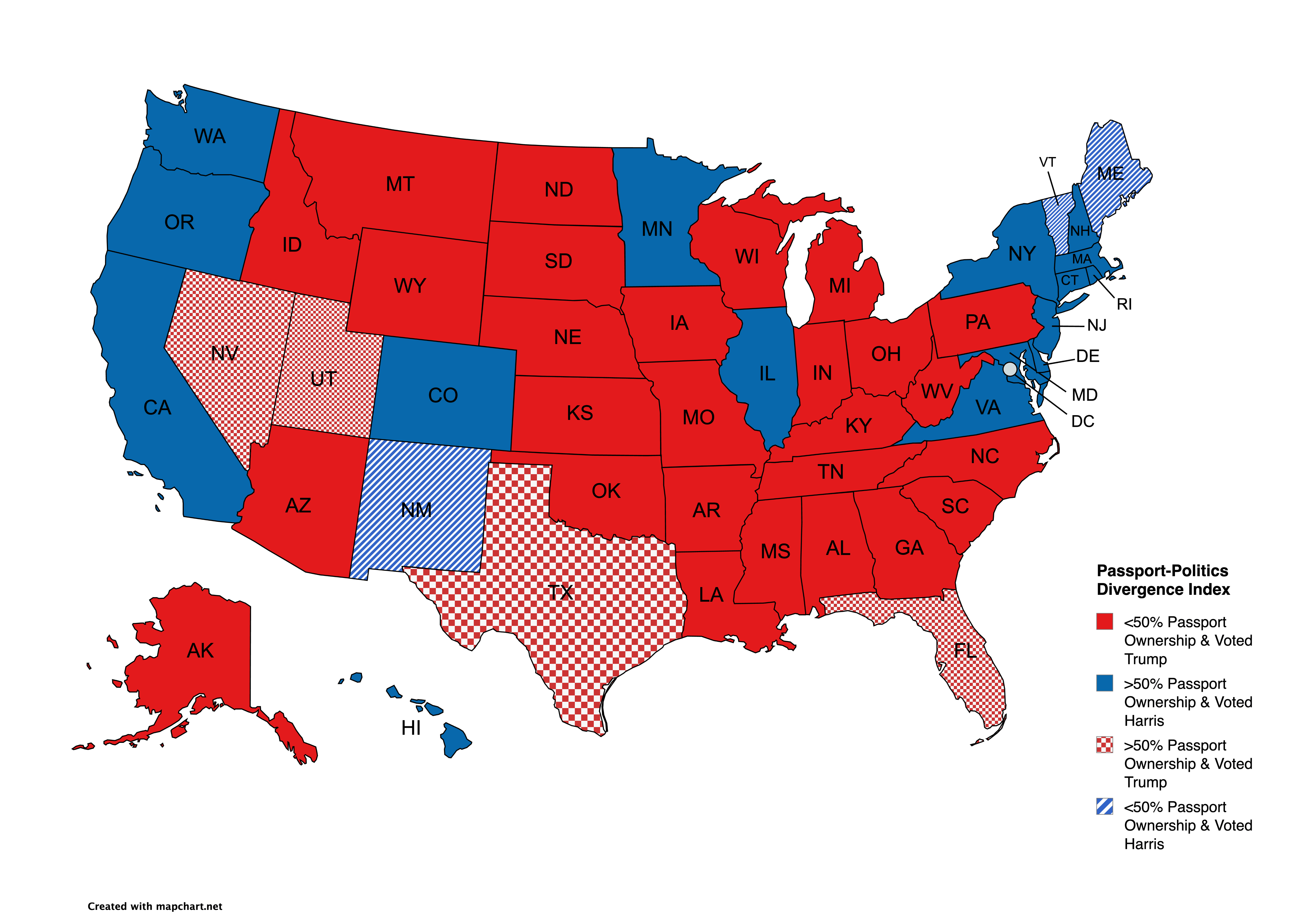
I was inspired by snakkerdudaniel 's Passport ownership map to combine their data with my election data sheet.
Posted by -Puddintane-

![[OC] Passport Ownership/2024 Politics Divergence](https://www.byteseu.com/wp-content/uploads/2025/05/jr6n59dwp8ze1-1536x1075.png "[OC] Passport Ownership/2024 Politics Divergence")
I was inspired by snakkerdudaniel 's Passport ownership map to combine their data with my election data sheet.
Posted by -Puddintane-
34 Comments
Would be easier to read if hashing always meant the same thing
1. Alaska is wrong, they should be red cross hatch (>50% Passport, voted Trump)
2. Passport data from Center for American Progress via [snakkerdudaniel](https://www.reddit.com/user/snakkerdudaniel/)
3. Election data from [FEC.gov](http://FEC.gov)
4. Map made with [mapchart.net](http://mapchart.net)
It kills me that the solid colors don’t represent the same thing. As in solid red is <50% passport ownership & Trump voter; therefore solid blue should be <50% passport ownership & Harris voter.
Cool data, but a tiny swap would make this much more intuitive to read.
Not surprising. Most Trump voters arent particulary well educated or well traveled…..
Scaling the checkerboard pattern makes it visually ugly.
I know you wanted to drive a political point home (Republicans never travel), but that really doesn’t come across effectively.
Keeping the markings consistent would go a long way towards making it more readable.
We should have a program that for first time international travel we help folks do it… meeting folks that think and look different from you will make you gain new perspective and how we are more similar than different, how we should strive for more partnership and that we shouldn’t fear others.
It isn’t surprising to see places where less than half the population has no passport and has never left the country or state live in constant fear of others “coming to get them or take their stuff” .
Interesting map! Can you do a scatter plot of percent ownership in X and the margin that Trump/Harris won by in Y. I’m curious to see how strong the correlation is.
So in other words there’s no relationship.
No wonder maga thinks the rest of the world is exactly like the US. It ain’t.
“Travel is fatal to prejudice, bigotry, and narrow-mindedness, and many of our people need it sorely on these accounts. Broad, wholesome, charitable views of men and things cannot be acquired by vegetating in one little corner of the earth all one’s lifetime.” Mark Twain
Was the original dataset only people old enough to vote?
Do it per popular vote now. Land doesn’t vote.
The outliers are the most fascinating. I wonder what it is that gives FL, TX, NV and UT both traveling populations and conservative politics.
As a Floridian, this certainly does gel with my experiences… it’s odd how many people I’ve talked to that come back from a trip to Europe and then share the most bigoted opinions.
That’s a lot of solid red
The party of the rich live in VHCOL cities and travels internationally more. What a revelation.
A map is a terrible way to plot this. It should be a scatter-plot, with a trend line if one’s justified.
TX, FL, UT and NV need to learn how to use their passports.
[deleted]
How do they determine that these people out a passport?
This is a rich state – poor state divide.
Solid blue and chequered red are rich.
Solid red and chequered blue are poor
Is this just a population plot in disguise? Percent of urban voters? It looks like all of the states with large urban/rural population ratios (large cities) have high passport ownership. It also happens they lean blue.
Seems like a case of “just because you can, doesn’t mean you should.”
This is such a snobby graph lmaoooo
I’m guessing having a passport has an EXTREMELY high correlation to affluence. Would be interesting to see if you get the same graph with a certain salary threshold replacing passport ow worship.
So 4 red states may lose republican voting edge to 3 blue states democratic voting edge?
Too many people are conflating these results along party lines. This is an economic issue. International trips are extremely expensive. It is categorically irresponsible to take a vacation when you are trying to save money for necessities like housing and education. A passport is not a good investment when you don’t have the money to leave the country. Might as well be a poverty map.
Does this include people who have travel ids that allow them to drive to Canada/Mexico that aren’t passports?
What a horribly confusion plot!
I’ve met more than enough people in Trumplandia who had no desire to visit other countries, or experience other cultures.
It’s not a money issue, it’s a xenophobic belief that other countries are inferior to the US, so why bother. They’re convinced that Europe, for example, is stuck in the reconstruction era of the early 50’s.
The ignorance and lack of inquisitiveness is much more pervasive in those red states. Its alarming.
I didn’t think the Honda Passport was that popular
This is actually interesting. I would have thought that more Maine, Vermont and New Mexico residents would have passports because of their proximity to Canada and Mexico.
US/Russia dual citizenship?
Over under 50% as a binary is bad. Should have more categories or a continuous gradient. 49% and 51% would be totally different markings on her but aren’t statistically different.
thats honestly about what I’d guess