
![[OC] My COVID Progression of Symptoms](https://www.byteseu.com/wp-content/uploads/2025/05/7gmgtdncr53f1-1024x853.jpeg "[OC] My COVID Progression of Symptoms")
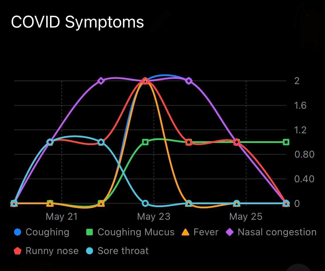
Recently tested positive for COVID, this shows the progression of my symptoms over the past week.
Source: I manually recorded daily symptom data on a 0-4 subjective rating scale.
Tools: The data recording and visualization were performed with Reflect, a personal tracking app I'm developing.
Posted by WarAgainstEntropy
21 Comments
Recently tested positive for COVID, this shows the progression of my symptoms over the past week.
**Source:** I manually recorded daily symptom data on a 0-4 subjective rating scale.
**Tools:** The data recording and visualization were performed with [Reflect](https://apps.apple.com/us/app/reflect-track-anything/id6463800032), a personal tracking app I’m developing.
This data is very ugly as the only values your points have are 0, 1, 2 yet the y axis is each 0.4
I’d like to know more about the brief moment of negative coughing just after May 23
Edit: *sore throat*, I can’t read
Thought the X axis was measuring years and was wondering how you were able to live having nasal congestion for over 3 years lol
When I had it, it lasted exactly 48 hours – fever, severe body aches mainly in my lower back, and extreme fatigue. Then 2 days later I was right as rain. It was wild – caught it on a flight from Rome to ATL and it took a couple of days to progress to where I had symptoms. My wife never tested positive, but got all of the same symptoms after taking care of me those two days – likewise lasted 2 days for her. It was the sickest I’ve ever been since I was hospitalized with H1N1 as a kid.
This is an example of why smoothing is nearly always wrong. At no point we’re you (hopefully) inhaling mucus from an external source, even though your plot indicates this. Or did you cough up a negative amount of mucus?
Noticed a lot of people in the grocery stores yesterday wearing masks. Seems like there’s an uptick in cases going around.
I don’t normally comment on this sub (long time lurker), but this is horrific enough to make me comment.
Please seek some design help if you’re at all serious about your app.
I was going to $hit all over this, but whatever…. I hope you recover soon with few if any lingering effects
Since this is a sub about presenting data beautifully, I have to say I really intensely dislike the design decision to smooth your curves and include wavy lines. I understand that it’s to prevent one line from hiding behind another. However, it makes peaks look higher, low points look lower (on a scale that starts at 0, you have lines that dip below 0), gradients that connect the same values have different slopes, and as if some values are changing fluctuating daily when they are really holding steady.
You have made something that looks pretty, but is not at all good for presenting data.
The curved lines showing negative values of sore throat really add to this
Had the same symptoms timeline…
Your throat around May 23 was better than usual? Because sore throat shows less than zero
How my git branches look like
No body soreness?! That was like my main symptom lol
man the y scale really make this graph beautiful, wouw. using decimal values for categorical data and then even excluding one of the only three categories!! this should be a crime
What is a 4 on your scale if none of these went above a 2?
Holy hell I haven’t seen a chart this bad in a long time.
Still dragging covid into 2025😭
My coughing mucus has been going for 5 years now.
I have had Covid during this exact window and can relate to the data here.