
![Comparative "Your Life in Weeks" Calendar Visualization [OC]](https://www.byteseu.com/wp-content/uploads/2025/05/ibakvug4hb3f1-1536x1334.png "Comparative “Your Life in Weeks” Calendar Visualization [OC]")
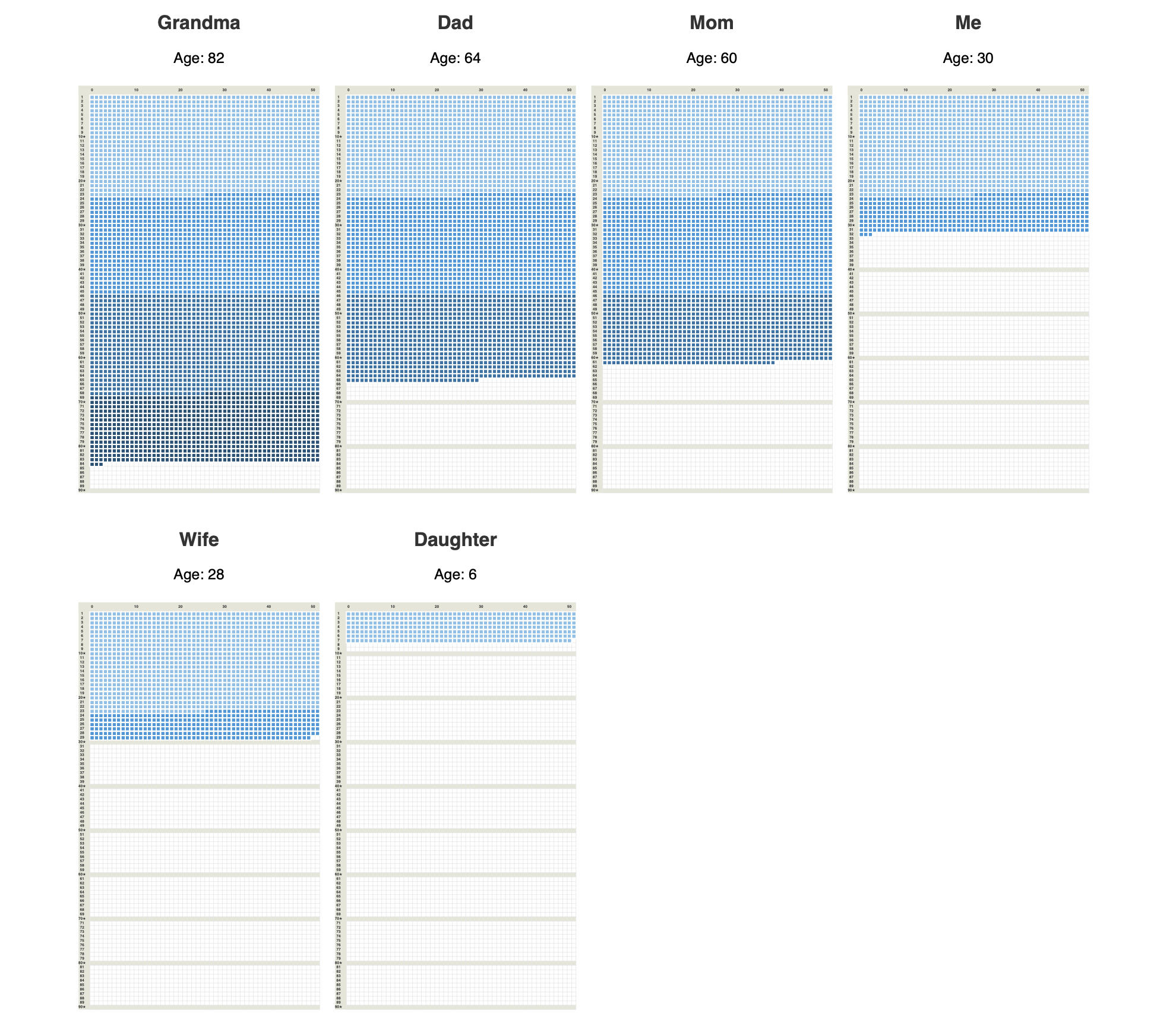
I assume everybody knows about “Your Life In Weeks” calendars. What I didn’t see before is using it to compare lifespans of different people in one screen. Gives a lot of insight imo. The visualization was built using ReportLab PDF Toolkit
Posted by fillingRoom
6 Comments
Source: The only data used here is birthdays, which I know myself
Tool: ReportLab Python library
Thanks for reminding me of how much time I have left on this Earth, OP. 😖
Can you expand on the “a lot of insights” OP?
Does the deepening colour gradient symbolise anything? Or is it just aesthetic?
I’d kinda also like to see the ages overlayed on top of each other, maybe marking out significant life events (eg when they got married/had children, went to uni, bought a house) or something! I know it’d only be representative of your family, but could be cool to see as an average of a larger population in this format!
Insight noted: Older people have lived longer and therefore have more dots.
I’m not sure what’s the insight here other than 60 is twice as long as 30 ?
What’s a “life in week” calendar? And what is the color code?