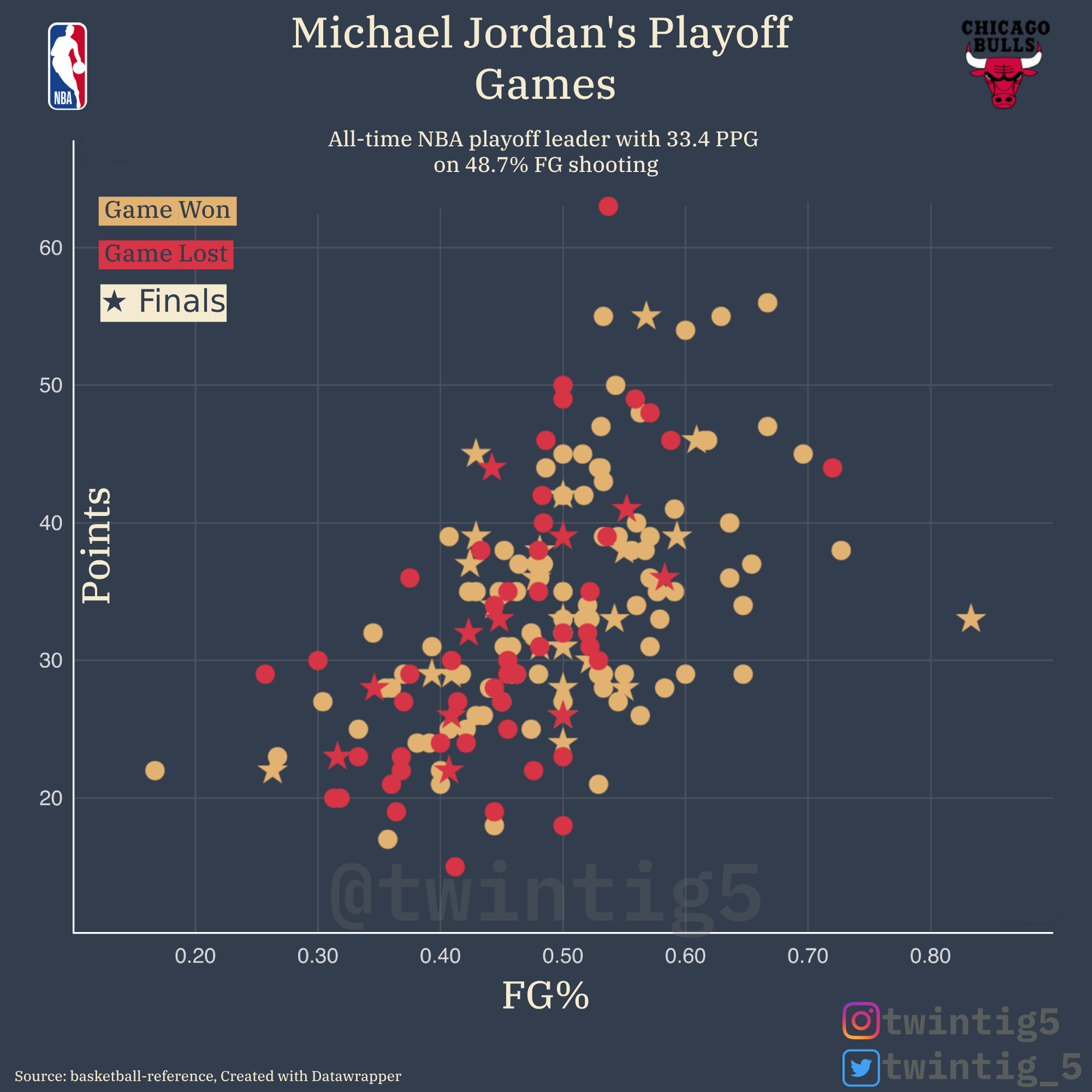
Losing a game where one player put up 60+ points is insane
Danskoesterreich on
what does this graph exactly tell me? he was more likely to score more points if his FG% was higher?
midwestck on
Looks like MJ shooting over ~55% was the most robust indicator for a win. Efficiency wins out.
BannedHammer on
I really want to see Lebron’s now just to compare the ages. (I’m Team Michael, btw)
attribution_effect on
This is great. Trend lines would be nice but looks like higher points and lower fg% in losses. Interesting, cool scatterplot.
NeuroXc on
What is the r value for this data?
UDcc123 on
I like the idea, but think it’d be better to segment on player instead of wins and losses. Put Jordan in Red, LeBron in Yellow, and Kobe in Purple on the same chart and see how they compare…win or lose.
stomachpancakes on
Jordan is the all time playoff leader in PPG mostly within a 90s NBA which was much less scoring than today. Just eyeballing stats, the 4 teams currently left all average ~10 pts more per game than the 6 Bulls championship seasons. I’d be curious to see Jordan’s % of team’s points in the playoffs vs others.

![[OC] Michael Jordan's Playoff Game Scoring Breakdown](https://www.byteseu.com/wp-content/uploads/2025/05/eeseg8z02l3f1-1536x1536.png "[OC] Michael Jordan’s Playoff Game Scoring Breakdown")
10 Comments
* source: Basketball reference
* tools: excel, Datawrapper, Photopea
GOAT statistics for the GOAT player
Losing a game where one player put up 60+ points is insane
what does this graph exactly tell me? he was more likely to score more points if his FG% was higher?
Looks like MJ shooting over ~55% was the most robust indicator for a win. Efficiency wins out.
I really want to see Lebron’s now just to compare the ages. (I’m Team Michael, btw)
This is great. Trend lines would be nice but looks like higher points and lower fg% in losses. Interesting, cool scatterplot.
What is the r value for this data?
I like the idea, but think it’d be better to segment on player instead of wins and losses. Put Jordan in Red, LeBron in Yellow, and Kobe in Purple on the same chart and see how they compare…win or lose.
Jordan is the all time playoff leader in PPG mostly within a 90s NBA which was much less scoring than today. Just eyeballing stats, the 4 teams currently left all average ~10 pts more per game than the 6 Bulls championship seasons. I’d be curious to see Jordan’s % of team’s points in the playoffs vs others.