
![[OC] New job postings data points to a decline in May and structural changes](https://www.byteseu.com/wp-content/uploads/2025/05/vcrxxygsst3f1-1536x918.png "[OC] New job postings data points to a decline in May and structural changes")
Direct link to my source data and visualizations: https://analytics.mobiusengine.ai/ (click on Raw Data)
Tools used:
- React + TypeScript for frontend
- BigQuery for data processing and aggregation
- Recharts for data visualization
- Supabase Edge Functions for data pipeline
- Tailwind CSS for styling
Data Source: Custom BigQuery dataset aggregating US-based job listings. I built my own scrapers to source that data and then enrich it. (architecture available upon request)

Tools: React, TypeScript, BigQuery, Recharts, Supabase

Interactive dashboard analyzing daily job market trends including:
- Technical vs non-technical role distribution
- Remote/hybrid/on-site work mode trends
- Job categories (HR, Sales, Product, Support, etc.)
- Seniority levels and company types
- Geographic distribution
Main data dimensions
- Technical job percentage trends
- Remote work adoption rates
- Company type distribution (startup, big tech, enterprise, agency)
- Geographic concentration (SF Bay Area, Chicago, etc.)
- Compensation disclosure rates
Posted by Away_Pay_536
4 Comments
We have a “team call” next Friday. Will be interesting.
Source: Custom BigQuery dataset aggregating U.S.-based job listings. I built my own scrapers to source the data and enrich it with metadata. Architecture available on request.
Tool:
React + TypeScript (frontend)
BigQuery (data aggregation & processing)
Recharts (data visualization)
Supabase Edge Functions (data pipeline)
Tailwind CSS (styling)
🔗 Explore the dashboard and raw data: https://analytics.mobiusengine.ai/ (Click on “Raw Data”)
Let me know if you’d like a breakdown of specific metrics or a look at the backend logic!
This would be more interesting if there was an overlap graph with hirings during the same timeframe. For example, is this just a retiring of ghost positions?
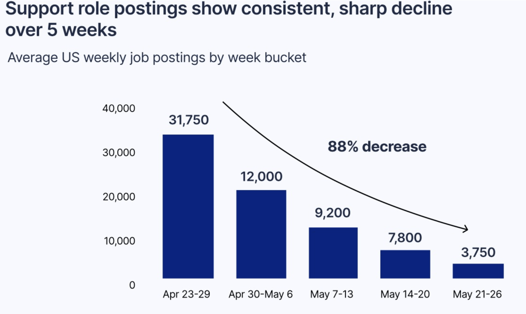
Why is the 12,000 bar above the 20,000 on the y axis?