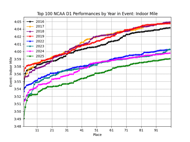
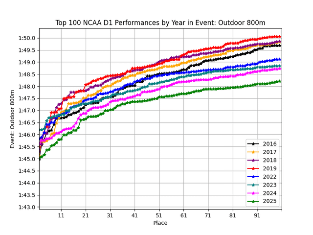
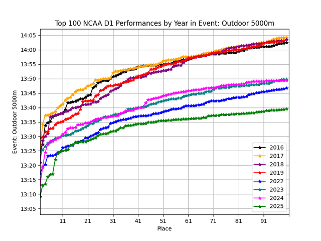
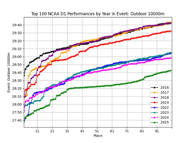
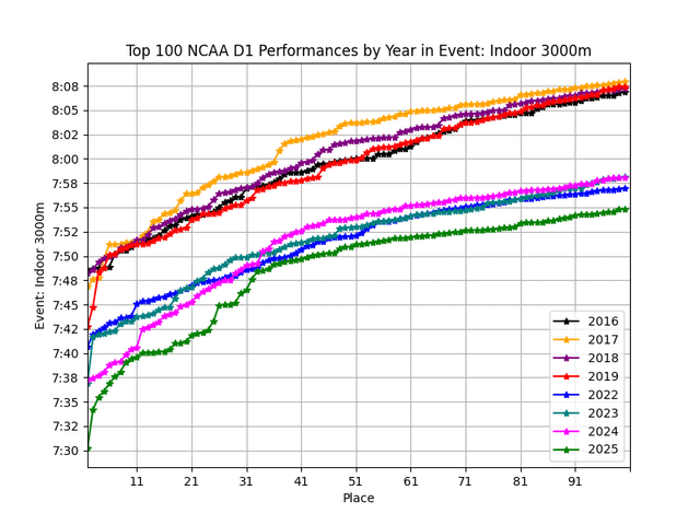
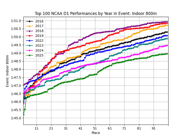
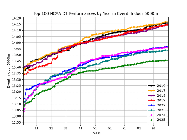
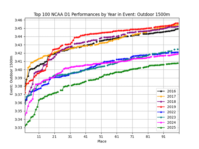
Pulled the leaderboard data from TFFRs with a web scraper and analyzed and created the charts with python.
Posted by EstablishmentOk6147

Pulled the leaderboard data from TFFRs with a web scraper and analyzed and created the charts with python.
Posted by EstablishmentOk6147
6 Comments
Honestly kinda wild they didn’t ban these the way swimming did
Half the time on this sub, I think it’s very much the opposite of ‘data is beautiful’, but this is good. I would love to see them have official half and full marathon distances also. Thanks for sharing.
Would be more beautiful if you used a sequential color map so you didn’t have to look at each color/year individually
The color scheme makes it really hard to follow a trend
The shoes aren’t improving this much each year. There are multiple variables, carbon shoes being just one. Nutrition science, new recovery methods, and new material technologies used in the surface of tracks have likely played the biggest role in these gains.
Ah, the sneaker effect. Now we’re running in the silicon era, where it’s not just the human but also the shoe that’s been engineered to perfection. Amazing analysis, by the way!