Data source: Annual CO₂ emissions (Our World in Data)
Tools used: Matplotlib
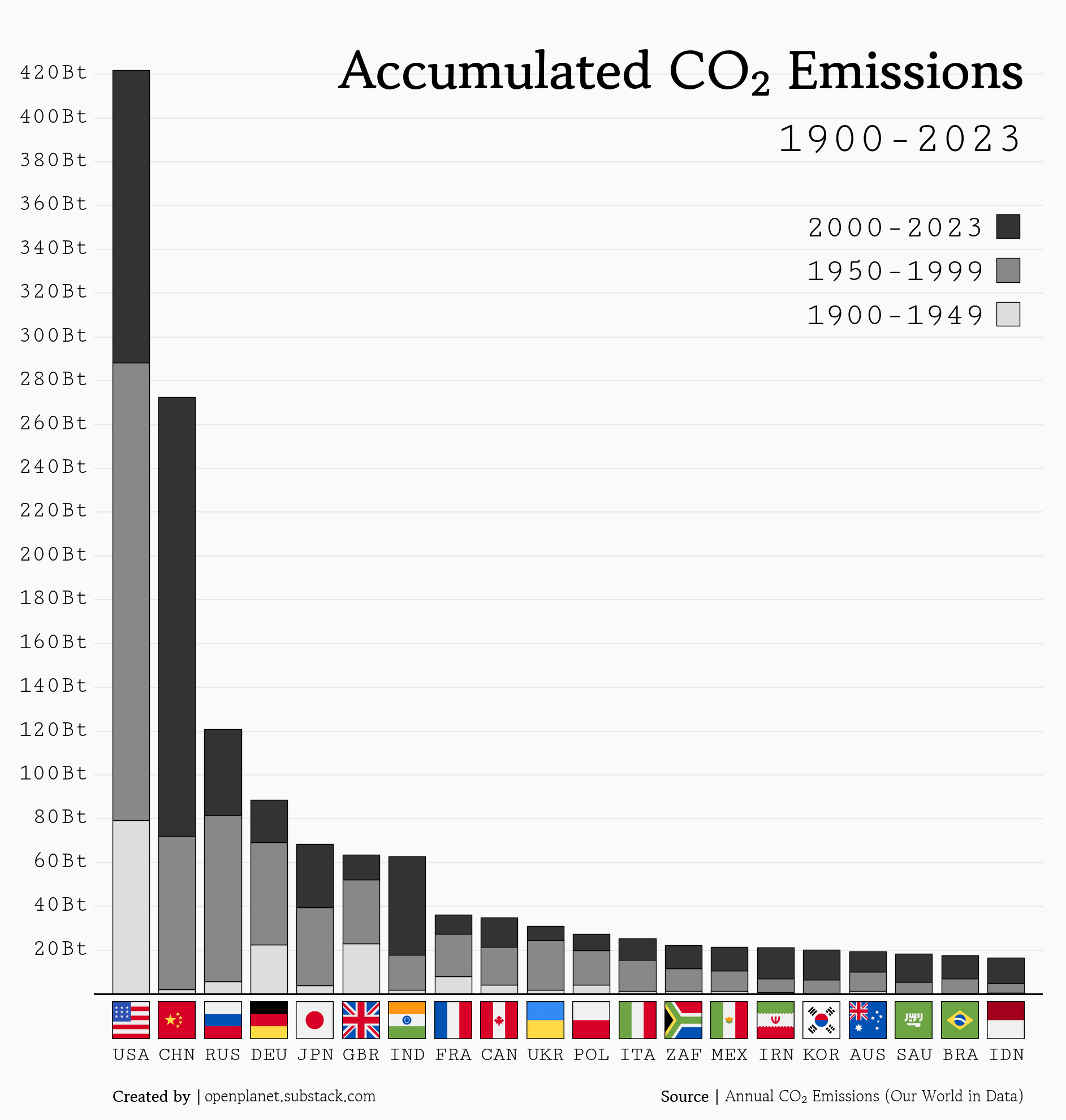
I created this chart because it was requested in the comments in my previous post:
Posted by oscarleo0

![[OC] Accumulated CO2 Emissions for the 20 largest emitters](https://www.byteseu.com/wp-content/uploads/2025/06/jyjjatu17x5f1-1462x1536.png "[OC] Accumulated CO2 Emissions for the 20 largest emitters")
Data source: Annual CO₂ emissions (Our World in Data)
Tools used: Matplotlib
I created this chart because it was requested in the comments in my previous post:
Posted by oscarleo0
14 Comments
It is so refreshing to see how despite being responsible for the minority of emissions we, Europeans, need to foot the bill and be taxed into poverty “to save the world”.
Anyone just need to look at the graphic to see how much sense it makes that we are slowly but steadily forced to stop driving our cars or going on holidays to create a positive impact on the planet.
What a fucking scam climate change is.
Can we get an additional data point which is all EU countries combined?
Maybe not possible to determine and graph, but I wonder how much of each country’s emissions (but mostly the US’s and China’s) were, and still are, for the “benefit” of other countries. As is, how much of the emissions were used to make things for export to other countries? People like to say, well, the US has benefited the most over the decades, but some of that benefit went to others.
This is a great way to show the aspect of carbon emissions that matters on a per country basis, while still showing how emissions have dropped for some countries but not others
Why isn’t Europe on one bar?
Are you kidding btw, because pretty sure the industrial revolution made most of the UK basically unbreathable
Stacking them like this at arbitrary cutoffs makes the data hard to compare between eras. It should be by decade or year, or split them up into separate graphs. The rise of industrialization in China in the past 50-75 years is very abrupt and hard to parse.
A bit weird to have 50 year intervals and then 2000-2023.
Might want to switch to rescale that or add a dotted estimate for projected 2000-2050 emissions given current average.
Sad chart. If the global temperature data are to be believed, global mean temperature are now 1.0-1.5 C above where they were in 1900.
Did tracking begin in 1900? Because if it went back further the US would have an even BIGGER “lead”
for being the biggest population india is shockingly low in emissions. wow
Yes, the US led the industrial revolution and belched out a crap ton of CO2 before anyone realized it was a problem. We’re doing a good bit better now but still have a ways to go.
So the chopping down of the Amazon for cattle expansion hasn’t even put Brazil in the top 15?? I mean it sucks about the species and ecosystems being destroyed but, that’s it??
And now accumulated per person
Hey! South Africa made the list!
Not a good list, but a list nonetheless