
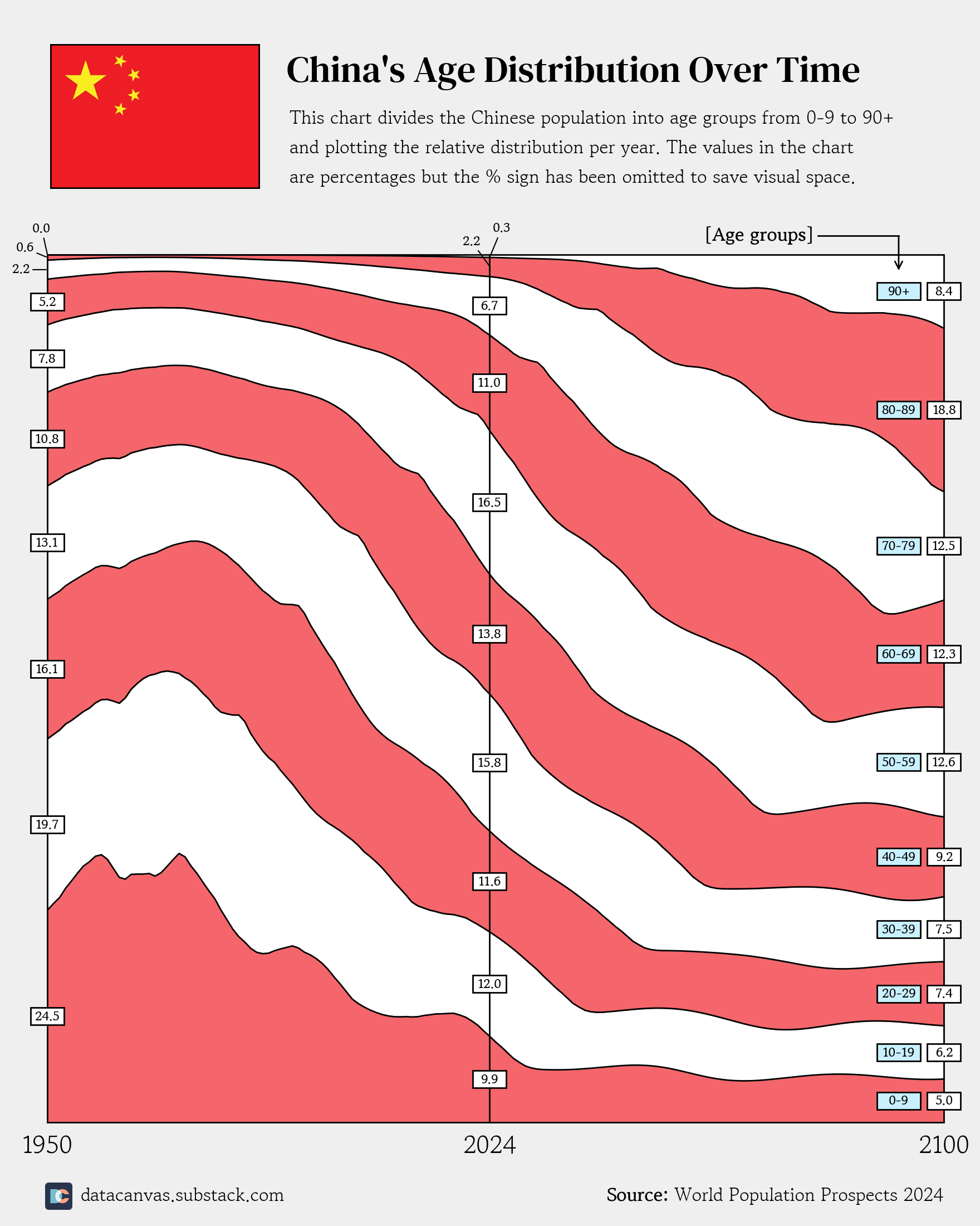
![[OC] China's Age Distribution Over Time - Historic and Official Predictions](https://www.byteseu.com/wp-content/uploads/2025/06/frscifzyma6f1-1229x1536.png "[OC] China’s Age Distribution Over Time – Historic and Official Predictions")
Data source: World Population Prospects 2024
Tools: Matplotlib
I've always like age distributions, but have only created standard pyramids in the past. I realized that if I remove gender (which isn't that interesting anyway since it's almost always 50/50), I can create a visualization showing how the distribution change over time.
I decided to try this out with China since they have some severe issues ahead regarding their demographics.
Let me know what you think! 🙂
Posted by oscarleo0
16 Comments
So did all counties have a baby boom in the 60’s?
wait I like the stripes idea, it looks really cool, would change the white to yellow and make the labels bigger to make it clearer that the inbetween sections are data.
This has got to be one of the few posts here that actually brought a visually different and interesting way to describe data. I love it
Are the projections extremely optimistic about the future birth rate? What’s the elbow around the end of this decade in the under 5s group?
At home I see elderly Chinese in the park exercising and stretching all the time. My parents haven’t stretched since 1985.
When I visited China and did a 6 hour hike that nearly killed my group of Canadians (was super hot and humid) I was shocked at all the elderly Chinese on the hike doing just fine. I’m fit too.
They seem to prioritize longevity.
That reminds me to buy some toothpaste. But on a serious not good presentation of data you can see the widening of the age distribution for people over 50, a ticking time bomb.
Nice work OP, this feels genuinely new. Also, China is going to have a challenging 21st century
China is going to have a difficult few decades.
Props to making a stacked chart that actually communicates meaningful breakpoints without an insane amount of visual clutter.
I think the age band labels should be larger and clearer.
Can you do this as an absolute plot instead of 100% scale? Would be nice to contrast the population growth/decline within each band (and overall) over time.
I would have thought covid would have really affected their older population.
Also looking at the 50’s I can see why there was so much fear of population momentum with those massive numbers under 30. Looks like it stabilizes now even though other economists are predicting population collapse.
Great visualization. Crazy to think that by 2100 40-50% of the population will have to support the other 60-50% of the pop.population. this doesn’t seem sustainable…
Removing gender because it’s “almost always 50/50” but then choosing to plot China, a country notorious for an uneven gender distribution, is a choice.
Very nice work!
Just curious though, where do you get the data for the next 75 years? Is it a mathematical extrapolation, AI, or just an educated guess?
China’s population graph looks like a rollercoaster ride, but with way more math involved.