Not sure I would consider a basic color pie chart beautiful.
uiop60 on
IMO this is data that would be better represented by a simple list — based on the percentages I have no idea how many issues of each type there are. There could be 20 total issues or any multiple thereof.
NevilleLurcher on
Not a visually pleasing graphic.
No source or definition for “Legal Issue”.
Arbitrary categories.
No way of knowing if it’s meaningful or not.
I could always whack that list in Excel and spit out a pie chart?

4 Comments
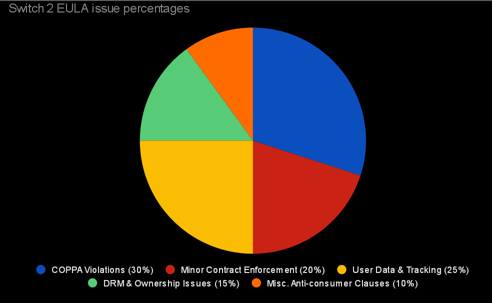
Data source: Nintendo Switch 2 End User License Agreement (2025)
Additional references: Children’s Online Privacy Protection Act (COPPA) §6502, expert legal commentary
Tools used: Google Sheets for chart creation
Detailed analysis and full document: https://drive.google.com/file/d/19TVqMr95E6bmCG7qthj_V1ybhr6s0_0F/view?usp=drivesdk
Not sure I would consider a basic color pie chart beautiful.
IMO this is data that would be better represented by a simple list — based on the percentages I have no idea how many issues of each type there are. There could be 20 total issues or any multiple thereof.
Not a visually pleasing graphic.
No source or definition for “Legal Issue”.
Arbitrary categories.
No way of knowing if it’s meaningful or not.
I could always whack that list in Excel and spit out a pie chart?