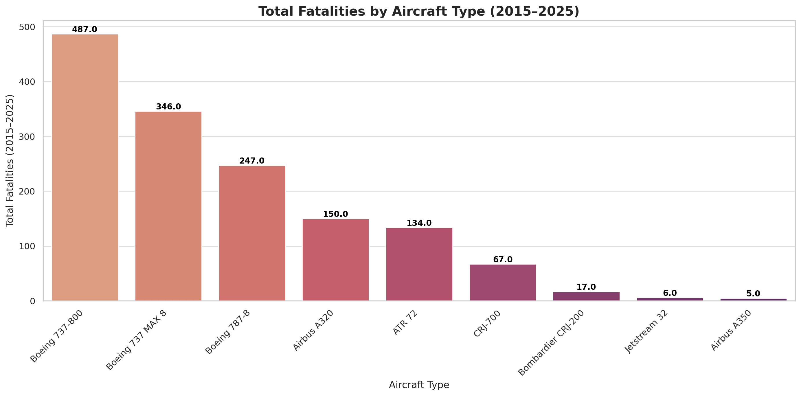
Made this after horrific crash of Boeing 787 dreamliner today in India. Just want to say avoid being at all costs
Posted by wolf_of-winterfell

![Title your visualization but keep the closing tag [OC]](https://www.byteseu.com/wp-content/uploads/2025/06/1vsqruajzh6f1-1536x759.png "Title your visualization but keep the closing tag [OC]")
Made this after horrific crash of Boeing 787 dreamliner today in India. Just want to say avoid being at all costs
Posted by wolf_of-winterfell
11 Comments
Source:
Source Links
Air India Boeing 787■8 (Ahmedabad, June■12■2025) https://www.the-sun.com/news/14458529/air-india-plane-crash-ahmedabad/ https://www.reuters.com/business/aerospace-defense/worlds-worst-air-crashes-recent-years-2025-06-12/ https://www.wsj.com/world/india/air-india-plane-carrying-242-crashes-in-western-india-de885d61 Jeju Air Boeing 737■800 (Muan, Dec■29■2024) https://www.thetimes.co.uk/article/south-korean-plane-crash-deals-another-blow-to-boeing-3ctj5p2bs China Eastern Boeing 737■800 (Mar 21, 2022) https://en.wikipedia.org/wiki/China_Eastern_Airlines_Flight_5735 https://www.reuters.com/world/china/still-no-cause-found-year-after-china-plane-crash-2023-03-20/ Ukraine International Airlines Boeing 737■800 (Jan 8, 2020) https://en.wikipedia.org/wiki/Ukraine_International_Airlines_Flight_752 Lion Air Boeing 737 MAX 8 (Oct 29, 2018) https://en.wikipedia.org/wiki/Lion_Air_Flight_610 Ethiopian Airlines Boeing 737 MAX 8 (Mar 10, 2019) https://flightradar24.com/blog/ethiopian-airlines-flight-et302-final-accident-report/ American Eagle CRJ■700 (Potomac River, Jan 29, 2025) https://www.cbsnews.com/news/american-eagle-crj-700-midair-collision-black-hawk-potomac-river/ Yeti Airlines ATR■72 (Pokhara, Jan 15, 2023) https://www.reuters.com/world/asia-pacific/nepal-blames-yeti-airlines-crash-pilot-error-2023-08-23/
total fatalities is a useless number on its own. what if there are a million times more Boeing flights vs Airbus? then even with this data you displayed, the conclusion would invert and mean that Boeings would be much safer
Nice graph, bad conclusion. This alone isn’t enough to conclude that Boeing is less safe
Not necessarily disagreeing, but another factor that needs to be shown is either air miles or take-offs and landings. Volume could change the conclusions.
What happens if you divide by the average number of people that fly on each type of aircraft in a year? Some aircraft are bigger than others and some are more popular than others. Some take off and land many times a day whilst others only fly 4 or 5 times in a week.
I suggest reconsidering your conclusion, and having look at number of airworthy planes per type. You’ll discover that it’s B737 and A320, 787 is also in the top used aircrafts.
Show me fatalities / miles flown. Or fatalities / aircraft in use.
This tells me there are more 737s flying more miles. Am I wrong?
Also , your “avoid being [sic] at all costs” while suggesting we fly a CRJ700, which has a range of less than 2000 miles and the impetus for this post was a crash that happened for a 4000+ mile journey is silly…
Thanks for the completely useless fear mongering copy and paste stats into a bar graph. This is pointless information, is highly inappropriate considering the timing, and you drew a completely unfounded conclusion based on nothing. You couldn’t even be bothered to spell check. Get a grip.
Not a beautiful or particularly clear presentation of the data.
If you wanted to make a conclusion about Boeing aircraft, it would make sense to – for example – use the colour scheme to specifically call out that manufacturer. Text is awkwardly positioned and difficult to read. Fatality counts don’t need a tenths digit. No need to repeat the x- and y-axis titles as the chart title.
That said, your conclusion is based on some pretty dodgy data, wholly unrelated to aircraft manufacturer. Ukraine International Airlines Flight 752, for instance, was shot down by Iranian surface-to-air missiles–which doesn’t strike me as something attributable to a manufacturing defect.
It’s also not clear what your source is that exhaustively lists *all* airline crashes over the last ten years.
For instance, [Azerbaijan Airlines Flight 8243](https://en.wikipedia.org/wiki/Azerbaijan_Airlines_Flight_8243) crashed in December 2024 with 38 fatalities, but the Embraer 190 doesn’t appear in your figure.
Now stop manipulating data and only showing the last 10 years. Increase scope to 30 years. Add A300, A310, A320, B707, B727 and others. Also, there was no fatality in the A350, the fatalities where on the other aircraft.
At least take away the decimal point when you’re counting people.