
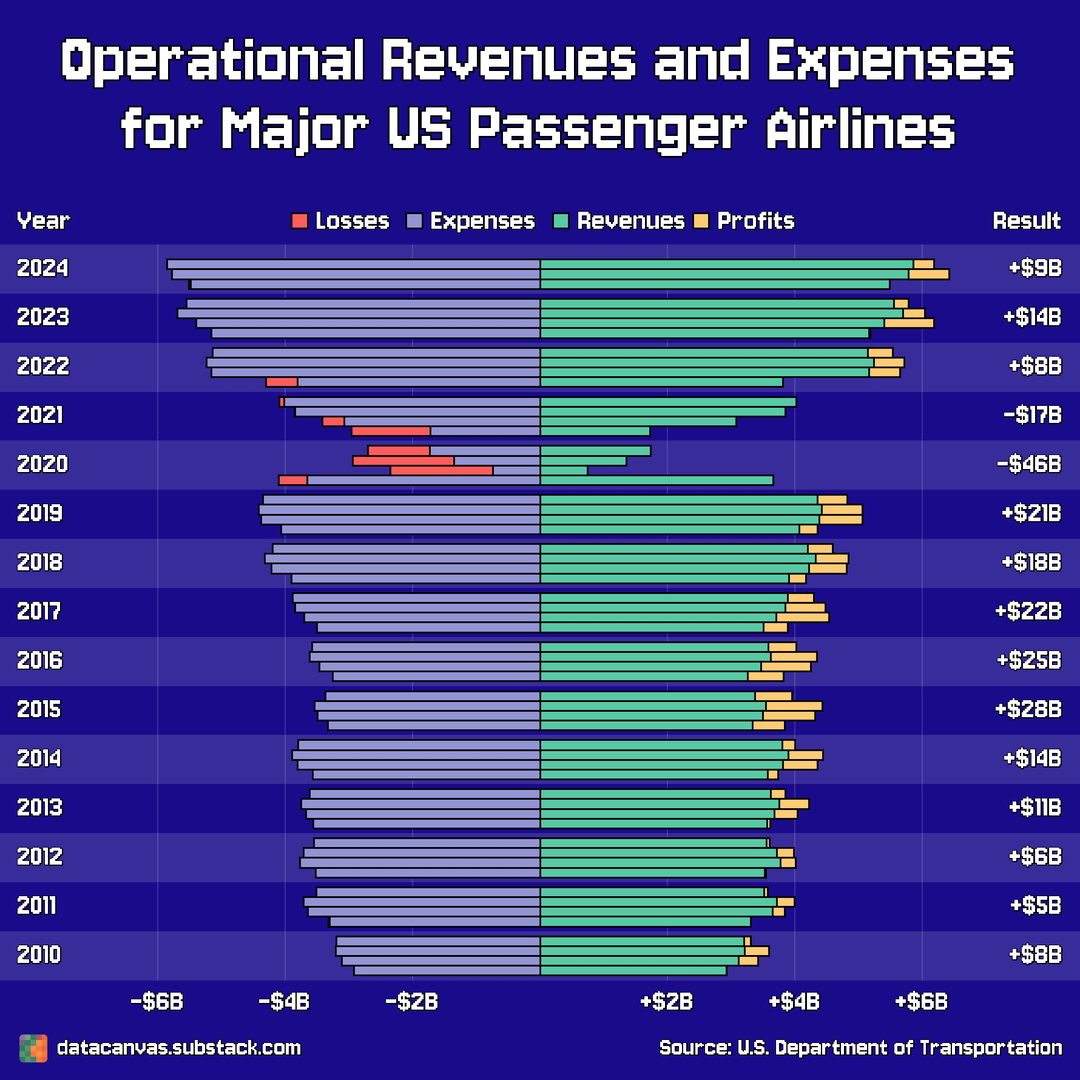
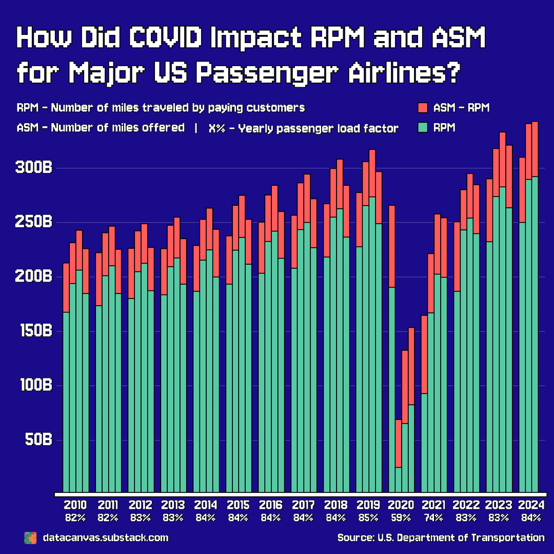
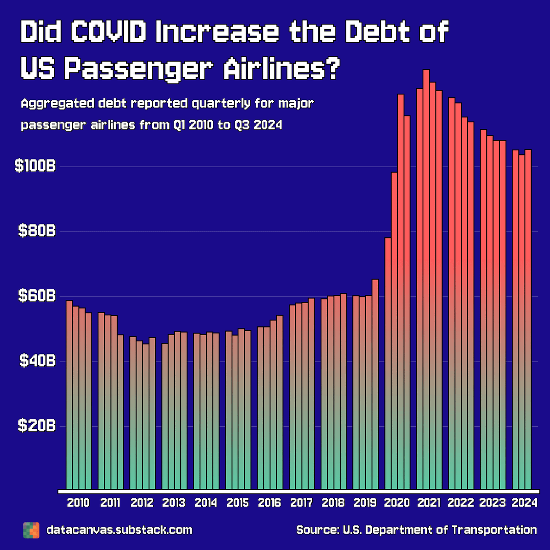
![[OC] How Did Covid Impact the Financials of Major U.S. Passenger Airlines](https://www.byteseu.com/wp-content/uploads/2025/06/apdg9zzby97f1-1024x1024.png "[OC] How Did Covid Impact the Financials of Major U.S. Passenger Airlines")
Data source: Airline Quarterly Financial Review – Majors
Tools used: Matplotlib
Colors:
- Background #1a0b8b
- Green #59C9A5
- Red #FF5C5C
- Gold #FFCB77
- Light purple #9395D3
Fonts:
- Jersey 10 (google font)
I wanted to create charts with a pixelated style because I haven't done that before. I realize that the text isn't optimal in terms of readability, but I tried finding a pixelated font that's easy enough to read.
I want to improve so I appreciate all feedback I can get on both the design and the use of data.
If you have datasets or topics that you want me to create unique charts for, let me know! Either here on Reddit or at datacanvas.substack.com
Posted by oscarleo0
5 Comments
I was glad the revenue recovered, but the debt graph really puts it into perspective. Nice addition!
The only conclusion I can draw is that relative ticket prices are too low now. All right folks, expect price hikes.
A few thoughts.
First, I don’t think I’d stack the profit and loss on the revenue and expense bars because fundamentally they are not additive. It is the result of the other two. You could put it on the same graph, just not stacking. For me, stacking in this would be for multiple kinds of revenues on the right and multiple expenses on the left (e.g. cost of revenue and SG&A).
Second, I’d make the passenger load factor a line graph on a secondary axis. It’s such a critical piece of what you’re showing that it feels buried as part of the x-axis. Highlight it by moving it into the actual graph space.
Third, maybe put the profit and loss as a line graph (secondary axis?) on the debt slide to show the correlation between two.
Lastly, another interesting thing you could do is show the airlines’ Retained Earnings over this timeframe if you have the data. This is their “cumulative lifetime profit and losses.” When looking at airlines, it’s amazing to see just how boom and bust they have been and, frankly, how unprofitable they have gotten at times (not just Covid).
This is a good presentation and puts the increased cost of air travel after Covid into perspective. I will complain ^^slightly less going forward.
Wow what an inaccurate infograph. The airlines are constantly getting bailouts. thus they’re not making any profit…..