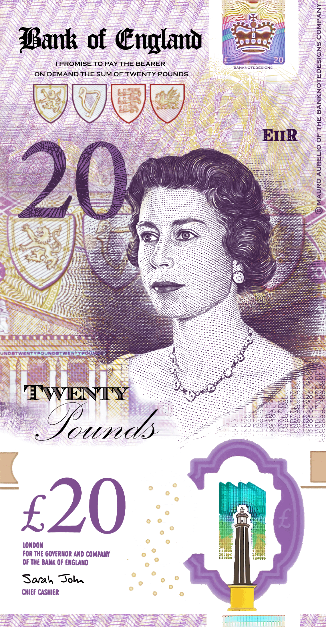
I tried to refresh the £20 banknote and design it in a vertical design. Here is the result. I just wanted to see what it would look like if there was a redesign. Feedback is welcome.
https://i.redd.it/imuupxxvfl0d1.png
Posted by aggroeuros

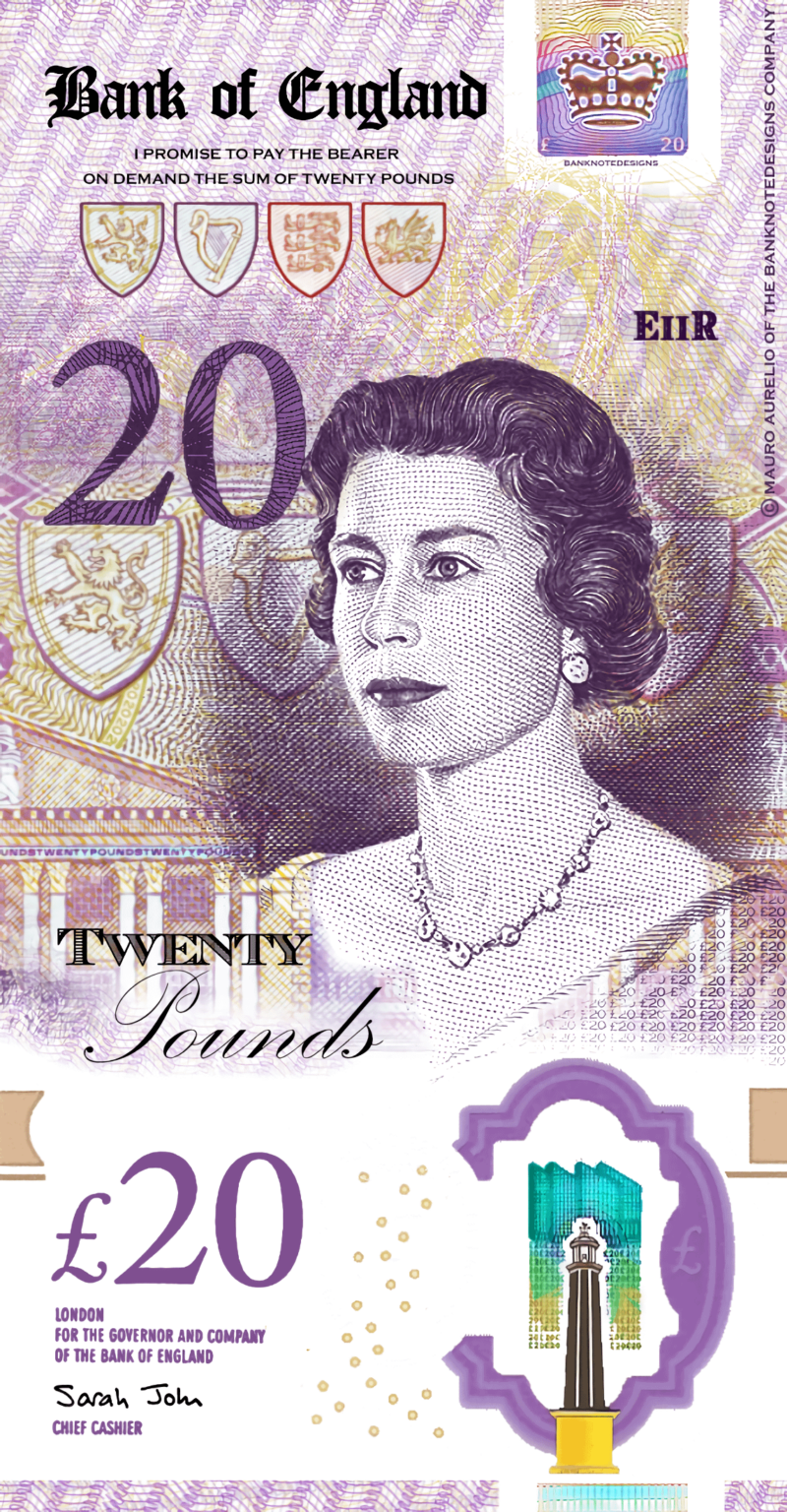
I tried to refresh the £20 banknote and design it in a vertical design. Here is the result. I just wanted to see what it would look like if there was a redesign. Feedback is welcome.
https://i.redd.it/imuupxxvfl0d1.png
Posted by aggroeuros
25 Comments
More Banknotes Designs I had upload on [“r/banknotedesigns”]
Are we starting to see Charles’ feminine side come out? He does look a bit like his mother though!
I’ve got some bad news about that young lady that’s on the front…
Rather strange to do a redesign and have it Queen Elizabeth II who died getting on for 2 years ago. I like the overall concept but you need to have it with Charles III.
Looks great
Done a a great job, with hm Queen Elizabeth
A real note would not have that white space at the bottom.
[CHARLES VERSION](https://www.reddit.com/r/banknotedesigns/s/j00znoFdAg)
Er……you know Queen Liz passed away. Don’t you ?
Love it!
You’ve improved Jeremy’s chances
This is very beautiful
No one tell him.
I love this design, elegant and simple.
Having £20 in the corners makes it eaiser to identify the denomination while going through a stack. This design only has it in one corner.
I really like it
I really hate to break it to you but… the Queen died.
Your scientists were so preoccupied with whether or not they could, they didn’t stop to think if they should.
If it’s going to be vertical then it should be a tasteful Charles nude rather than just the head and shoulders
Ew royals
Charlie’s doing drag now?
What about on the obverse, needs one of the greats like Jamie Murray or Johnny Vegas
She dead mate…
I’ll be all for vertical notes; the Scottish ones are so nice. It’s just more natural to sift through in your hands, being able to see the denomination the correct way up.
Really interesting idea to try portrait, glad you did it, not convinced it is better enough to justify a change.
Are there any use cases where one orientation is better than the other?
I do like having the denomination in the corners (personally I would have it in all 4 corners) so I think you need that.
Using Queen Elizabeth II was an odd choice considering she’s dead. But I do love the idea of a vertical design to bank notes. Some countries have done them well.