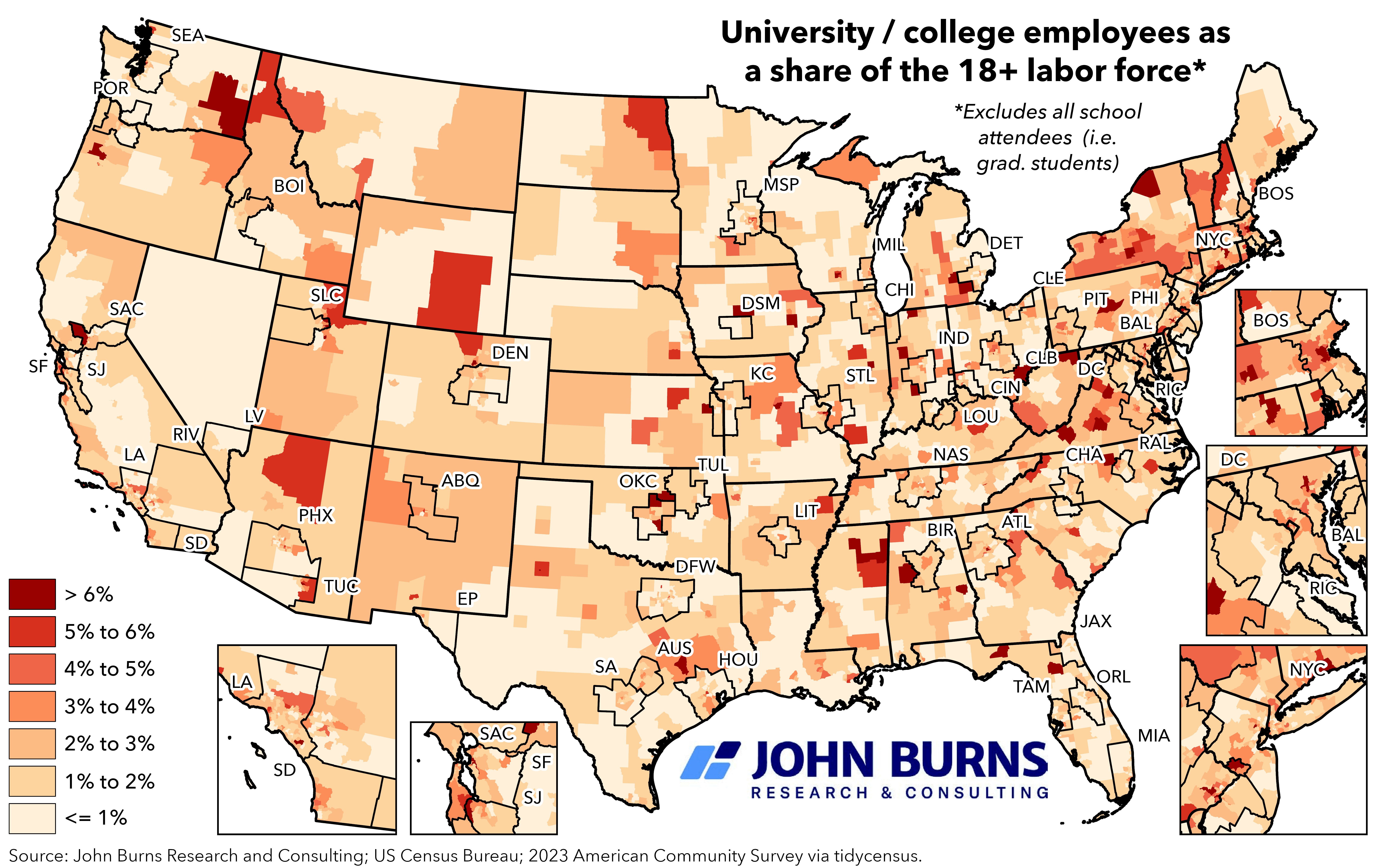
Source: John Burns Research and Consulting; 2023 American Community Survey Public Use Microdata Sample via tidycensus.
*Note: Excludes all school attendees (i.e. graduate students)
Posted by SweetYams0

![University / College Employees as a Share (%) of the 18+ Labor Force [OC]](https://www.byteseu.com/wp-content/uploads/2025/06/obibssw9ob7f1-1536x967.png "University / College Employees as a Share (%) of the 18+ Labor Force [OC]")
Source: John Burns Research and Consulting; 2023 American Community Survey Public Use Microdata Sample via tidycensus.
*Note: Excludes all school attendees (i.e. graduate students)
Posted by SweetYams0
7 Comments
the red blotch in arizona is for the seismology grad students collecting data for the Tremors sand shark monsters
I like the metro areas being outlined like this.
Excluding undergraduates makes sense because they aren’t employees, but graduate students are legitimate employees that get paid for their work, and should be included in these data. Post-docs are often considered students as well, are they excluded from these data?
Soooo… a map of where colleges are in the US?
The labels for your cities seem to be pretty far from where the cities actually are on the map
I like this one because it’s not just a population density map. Seems like often rural areas are more dependent on universities than urban areas, despite universities being often more vilified by rural politicians.
I was surprised the SF Bay area’s peninsula region is showing a darker impact from the smaller private Stanford, where there are also tons of competing Silicon Valley jobs. Compare to the lighter region in the east bay for Berkeley, where there are fewer jobs and more bedroom communities with folks taking BART into the city to work. With the large UC university and Mills College nearby to assist, I was expecting the East Bay to be darker.