Share Facebook Twitter LinkedIn Pinterest Bluesky Threads Data source: Excess Mortality (Our World in Data). Tools used: Matplotlib Posted by oscarleo0
ClemRRay on June 17, 2025 11:31 am Cool, can you maybe mark the 0% line to see it better ? And maybe choose a color gradient for the years instead of completely different ones EDIT : I thought the circles were for one year each. Maybe draw 4 small circles for the 4 years, then one big for the average ?
swazal on June 17, 2025 11:44 am Missed the first “T” and so was thinking “this should be interesting” (excess morality)
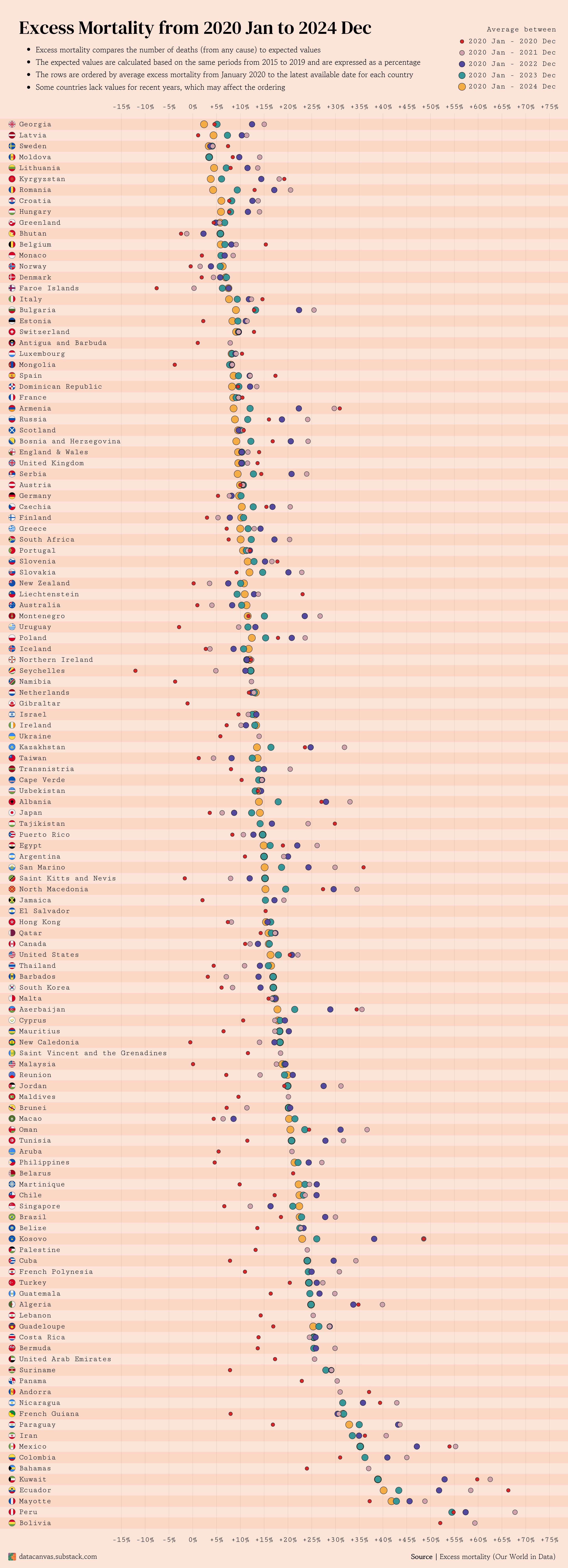

![[OC] Excess Mortality from 2020 Jan to 2024 Dec](https://www.byteseu.com/wp-content/uploads/2025/06/ixywvkrgzg7f1-557x1536.png "[OC] Excess Mortality from 2020 Jan to 2024 Dec")
3 Comments
I’d predict this data will go negative in the upcoming decade.
Cool, can you maybe mark the 0% line to see it better ? And maybe choose a color gradient for the years instead of completely different ones
EDIT : I thought the circles were for one year each. Maybe draw 4 small circles for the 4 years, then one big for the average ?
Missed the first “T” and so was thinking “this should be interesting” (excess morality)