

I realize that most posts are of a single end infographic, but some graduating readers may be interested in a real professional use case that supports why hiring managers value data visualization as a broadly defined skillset.
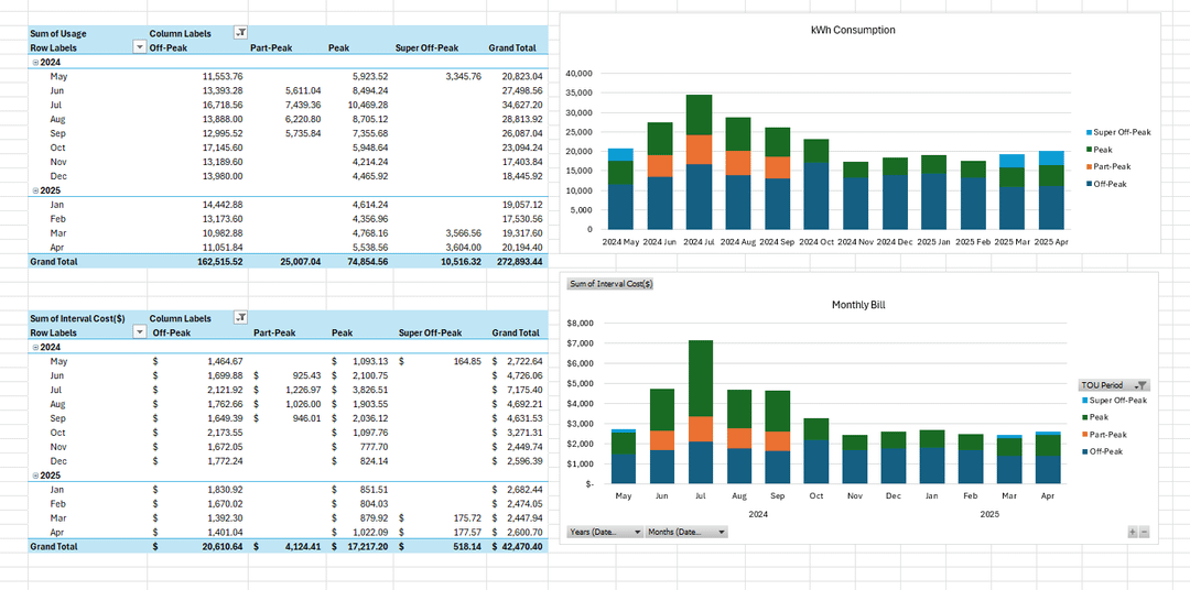
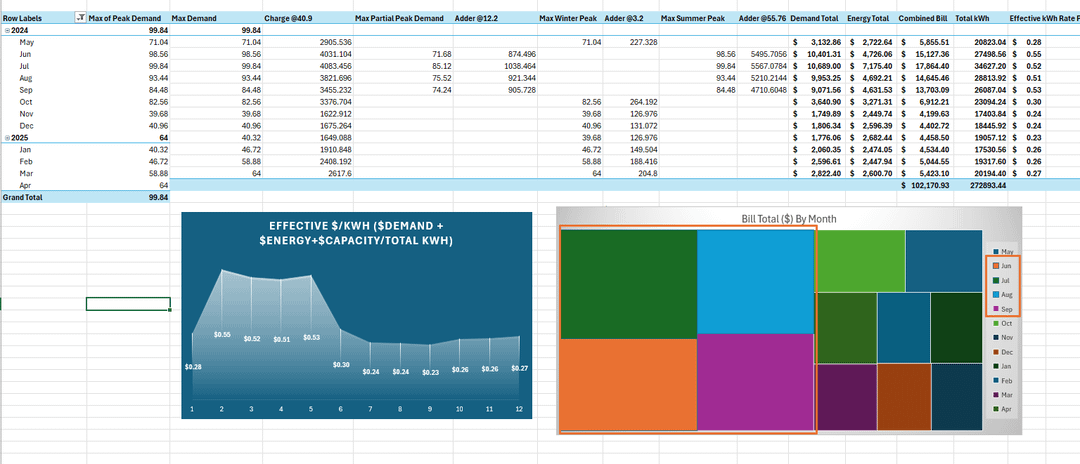
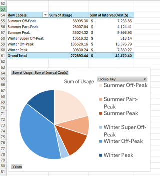
Premise I had hunch was true: This dealership spends more charging their fleet these 6 EV fast charge stations in the 4 summer months than the rest of the year combined.
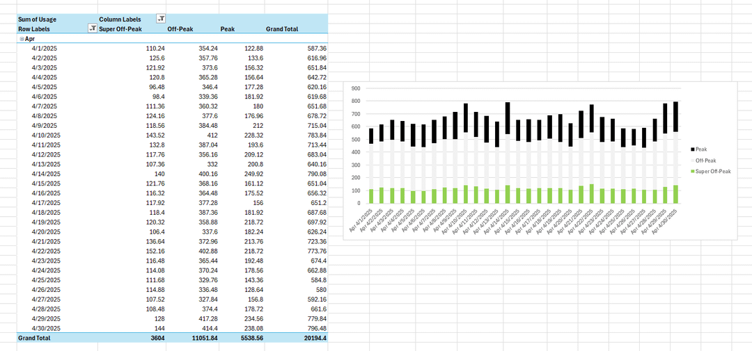
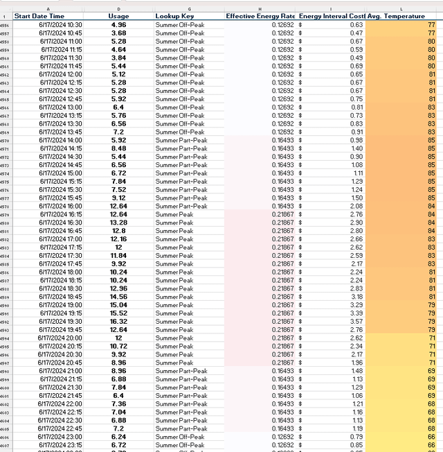
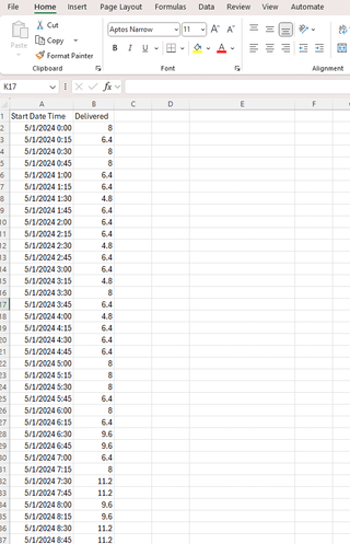
Primary Data Source: said dealership's electric meter 15 minute interval file which is a .csv format with 36000 rows and two columns (time and kwh). Accompanied by a verbal "we're on B-19 Rate".
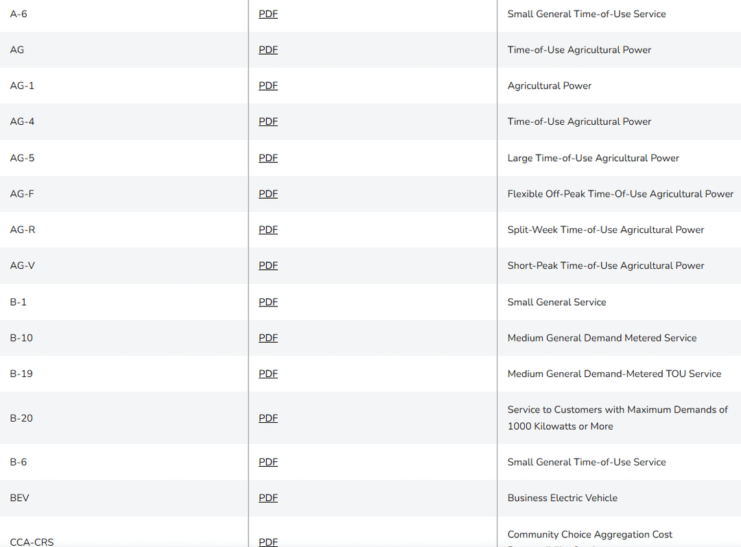
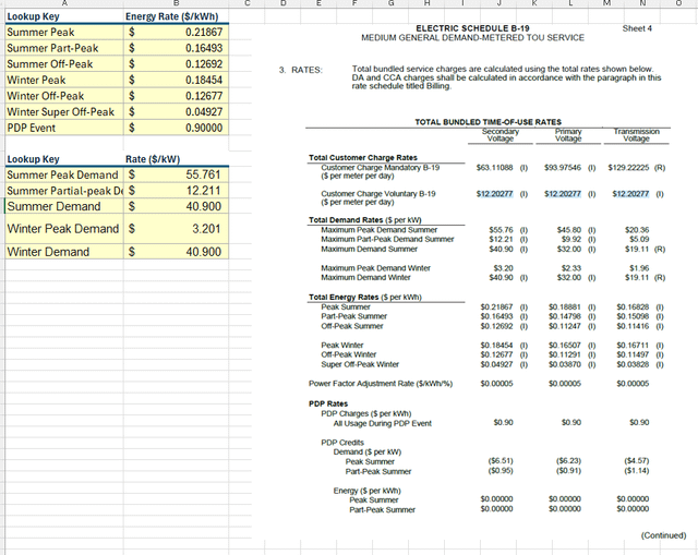
Secondary Data Source: CA electric utility rate tariff ELEC_SCHEDS_B-19.pdf
This was just all in excel, so why do it this way even though other specialized tools like flourish, powerBI, etc. could make this look even more beautiful? Because I knew the recipient in this case uses excel daily for finance applications and could follow along with my work socratically step by step which adds trust. They also would place more value turning it around quickly in order to get feedback on the storyline before working. The reality of that world is that data pretty much comes into your world ugly everytime, and only by adding context and other information sources can you create something new for your reader that has never been created before.
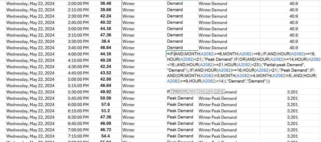
Hard: writing the nested IF loop to assign the correct TOU lookup key for each row.
Harder: interpreting the tariff with the dozens of B-19 subclasses rate this meter would be read as.
Posted by Due_Recommendation58
3 Comments
Man doing this in Excel is rough. It’s functional though and got the output you’re looking for so I respect it.
I’d argue powerBI and such isn’t the tool for this sort of data. It’d be similarly awkward to do as a data model. There’s probably a mid ground of a scripting language to prep, then you can finish the job in Excel or powerBI . When you have nested if functions it is so easy to make a mistake and it isn’t as easily repeatable/scalable
This is nice work!
I haven’t done it with electrical bills yet but there are some pretty good AI tools people at our tech company we are using for data visualization. You definitely need to check the work, but like without any additional prompts can copy paste annual usage for forecasting and optimization recommendations and it does it in minutes. Full statistics, analysis, recommendations, buttoned up in a clean spreadsheet and accompanied by a presentation. Again, you still need a human to decide what’s important, real world analysis, and to correct it when it’s wrong or hallucinating. But hours of work done in minutes in easily digestible ways. Amazing but scary times.
Nice work! Would it be possible to anonymize the CSV or at least provide the struct of it so we could play with it?